Before & After

Cliff House Before and After

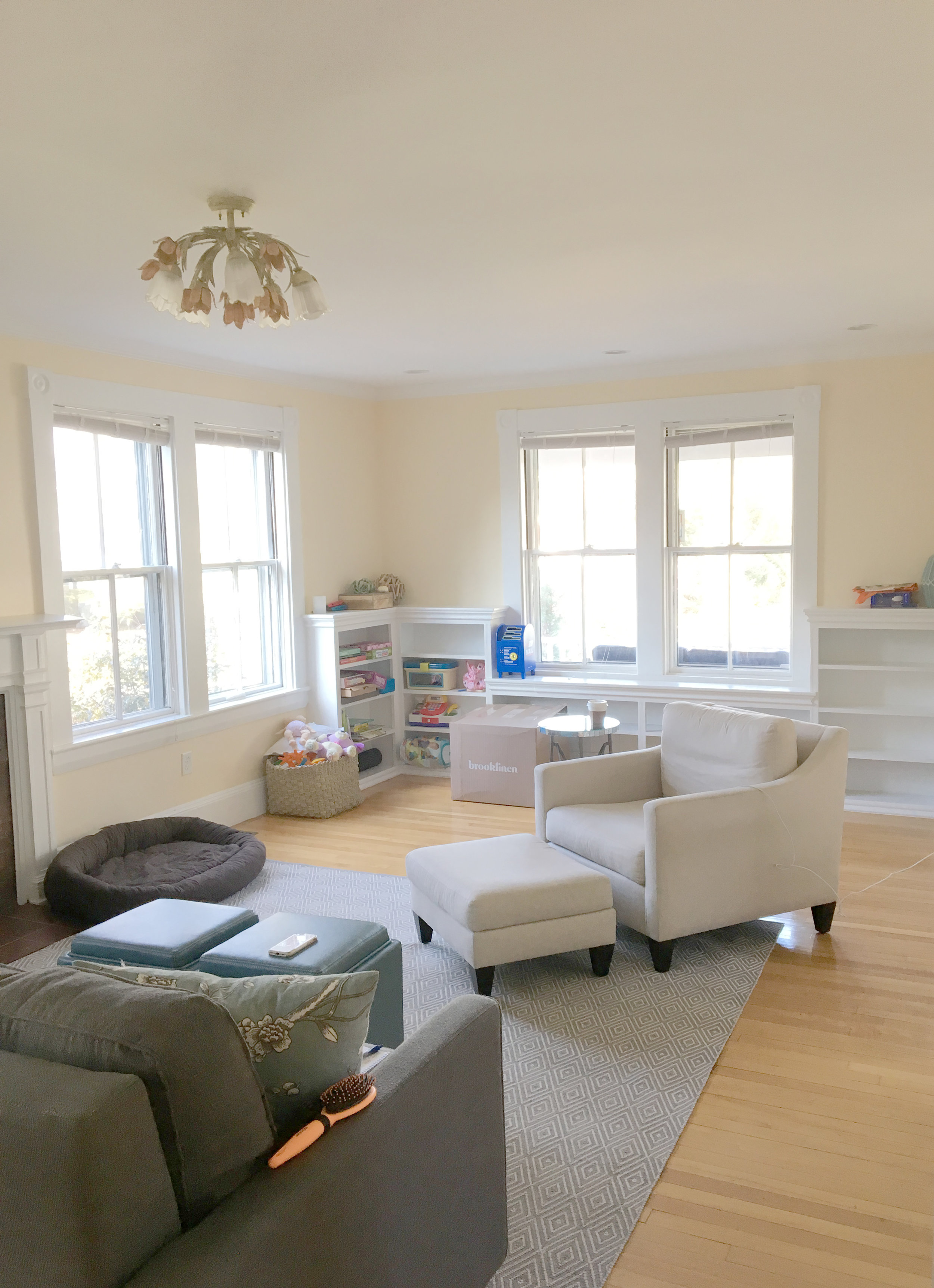
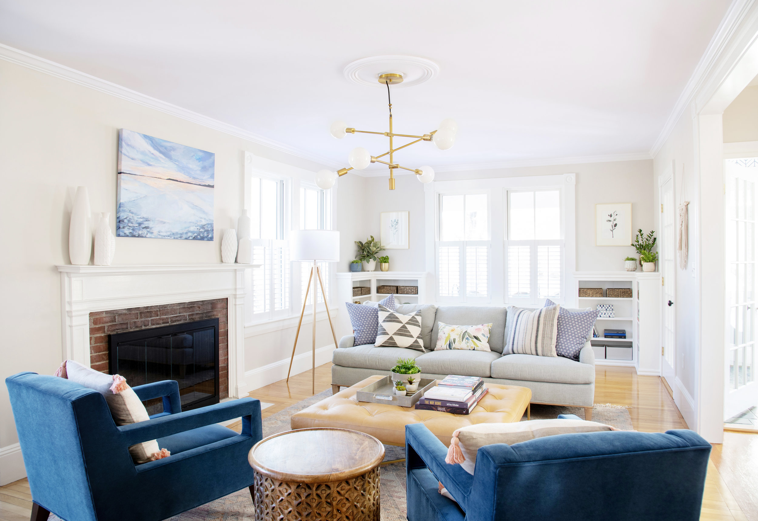
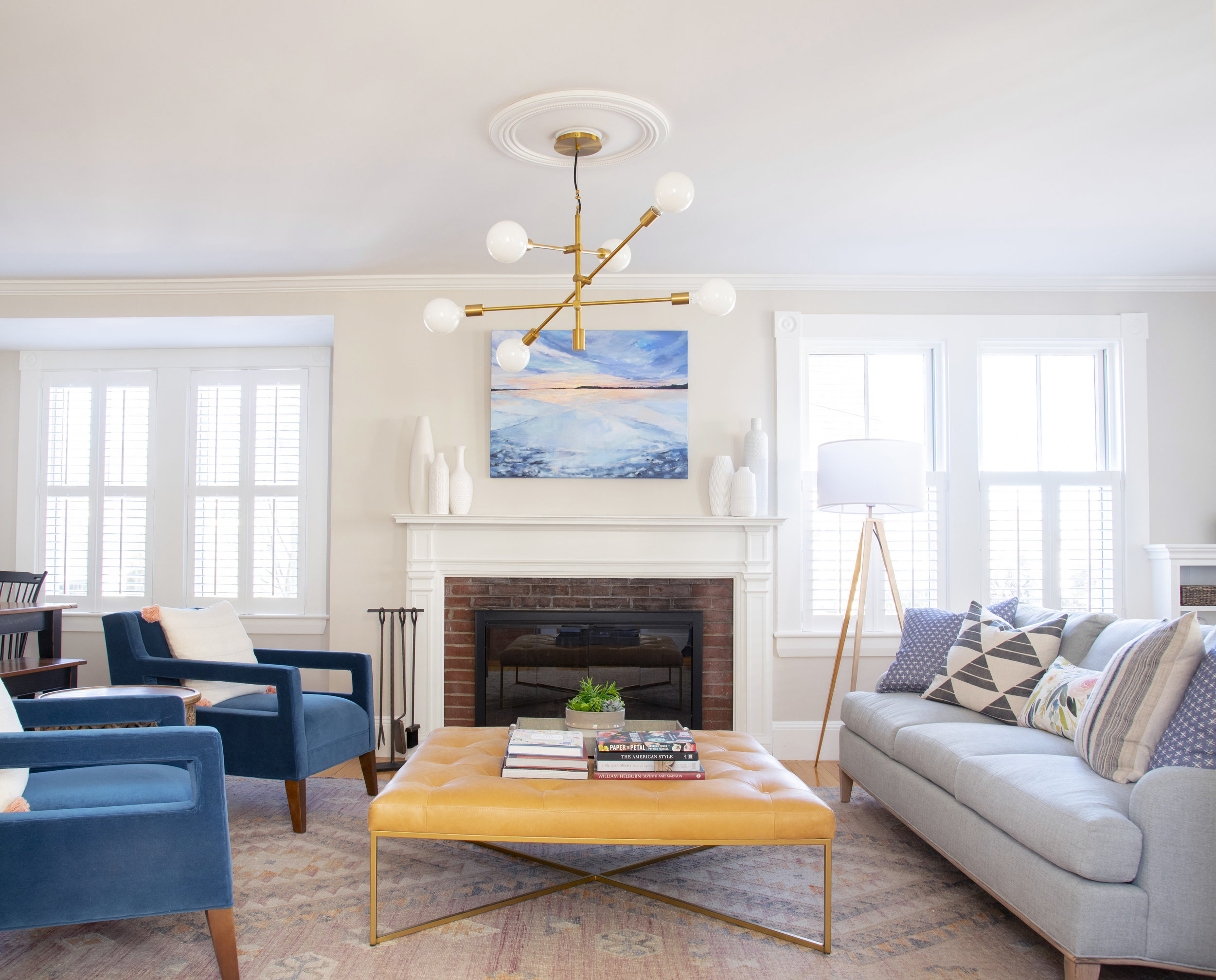
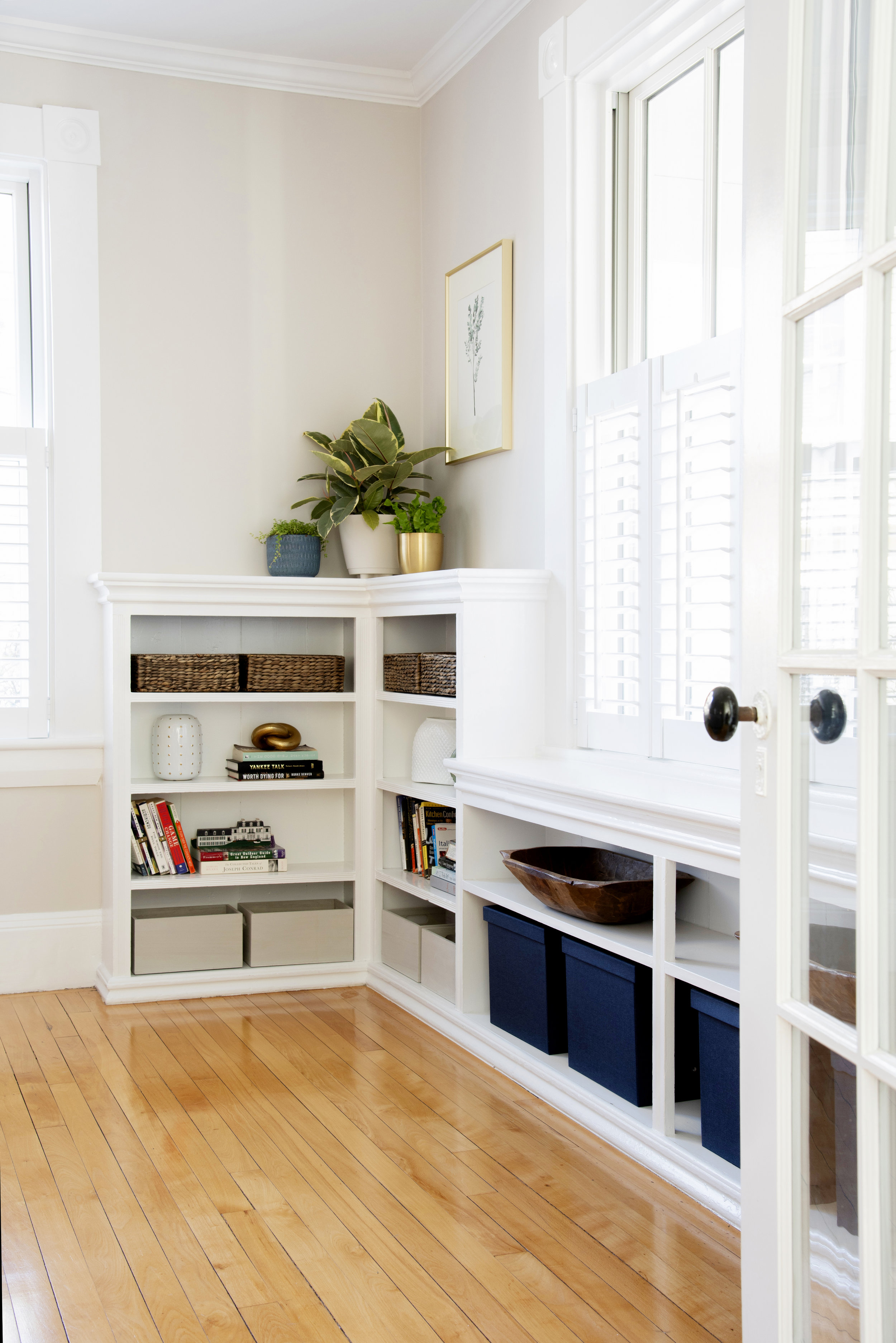
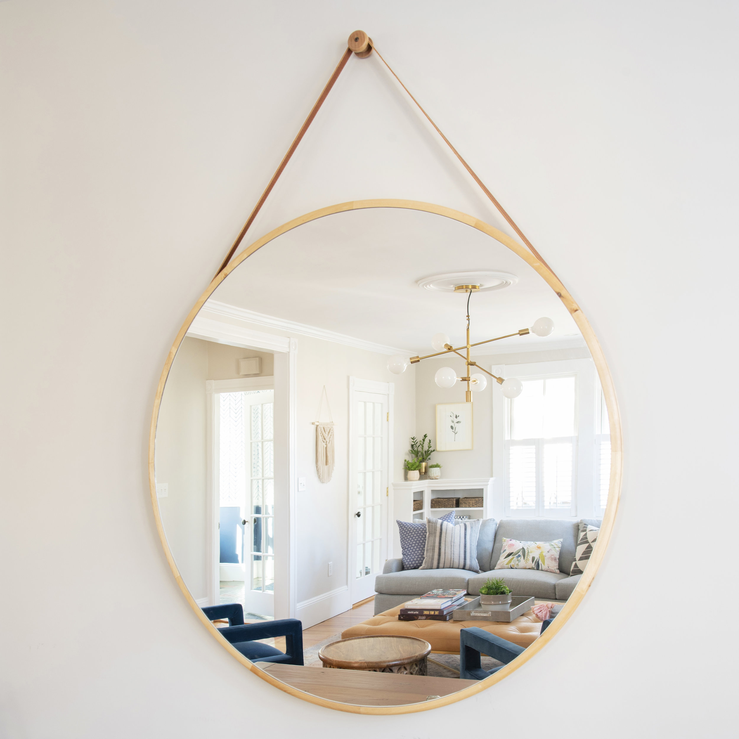
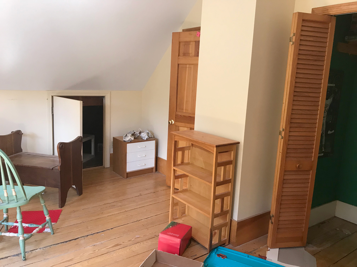
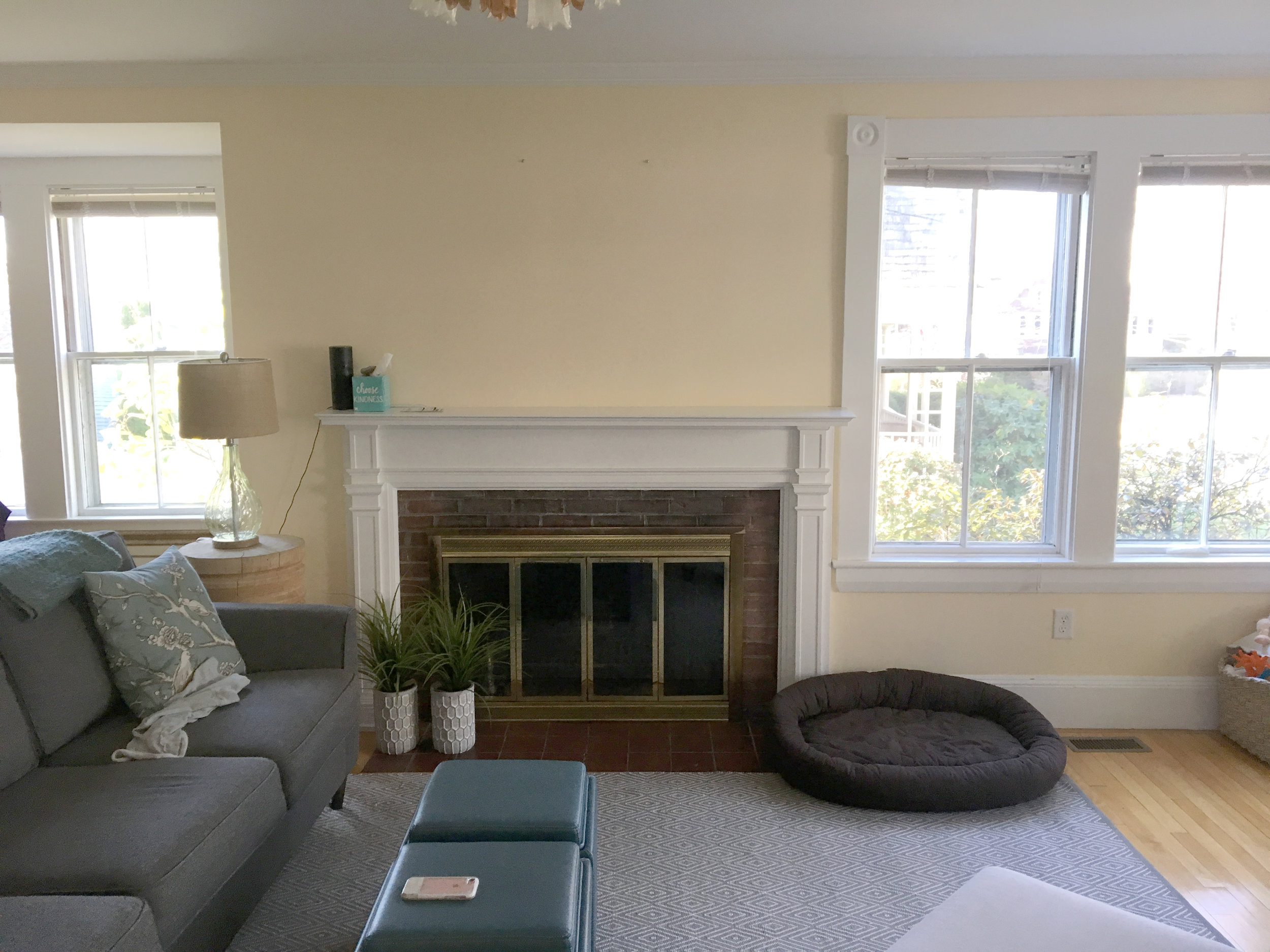
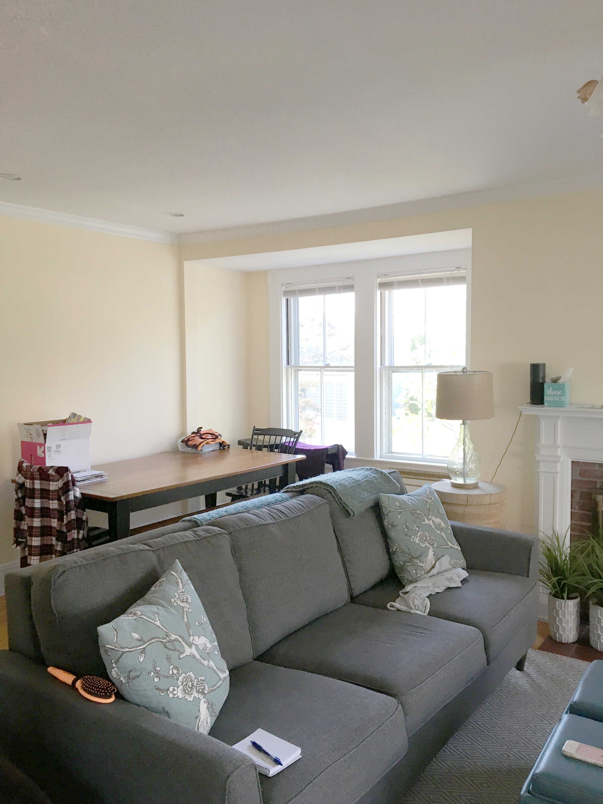
Who doesn’t love a good before and after?? This living room in a charming antique home needed a bit of help living up to it’s potential. The client reached out to me shortly after her family moved in. With the “kid zone” in another space, she really wanted the living room to be one where adults could relax and chat while still family and pet friendly. Click through the images to see both the space before and the final result!
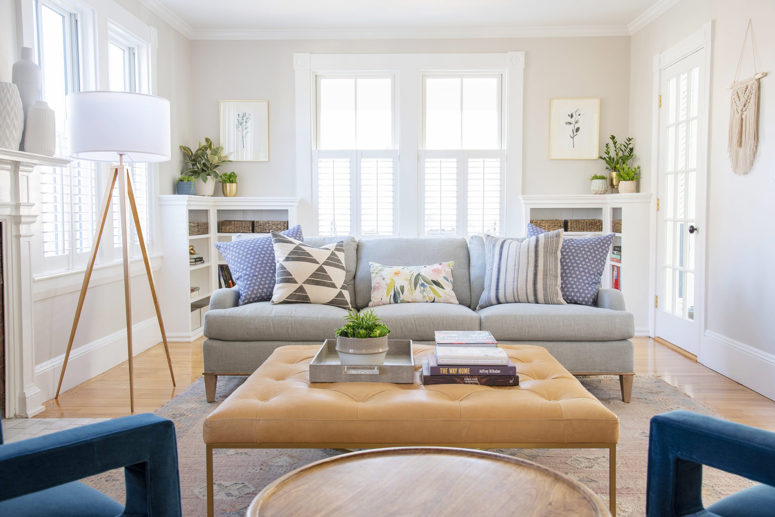
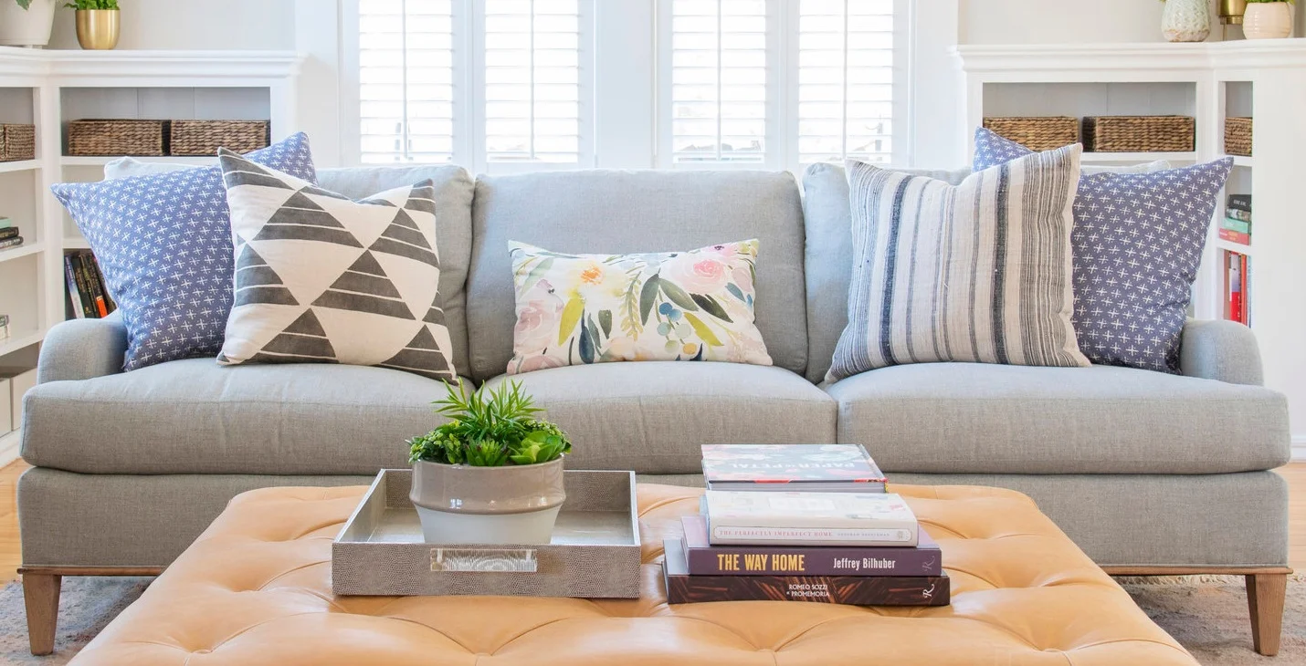
One thing that I really feel like makes such an impact in a living room is the pillows! I’ll let you in on one of my secrets: there’s a ‘formula’ that I often use for pattern mixing with pillows:

Small pattern + Large pattern + organic or loose pattern = Pattern MAGIC!

Here I anchored the sofa with a set of small scale patterns, contrasted them with 2 non-matching larger geometrics in the same color palette, then softened it all with an organic pop of color that ties it all together. The real secret is sometimes it’s just about playing with different pillows and seeing what feels right!

DSC_7770_F+copy.jpg

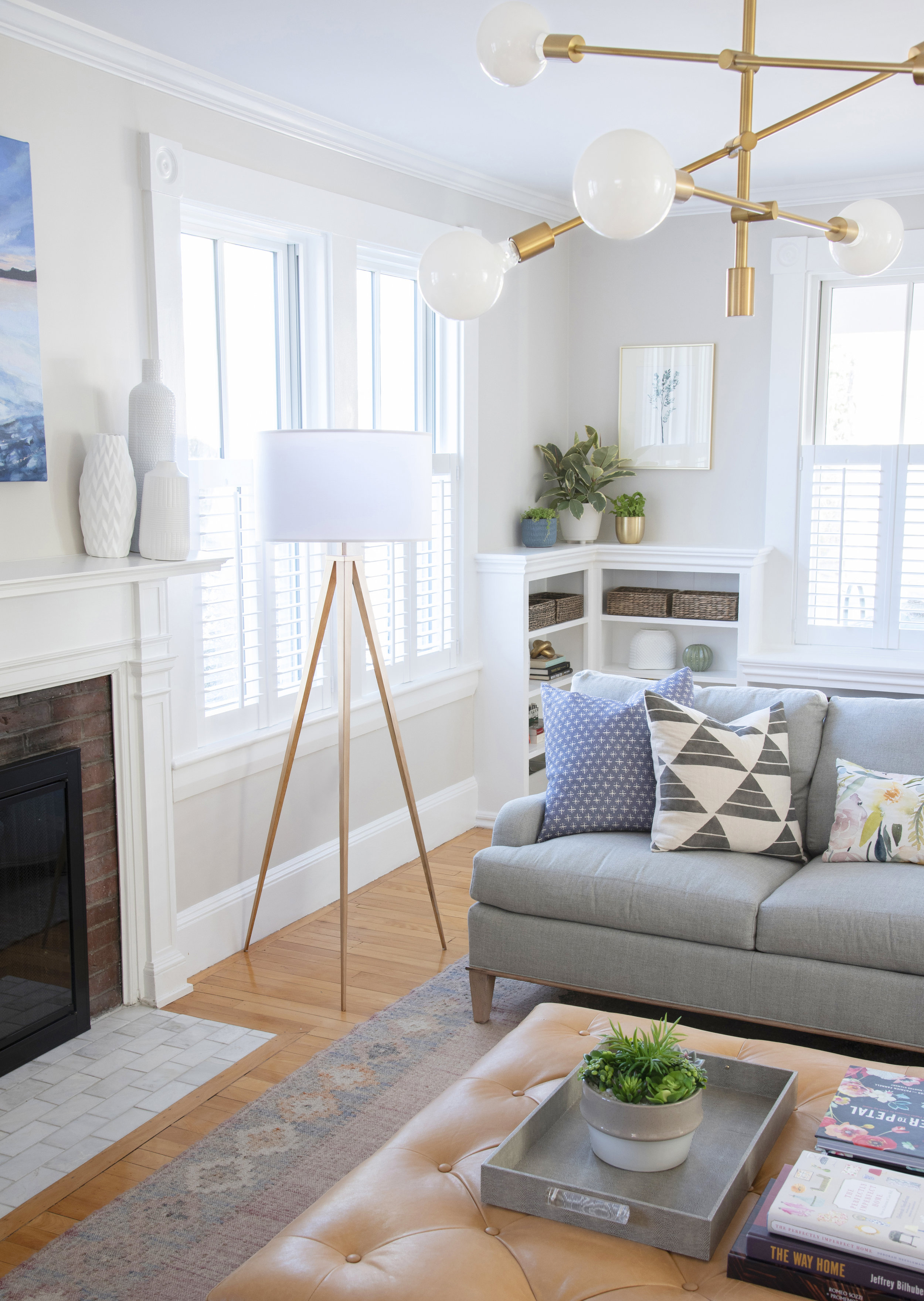
I can never resist a good side-by-side view comparison and I hope you can’t either! The view from the stairs to the fireplace has improved pretty dramatically and includes a custom painting from local artist Julianne of Moss and Blue. Aside from furniture and decor, we added plantation shutters, swapped out the old brass fireplace doors, retiled the hearth, and swapped out the dated lighting. No major construction, but major impact!

It was such a pleasure helping bring this living room to life!!

If you have a space that you aren’t sure what to do with or that you know isn’t living up to it’s potential, please fill out my New Client Questionnaire!

logo signature2 2019.png

Cole the Flip House: Before and After!

I hope you enjoy these weekly updates as I navigate through the business of flipping houses one house at a time!!  If you’re new here (Hello!!!) or just enjoy walking down memory lane, you can see my 7 previous flip houses here.  Thanks for coming along for the ride as I jump into flip #8!!!  Check out previous posts about this house here and follow along on my insta-stories for more behind the scenes goodness! This post may contain affiliate links.  For more information, see my disclosures here.

I know you've been eagerly waiting to see the "afters" and although I know some of you have cheated and found the house listing, let's do this!  It's going to be a long post so I can fit it all in, so have a seat, make yourself comfy and stay a while!!

While we focused the budget inside, we couldn't ignore the exterior all together.  When we bought the house 15 weeks ago, he was dwarfed behind a forest of overgrown shrubbery.

Aside from landscaping, the exterior got new shutters (which needed to be larger than the previous to cover holes.....), new exterior doors with a great paint color, new lights, and some concrete patching.

Handy dad jumped in to make this adorable house number planter to add a little character to the main entry.

Inside this house is really where the magic happened.  Normally, I like to save the best for last, but I'm going to shake it up a bit this time and walk through the house like you would when in person, so that means that the first room you get to see is the KITCHEN!!!  EEE!  But first, memory lane.  So much potential in this "before" kitchen, but that's about it.

I KNEW this kitchen could be the stunner of the home, so I needed to make everyone else see what I could!  I maximized cabinetry, took down the wall between the kitchen and dining rooms, closed off a doorway to the living room, and shuffled the stove location.

The MOST fantastic thing about this house now is the connection of the spaces on the first floor.

Before we head into the dining room, we need to visit the main bathroom which is off the kitchen.  It wasn't the worst I had to deal with, but it could be SO much better!

This new bright, clean bathroom comes complete with original built-in, antique medicine cabinet, and new everything else.

Heading back out into the dining room, it originally was dark and closed off.  The below view is the view from the living room with the kitchen through the doorway on the right.  The same view as the first "after" pic down below.

Now open and spacious, I can really see holidays being hosted here whether with family or friends.  It could easily fit a long, expandable table!

The living room brightened up the second we took down the old paneling, but this room almost feels unrecognizable.

The old pass-through to the kitchen got closed up to allow space for a wall-mounted tv.  The bigger difference here is with the stairs opened up and the dining room now open to the kitchen, the entire floor feels open and connected.

Heading upstairs to the 2 bedrooms, the rooms themselves didn't undergo huge transformations, but we all know what miracles paint and details can be!

The smaller bedroom is worlds brighter with a new door into the *NEW* powder room.

The original master bedroom didn't seem very masterly to start with.

I definitely rectified that, however, putting almost 12 feet of closets along the wall.  Just staging it with a queen size bed and nightstands makes it feel so much cozier!

The biggest change upstairs was definitely in this closet.

Which is no longer a closet.  The space was perfect for a small jack and jill powder room!  The walls didn't move at all to allow for this space, just some new doorways.  We were lucky that the footprint was already here!

So what do you think??  Did you see the potential in this house 15 weeks ago?

The key to this entire house was MAXIMIZING.  Maximizing the usable space, maximizing it's potential, and maximizing our budget!  We're hosting 2 more open houses this weekend, Saturday and Sunday from 12-1 so if you're in the market, message me for the info!!!

If you made it all the way down here, congrats and THANK YOU!  XOXOXOXO

Have an amazing weekend and Thanksgiving week!

Copper Dot Office

Office-After-23.jpg

After getting kicked out of my home office for Copper Dot Baby's nursery, I swiftly realized that the dining room table wasn't going to cut it as an office.  If you don't recall the "before" office teaser that I shared with you back in January, let me give you a refresh.  Partnering up with Stephanie of Stephanie Rita Photography, we rented a 237sf office in a historical town building from 1874.  My commute increased significantly from 50 steps to the dining room table to 1/2 mile down the road, somehow, I'm finding it manageable, however.  **this post may contain affiliate links**  


I started working here as soon as we got internet hooked up, but it took us a little bit to really make it "home."  After painting the space a crisp coat of white, we slowly moved things in and accessorized, finally putting the last finishing touches on just a few weeks ago.  I'm so excited to show you what the space looks like now!


Come on in!!


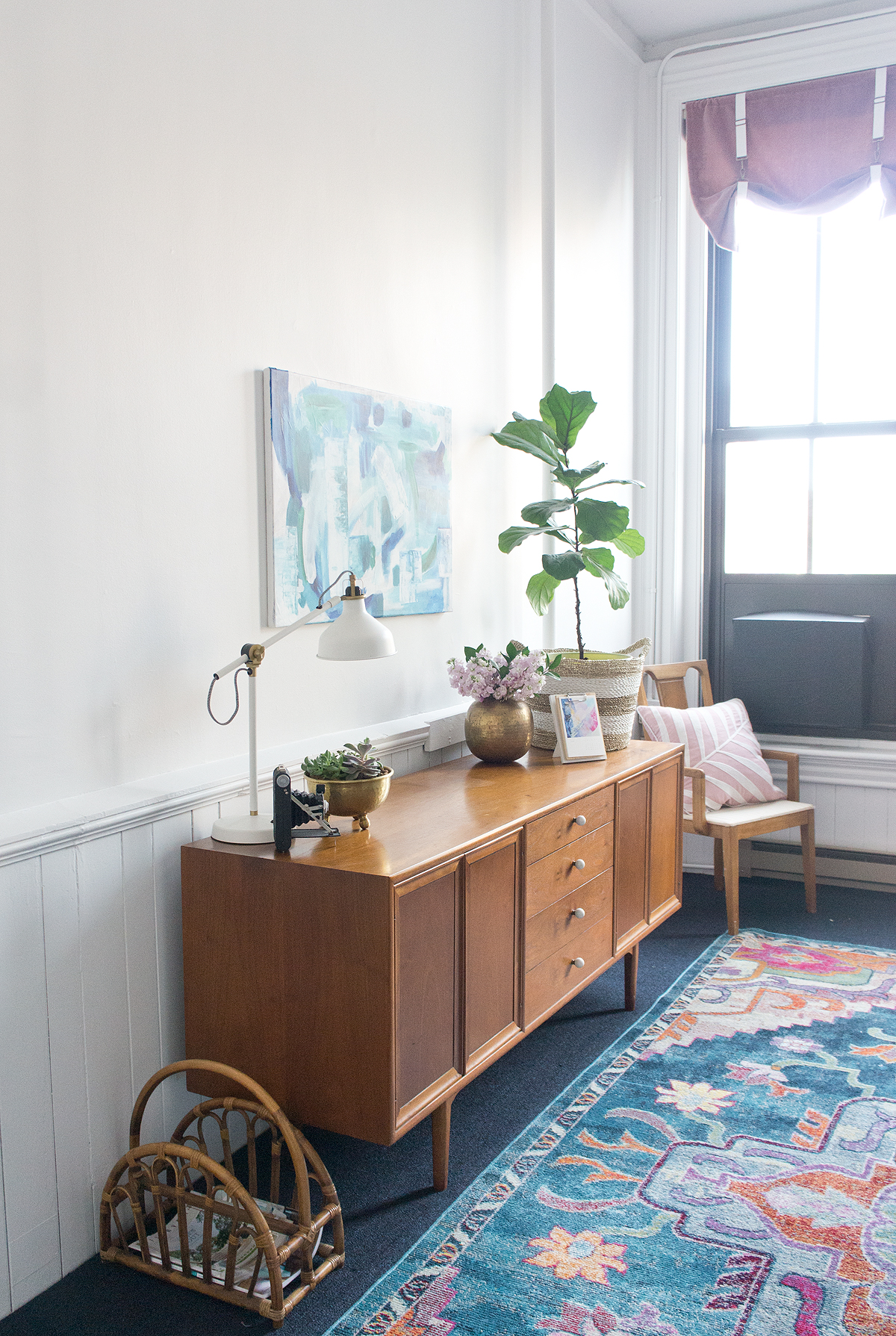
We got a little creative filling the space: we used a lot of items we already had, a table and chairs from facebook marketplace, and a few awesome hand-me-downs.  The sweet credenza was inherited from Stephanie's grandfather who was conveniently downsizing.


Not to be left out, my parents had a few pieces in their basement they were just itching to offload on me.  One of the items from my parents that I would have been a complete idiot to say no to was a card catalog that my retired librarian mom adopted when she was cleaning out a local school library while she worked there.


Since we couldn't have it just chillin on the floor, I raised it up on metal hairpin legs and I'm totally in love.  Currently, it's the perfect size to hold my paint fan decks and fabric samples sorted by vendor.  Really trying to get and stay organized here!  Some days I'm better than others, but it's WORLDS more organize than my home office ever was.

The white walls have been great for both of us as a designer and photographer: I have a white backdrop that I can tape up samples or view paints without being muddied by weird other colors reflecting, and Stephanie has already used the white backdrop for several photo shoots.


With the space being only a rental, there's more than a few things we need to work around such as permanent in-window air conditioner (that we "hid" with a black cover... totally tricked you, right??), dark blue carpet that hides nothing, pipes that are a bit less conspicuous now that the entire shell is white, and my person favorite.... fluorescent lighting (ick).  Luckily the natural light coming in from our 8 FOOT TALL windows and the character that just oozes from the old trim, high ceilings, and doors makes the other things completely forgivable.


Before breaking out on my own, I spent more than a few working hours sitting in cubicles and corporate spaces that just ended up zapping my creative energy.  I'm loving the vibe our little office has!  A little boho, a little vintage, a little modern, and a little chic.  Renting this space has been the best decision I've made for Copper Dot!!  Not to get too woo-woo on you, but I swear, moving to the office was apparently my subconscious way of telling the universe I was serious about my business and ready for it to grow- and the universe reciprocated!  I have so many exciting projects coming up that I can't wait to bring you along on!!
 

Sources:

RUG!!!! // Hairpin legs on card catalog // Office chairs // Detail photos and painting by Stephanie Rita Photo