Before & After

Dining Done

Ok, I get it.  You guys like seeing projects get done, not hearing me talk about them progressing and simply showing you pretty pictures from the internet.  Message received loud and clear.  Results get more views.  Views are like crack to a blogger.  We just want more!  So I need to start delivering.  But, I digress. Dining room accomplished!! How's that for results?

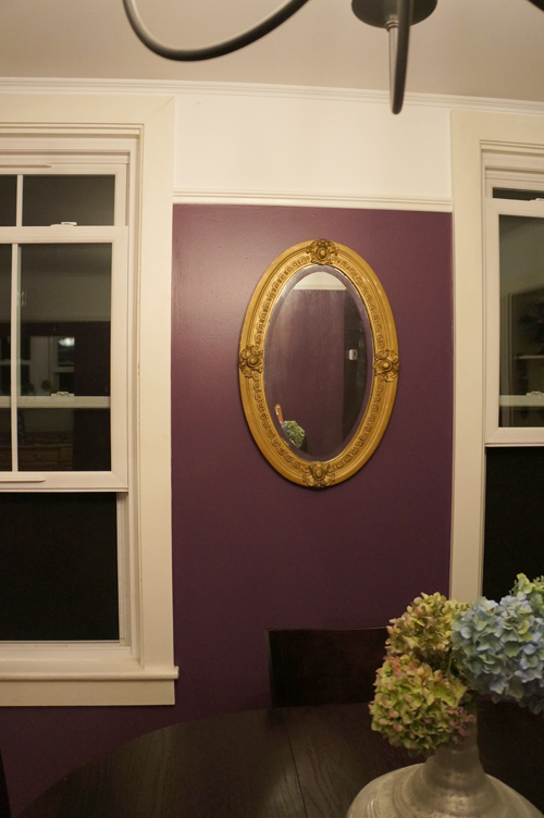
Or at least the walls and trim are.  (apologies for the night photos- I was touching up paint until after dinner)

Remember what the dining room looked like about 2 weeks ago?  Nothing offensive, but kind of dreary.

Even the plastic faux wood doorbell cover got a makeover

There were some crazy angles that I had to try and get trim to fit.  The one below is a nice and easy 126 degrees.  Even my new adjustable miter saw balked at it.  With some paintable caulk and white wood-filler, though, I was able to conquer the corners!

The trim fits in with the character of the house.  It looks like it could have been there since the house was built 112 years ago, and naturally, that makes me happy.  so does purple.

Now I can't wait to raise the rest of the room up to the level of the walls.

Still left to do:

  • Replace chandelier
  • Swag chandelier over table
  • Paint antique 'liquor cabinet'
  • Refinish collected chairs
  • Paint piano
  • Create built-in 'china' cabinet (eventually)

Phew!

Art: Generic to Custom

In an effort to try and 'finish' my living room, I wanted to introduce a mini-gallery wall surrounding the TV.  After taking inventory of the art in my house piled up and waiting to be hung, some made the cut.  To my surprise, most of the framed pieces we have are around the same size.  I wanted to play with sizes a bit, so I headed to HomeGoods (as usual) to scout accessories.  I absolutely love HG for most accessories, but their framed art can sometimes look cheap and generic. When I found this lotus print, the colors called to me.  The plastic on plastic frame, though was just about as classy as Jersey Shore.

The print and frame was only $20, so I decided to play with it a bit.

By cutting the print into 3 pieces, I was able to create a playful triptych in exactly the scale that I was looking for.

I have a few finishing touches in order to really pull together the art on this wall, but I'm excited to show it to you next week.

Have an amazing weekend!

Wanna Know a Secret?

I'm finally ready to divulge the mysterious secret of the desk that I told you about here.  But, you'll have to wait until the end of the post.  Unless you're just THAT impatient and scroll down right now. I've been working like crazy to refinish this $80 craigslist find so I could deliver it to my sister in law this past weekend.  $80 is probably more than I would have spend on a regular old desk, but as I mentioned, this is no regular old desk.  It's original state was sad, though.  I would have loved to salvage the wood, but the veneer desk top and drawer fronts were beyond help.

Naturally, the solution to that was paint it bright green.  Naturally.

I'm kind of in love with the color.  It's so glam.  Good thing I can't cheat on Hubby with a color, he might have competition.  The flower knobs are from Anthropologie, and for the amazingly inexpensive DIY ring pulls, I followed Sarah M. Dorsey's tutorial.  But, we all know by now that this desk is more than meets the eye.

It's the PERFECT piece for a spatially challenged NYC apartment.

I have never seen one before.

ever.

Is the suspense killing you??

Ok, fine.

I'll tell you.

How cool is that?!


Shared at the link party at Primitive and Proper