Before & After

A Finished Kitchen!

Before I show you the final result of the kitchen, let me remind you where it was a few months ago (which is still a marked improvement from when we moved in) dated kitchen progress/before

I designed nothing in here because it felt like a losing battle against poor quality cabinets and finishes that just weren't us.

Until now.

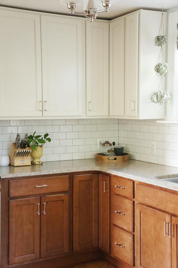
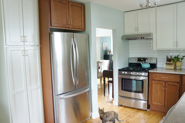
Two Tone kitchen reveal

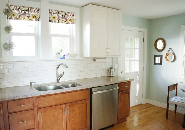
I never thought these words would escape my mouth, but the kitchen is now my favorite room in the house.  (That doesn't mean I'll start cooking though)

Two tone kitchen reveal

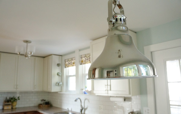
I gave the room a fresh coat of paint, we replaced the cabinets and lighting, reused our previous countertops, and added a tile backsplash.  As one of my favorite completing things in the room- the backsplash was extremely cost-effective, coming in at only $150 total!

Kitchen Lighting detail

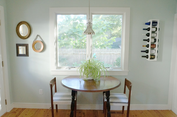
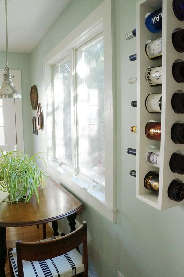
kitchen seating

With just a few simple and relatively low cost accessories, the kitchen finally feels complete.

kitchen reveal

kitchen fridge reveal

As a bonus, the added cabinets have now allowed us to hide away the microwave, trash, recycling, and all the other ugly stuff that cluttered up the room before.

Kitchen details

kitchen reveal

kitchen mirrors

Even with the bumps we hit in this project, I'm so happy with the results!

So, tell me, what do you think?  Is it what you were expecting to see?  Better? (I hope)  Any tips on photographing a room that gets bright direct morning sun and bright indirect afternoon sun?

Faux Sure

Sorry for starting off the post with a really bad pun (I'm really not sorry) but it's been stuck in my head the entire time I was putting this project together. Faux roman shades! and the last kitchen teaser post before the big reveal Friday!

Faux roman shade diy

Why are they faux?  Well, they don't actually work like shades- they just sit there and look pretty.  Tough job.

So, how did we get here?

When last we visited the kitchen windows, they were naked.

naked windows

I knew I wanted to soften the windows a bit with fabric, but functional shades just aren't necessary here.  I googled a bunch of faux shade tutorials and then did what I do best- made it up as I went along.

I started by cutting my fabric and a piece of liner to the proper size.

faux shade fabric

To line, I faced the good sides in and sewed 3 sides leaving the top open like a pillowcase.  Turn right side out and iron.

faux-shade-iron

Then comes the fun part- figuring out where the folds go.  I ended up folding the bottom up for a softer edge and adding only one additional fold.

faux-shade-folds

I started by pinning the folds, and tacked them into place with a needle and thread once I settled on them.  I sewed from the back and didn't go through the front layer of fabric, so you'll never see the stitches.

faux-shade-tack

I folded the top, unfinished end over until the shade was the height that worked best for the windows.  I didn't even bother to cut off the excess or finish it, since this will be hidden once installed.  And since I have windowS above the sink and not just one, rinse, repeat.

faux shade repeat

This fabric isn't as regular as a pattern as it seems at first glance, so getting it straight and even from shade to shade was a challenge.

Install was probably the quickest part of this process.  I used a pvc trim piece that I already had, cut it to the desired width and nailed the new shades into place.

faux shade tools

faux shade install

As you can see, the trim piece is hidden under the fabric and will never be seen.

Viola!  Such a simple project, but it totally helps the room feel more complete.

faux roman shades

Do you recognize this fabric from our dining room?  Once I brought the extra fabric into the new kitchen, I knew it needed to be in here instead- the colors work perfectly!  The purple ties in the dining room, and the grays pick up the green kitchen walls.  You can probably guess what that means for the dining room- chair recovering in the near future!

Have I inspired you to try faux roman shades?  Or have I just tortured you with another kitchen teaser and you're ready to jump through the computer and make me post the finished kitchen?

 **update** check out the finished kitchen HERE

If You Love Something

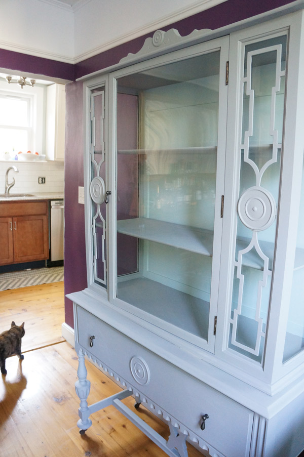
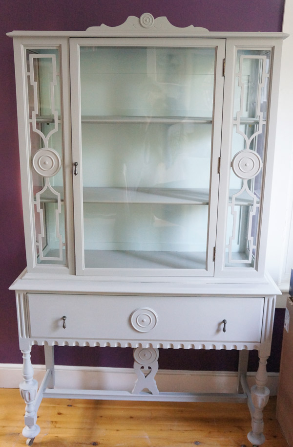
...set it free. That's exactly what I am doing with my newly redone china cabinet.

china-cabinet-makeover

I love it.  I really do.  It came out awesome and I swoon over the new pulls.  But my dining room just isn't it's home.  It doesn't feel right in the room and sadly there's no other place in this house for it.  So I'm setting it free- it may even have a new home already.

But before I let it go, let's talk about this thrifted china cabinet's transformation.

china-cabinet-before

Such a sexy piece, just BEGGING for me to bring it home from the thrift store and give it a new life.  You know me- when old furniture calls, I answer.

I had been itching to try a chalk paint (not chalkboard paint, chalk paint), but the hefty price tag was deterring me.  What's a DIY blogger to do?

diy chalk paint

Yup, I took to the internet, read different DIY chalk paint recipes, then, like a good rule follower... I winged it.

The basic premise is to dissolve plaster of paris in water and then mix it into the paint.  My first mixture was too watery, so I kelp playing with the balance until I was happy with the finished texture (learning from experience: the less water, the better).  It's really a precise science, just like my color-picking.  I started with one color, then added another until I liked it.  (Sorry, that means I can't tell you what color most things in my house are).

With any chalk paint (or so I read), the first coat will be very streaky,  but the big draw of this paint is that you do not need to sand or prime the surface to get the paint to adhere.  Coat #2 covers fully, hides all the brush strokes, and gives it a very pretty chalky-matte texture.  In this pic, you can see the 2 spots where I tried out coat #2 (and one's still wet).

chalk paint coat 1

In addition to the paint, hardware was MUCH needed here.  The broken 80's fake gold pulls that were on it when I got it just weren't cutting it.  I got these drop pulls from HomeDepot.com and I want to put them on every piece of furniture now.

china-cabinet-hardware

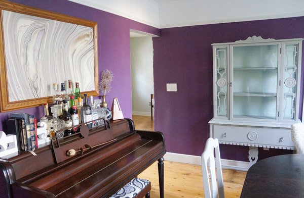
I'm sad that it just doesn't feel right in my dining room- I was hoping after refinishing the puzzle pieces would fit, but alas it competes with the piano too much.  Sorry china cabinet- my grandmother's piano wins this round.

china-cab-dining-room

At least it will go to a new home where it will be loved and appreciated and display pretty china like it was destined to do.

china-cabinet-after

Isn't she gorgeous?