Before & After

Sayonara Scallops

Happy Monday! I know that's extraordinarily cheerful for a Monday, but I'm just excited- today, we bid adieu to the pink bathtub!  Naturally, I'm going to make you wait until Friday to see it, though, in my weekly flip update.  OK, maybe I'll put a sneak peek on instagram if you're lucky.

On the topic of saying farewell to dated 50s home elements, let's visit my parent's house.  It's been quite a while since we visited one of their home projects.  My parent's approach to DIY is a lot like mine, but more productive and strategic (unlike my usual philosophy of "I'll figure it out as I go").   Even they're 'little' projects are pretty awesome.

Check out the latest transformation in their dining room:

hutch before and after

By just removing the scallop and switching out the doors, the built-in went from 50s not-so-chic to pretty darn timeless!

new hutch doors

I should also mention- Handy Dad built the new doors from scratch (go Dad!).  This is why I beg let him teach me how to make/build/fix things.

Cheers to a productive week and updating antiquated 50s design elements!

Salvaged Tile Art

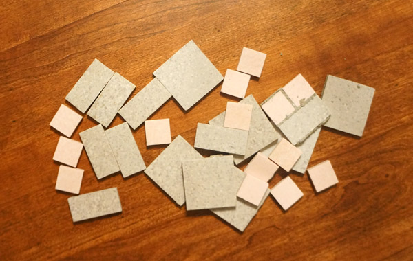
Last week when I was brute-forcing the bathroom floor out, I was hit with inspiration in the form of concrete chunks.... that's not too odd is it? tile-chunk-inspiration

In my demo delirium (I've decided that's a thing) I looked at these pieces and fell in love with the modern art that smashing a floor created.  I thought it might be a bit too crazy to frame a chunk of concrete (not to mention HEAVY), so I salvaged some individual tiles that were intact and had a bit of fun.

The lighting seems to have been a bit funky in my house/I probably had the camera setting wrong while doing this project, but the real color of the tiles is closest to the smashy pictures above.

salvaged-tiles

I got a shadow box frame from Michael's (with a coupon naturally) and started experimenting with tile patterns.  Once I settled on a placement, the tiles got glued directly to the frame's black fabric backing.

glue-gun-tile

The entire project was complete in just a matter of minutes.

Who knew tiles saved from the dumpster could be so pretty?

salvaged-tile-art

Before gifting it to our real estate agent for all her hard work in helping us find Frankie (thanks again Amy!), I attempted to get a better picture of the shadow box on the picture ledge in my office.  The colors are better, but it's a bit shadowy.  I guess my photography skills were on vacation during this project.

abstract-tile-art

I don't know about you, but projects like this (even with the bad photography) just make me smile.  What was last week considered ugly and dated in the form of a floor is now an abstract piece of art with a history.

Have you salvaged materials from a renovation and given them a new life?  I'd love to hear about it!


Dining Evolution

dining-current1.jpg

I am pleased and astonished to announce..... the dining room is DONE (well, as done as any room in this designers house gets) In the 3 years we've lived in this house, the dining room has been through several evolutions to get to this point.

The first iteration was the "drop what we have in the existing space" method.  Not terrible, but it always felt dark and drab (aka SO not us!)

dining room beginnings

The second iteration was a HUGE step in the right direction.  I added picture rail around the room and painted the walls an awesome (in my humble opinion) purple.  Even though the walls are a darker color, somehow the room felt larger and brighter.


dining room progress

Then I made an attempt to finish the space with chairs and a new chandelier, but something felt off still. *coughTABLEcough*

dining room updates

Which brings us to today.  A proper photoshoot of this space is necessary, but I'm just so excited to share the space with you that I can't wait!

bright fun dining room

Well hello, sexy, refinished, correctly proportioned table.  (Check it out pre-modification/refinishing here)

refinished dining table

I have also started using the picture rail for its intended purpose- imagine that!

dining room redesign

Of course since I never leave well enough alone, I may modify the chair color at some point, and install a built-in liquor cabinet on the far wall.  But for now, the space finally feels appropriate to us and the house.  It's about time!

I really apologize for the quality of these photos- with the high color contrast and the position of the room in the house, I just can't figure out the best light and camera settings- any suggestions??