Before & After

Millie: Kitchen Reveal!

I hope you enjoy these weekly updates as I learn to navigate through the business of flipping houses.  This flip, Millie is the most challenging and most exciting yet! You can find more about this house and about my 3 previous flip houses here. Yesterday's open house was a crowded success with at least one second showing already scheduled!!  I'm cautiously optimistic that this house will move FAST!  I know several of you also made your way over to the open and I'd love to hear what you thought in person!

If you didn't sneak a peek on the real estate listing or at the open, congrats on your patience and sticking with me all the way until reveal week!  The wait is totally worth it, I promise.

So without further ado, I figured why not start with my absolute favorite room in the house.... which started out as not my favorite room... Let's take a drive down memory lane, shall we?

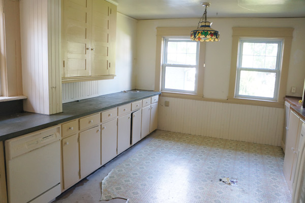
Remember the welcoming kitchen entrance?  Complete with crowding appliances, an offplaced sink, painted laminate countertop, and peeling wallpaper above the windows.

Millie-kitchen-3

Oh that floor still gives me nightmares- sheet vinyl over plywood over 3 layers of vinyl tile all hiding the original hard wood floors.

Millie-kitchen-2

Why do people do this to houses??

millie-kitchen-before-1

millie-kitchen-before-2

Long story short in this kitchen- there was lots of space, but it was not even close to a functional kitchen....

Millie-Kitchen-1

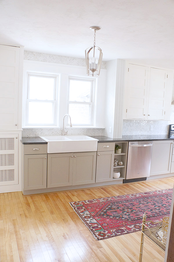
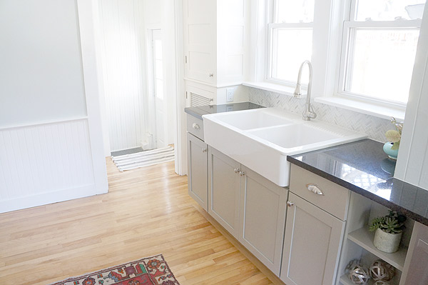
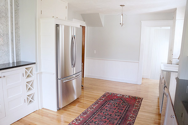
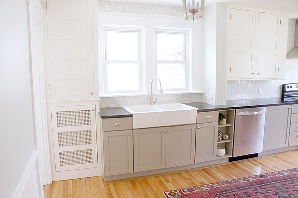
Until now.  How's this for the new kitchen entrance?  Not walking into any misplaced appliances and instead you get a gorgeous view of the window framed farmhouse sink.

Millie the fliphouse kitchen reveal via Year of Serendipity

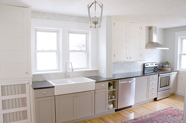
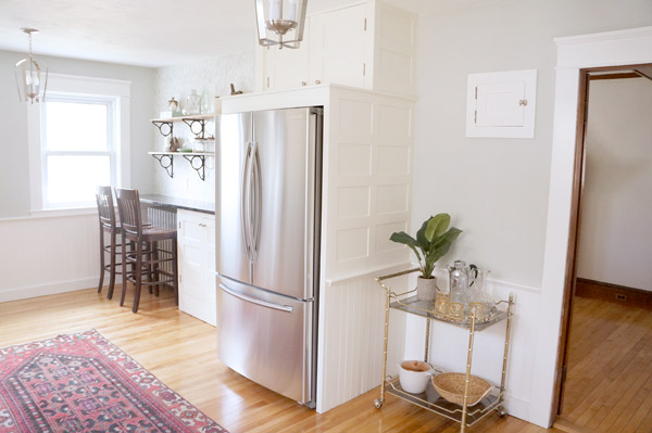
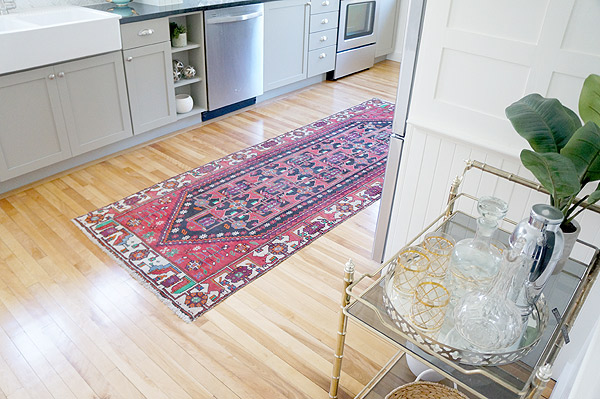
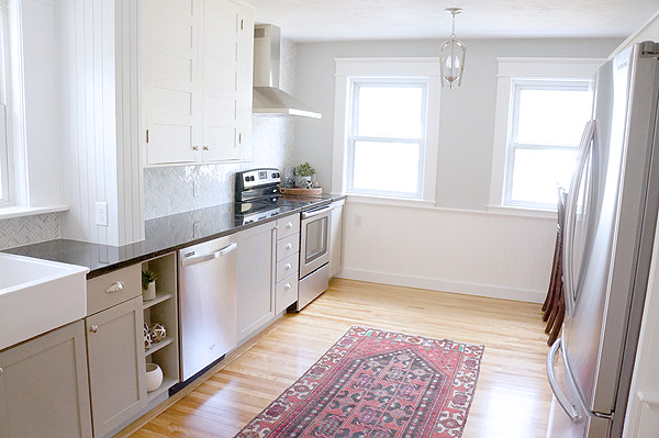
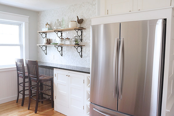
But, Karen, where did the stove and the fridge go???  I gave them real homes and created a proper kitchen triangle.  The fridge is now found on the opposite wall in between the sink and stove.  If you drew a line between the fridge, stove, and sink it would be a nice triangle- which is optimum for a workable kitchen.

Millie the fliphouse kitchen reveal via Year of Serendipity

Millie the fliphouse kitchen reveal via Year of Serendipity

For better or worse, I could talk about this kitchen for days.  In addition to the reconfiguration of appliances, I modified a 100 year old cabinet to give the fridge a home, installed new lower cabinets and countertops, modified another non-original cabinet (next to the fridge) to look original, installed open shelves, and tiled the walls with the sexiest wall tile ever.

Millie the fliphouse kitchen reveal via Year of Serendipity

Millie the fliphouse kitchen reveal with open shelves via Year of Serendipity

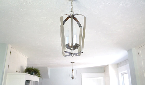
The ceiling got all new drywall over the cracking plaster and is now the ONLY textured wall or ceiling in the house.  Even though it's new, going over the old ceiling gave it some lumps and ridges that would have been glaringly obvious if this ceiling was smooth.  Now, with the least amount of texture possible, you see no blemishes, just a clean ceiling.

Millie the fliphouse kitchen reveal via Year of Serendipity

Millie the fliphouse kitchen reveal via Year of Serendipity

Millie the fliphouse kitchen reveal via Year of Serendipity

Millie the fliphouse kitchen reveal via Year of Serendipity

Millie the fliphouse kitchen reveal via Year of Serendipity

Millie the fliphouse kitchen reveal via Year of Serendipity

Millie the fliphouse kitchen reveal via Year of Serendipity

What's a good before and after post without some old and news side by side?

Millie-kitchen-2Millie the fliphouse kitchen reveal via Year of Serendipity

Millie-Kitchen-1Millie the fliphouse kitchen reveal via Year of Serendipity

Millie-kitchen-3Millie the fliphouse kitchen reveal via Year of Serendipity

millie-kitchen-before-2Millie the fliphouse kitchen reveal via Year of Serendipity

And that floor

millie-Kitchen-Before-4Millie the fliphouse kitchen reveal via Year of Serendipity

Come back tomorrow for another space revealed!

DIY Book Planter

swap it like its hot As I mentioned last week, we had around $10 to go thrifting, then send those treasures to another blogger for an awesome makeover.  The time has come to reveal what I've done with the treasures that Jessica at Decor Adventures sent me!

#swapitlikeitshot treasures

Of the 4 items sent, the frame and the book called out to me.  The task was to transform these thrifted items.

#swapitlikeitshot frame and book before

The frame was the simple transformation.  From the moment I saw it, it said "tray" to me.  What does a frame need to turn into a tray?

#swapitlikeitshot tray feet via Year of Serendipity#swapitlikeitshot tray spray paint via Year of Serendipity

Feet (which are actually IKEA knobs) and a little spray paint, clearly.

#swapitlikeitshot DIY frame tray via Year of Serendipity

I put some scrapbook paper in place of the photo.  You could also easily put a fun fabric there or switch it out with your decor.

#swapitlikeitshot DIY frame tray via Year of Serendipity

#swapitlikeitshot DIY frame tray via Year of Serendipity

My pet project, though, was the book.  I'm addicted to styling with books if you haven't noticed.  My first thought was to hollow it out and create a secret 'safe,' but that project, while useful would have been, well, safe.  And let's face it, plants are always more fun.

#swapitlikeitshot DIY book planter via Year of Serendipity

This was such a simple project but was more time consuming than I anticipated.

#swapitlikeitshot DIY book planter via Year of Serendipity

#swapitlikeitshot DIY book planter via Year of Serendipity

The most tedious part of this project was hollowing out the book.

page.  by.  page.

#swapitlikeitshot DIY book planter via Year of Serendipity

#swapitlikeitshot DIY book planter via Year of Serendipity

I cut a hole to fit the tupperware, then trimmed the tupperware to the height of the book.

#swapitlikeitshot DIY book planter via Year of Serendipity

Once cut, I glued the interior, put a piece of parchment paper between the pages and cover to prevent it all from getting glued together, then I clamped.

#swapitlikeitshot DIY book planter via Year of Serendipity

#swapitlikeitshot DIY book planter via Year of Serendipity

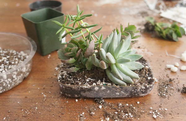
While waiting for the glue to dry, I made a big mess with succulents.  Fingers crossed that if I ignore these, they'll stay alive!

#swapitlikeitshot DIY book planter via Year of Serendipity

With the book dry, I put everything together and started swooning.  Why didn't I do this sooner??

#swapitlikeitshot DIY book planter via Year of Serendipity

#swapitlikeitshot DIY book planter via Year of Serendipity

#swapitlikeitshot DIY book planter via Year of Serendipity

#swapitlikeitshot DIY book planter via Year of Serendipity

Thanks Jessica for the challenge!!  Head over to 58 Water Street and check out what Colleen did with the items that I sent her!

There will be a week full of these awesome projects, today's the first day, but you should head over and check out what these other lovely ladies are doing!

Day 1


Meanwhile at Copper Dot

In the midst of dealing with this crazy winter and my flipping frenzy, I've also been keeping myself busy(er) with my design business, Copper Dot Interiors.  I did a dining room install over the weekend and snapped a few quick shots as I was on my way out that I'm eager to share. My clients hadn't really touched the dining room at all since moving in a little over a year ago and the previous owners clearly hadn't done much since it was built in the 90s.  Don't you just love builder-grade brass chandeliers??

soph-quirky-dining-before

My clients weren't sure what their style was, but they knew it wasn't this.  Turns out they were looking for a quirky yet sophisticated room with some color that could be used by the whole family (including small children).

There are still a few small tweaks to be made and I'll be getting better pictures when I'm there next, but what a contrast!

soph-quirky-dining-after1

The trim color stayed the same off white since it runs throughout the entire home, but aside from that I was given a blank slate to play with.

soph-quirky-dining-after3

soph-quirky-dining-after4

In just switching out the maroon walls for Benjamin Moore's St. John's Bay, the room feels instantly about 5 thousand times brighter.  It's amazing what a swift injection of color can do to a space!