Before & After

DanceFit Reveal!

A few months ago, I introduced you to DanceFit Studio and the new location that we were giving a facelift to.  Well, I'm pleased to say that the new studio has been up and running for about a month and a half and we finally were able to have a photoshoot and get some sweet pictures to share with you!  I'll give you a minute to pop back to my post about the design plans, so you can see what the ideas were for the space.  Now go ahead and tell me that you wouldn't want to take fitness classes here or be a little kid on your tippy toes at ballet class...  
DanceFit Studio Reveal - Mirrors and Windows


It was pretty far from this to start with.  It was originally an auto garage that had been converted into a karate studio with the worst colors and stained carpeting that you could pretty much imagine.  Trust me when I say that carpet was much worse in person.
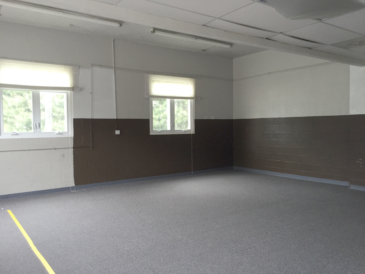
 

DanceFit Studio Before DanceFit Studio Lobby Before


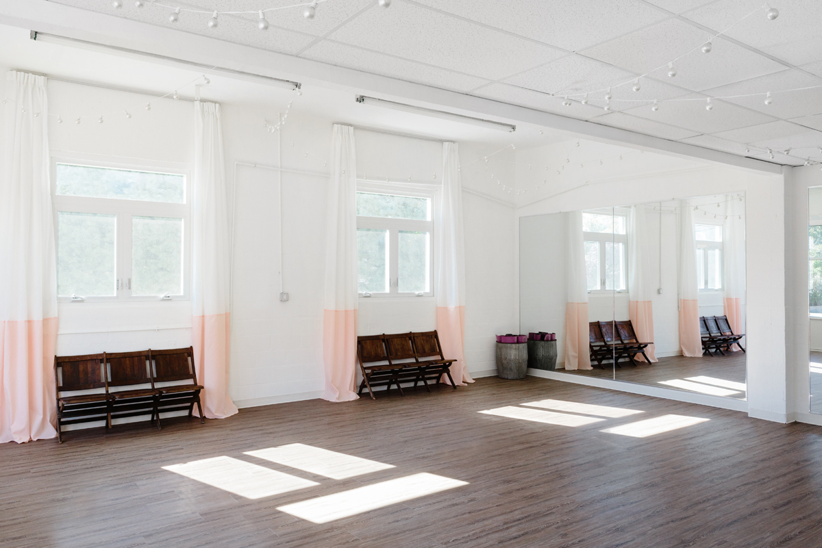
We were working within a budget so we made sure that the first things we spent on were the floor and the mirrors since those make the most impact in a dance studio.  From there, it was about making things functional and adding a touch of glamour throughout.  My personal favorite view, and what seems to be the general consensus's favorite view as well, is these vintage theater chairs with floor to ceiling curtains.  I found the chairs at a local vintage shop and used IKEA curtains sewn together to create color-blocked curtains that were tall enough for the 12 foot+ ceilings.


DanceFit Studio Reveal - Windows, curtains, and vintage chairs


On the other side of the room we got creative with storage, using IKEA's Kallax cubbies to house most of the small fitness equipment including hand weights, yoga blocks, stretching bands, and pound sticks as well as supplies for the kids classes.  Using a light gray box painted on the wall, we were able to give designated area for client achievements and tracking classes.  They offer some fun incentives for reaching class number milestones- I'm only one class away from 50 classes this year and earning my sparkly headband! #littlewins
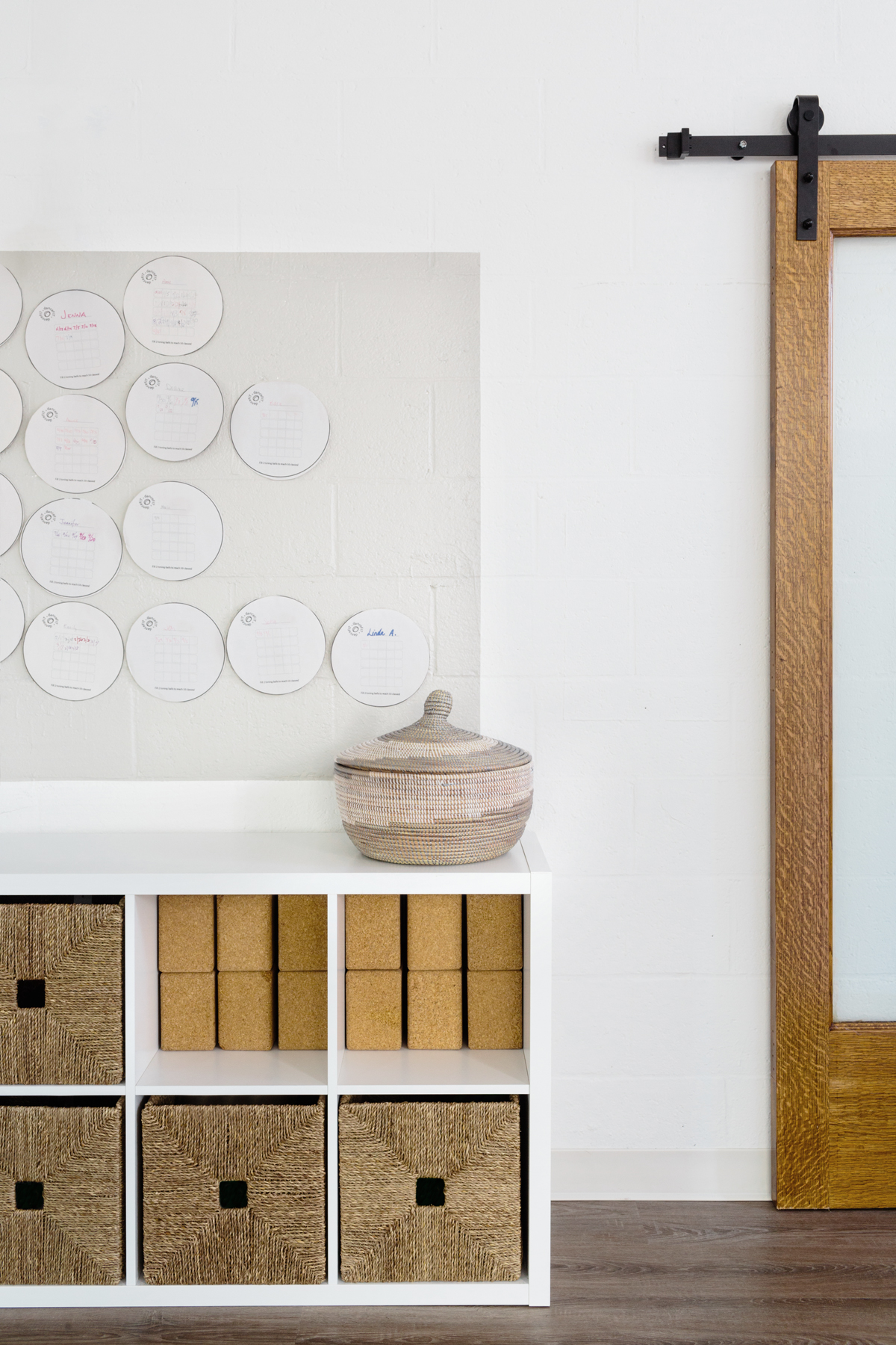
 

DanceFit Studio Reveal- fitness organization


In between the studio and lobby, we installed a glass sliding door to give a little bit of privacy to the studio while still allowing parents to watch the pirouettes of their little ones.
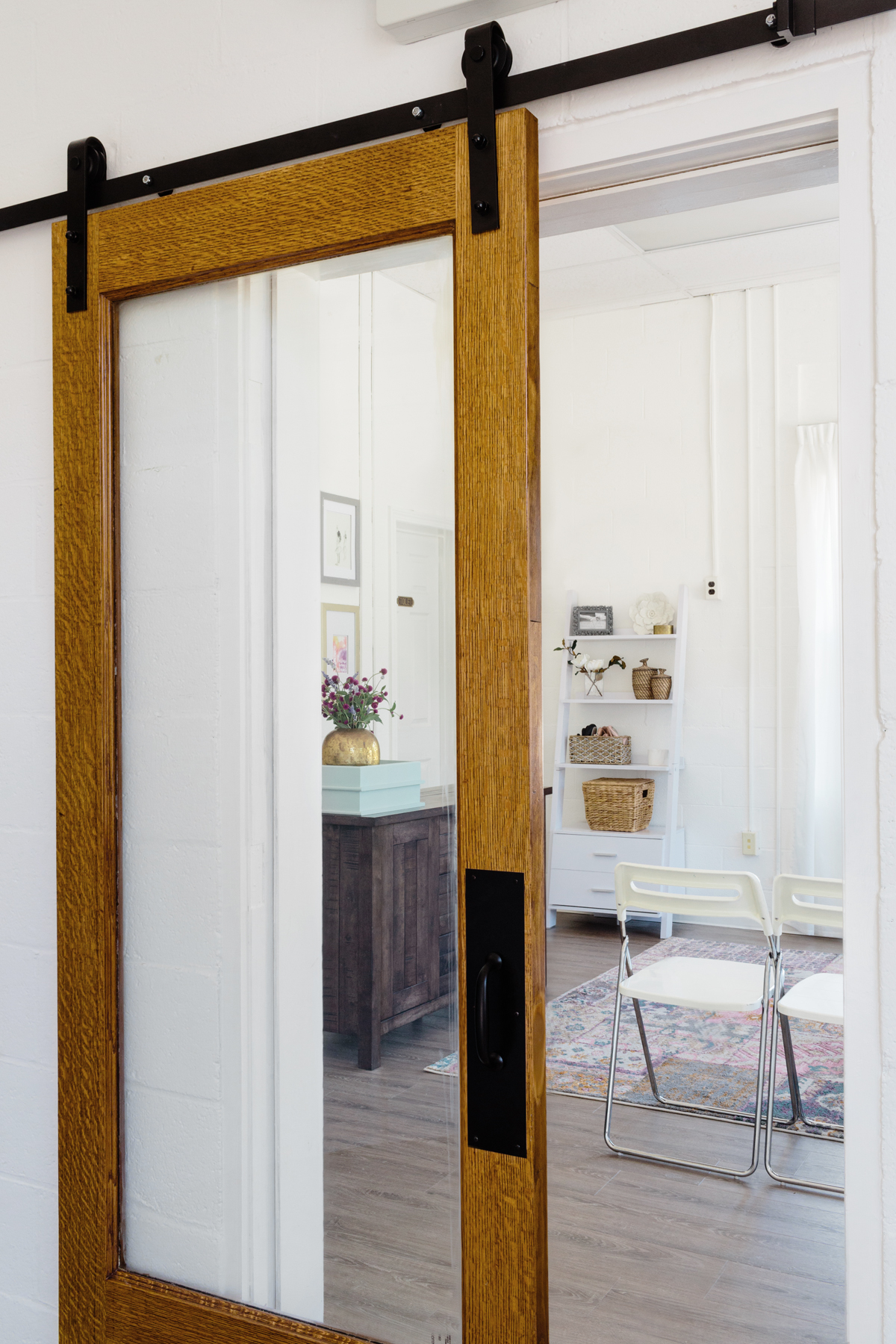
 

DanceFit Studio Reveal Viewing door between studio and lobby


The lobby sets the tone for the space once you enter with an eclectic, but relaxed vibe.  Function was key in this entire project and the lobby was no different.  It needed to accommodate waiting parents, kids coloring at the large coffee table, and be flexible enough to be moved around for birthday parties or other events.  I'm so glad Gina, DanceFit's owner fell as much in love with the Letterboard as I did.  She needed a place to make announcements about pop up classes, special events, and general studio goings on.  I swear, every time I come in, she's switched it up already- I've created a monster.  Well, I guess I awoke the monster in myself too, because after seeing this stellar board in person, I just knew I need to get one for myself (did you see it in yesterday's big announcement post??)
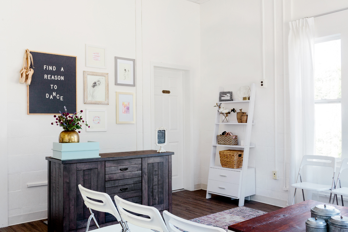
 

DanceFit Studio Reveal lobby


Check out DanceFit's website for their full list of adult fitness classes, virtual online classes, and kids dance classes.  I personally recommend the BalletFit, Zumba, Pilates and Pound!  See you at the barre!
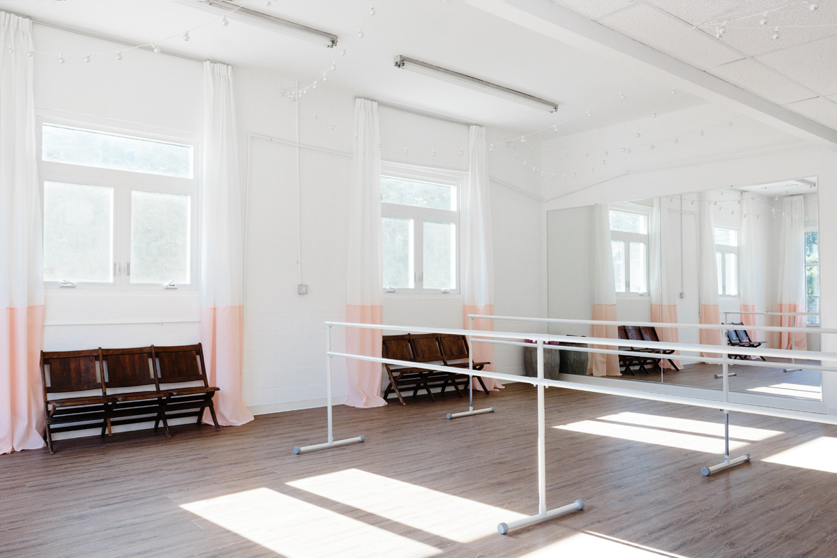


DanceFit Studio Reveal - Mirrors and Windows and Barres

Photos taken by the talented Joyelle West Photography.

Disclaimer: some sources below may contain affiliate links.  Shopping through these links will be at no additional cost to you, however will help support my design addiction so I can keep sharing it with you. XOXO

Sources:

Lobby- desk from World Market, sign board from Letterfolk, shelves from Wayfair, folding chairs from IKEA, rug from RugsUSA, Curtains from IKEA, & custom coffee table by Mauricio Woodworking

Studio- vinyl flooring from Lumber Liquidators, vintage theater chairs from Robject's D'art, curtains from IKEA (sewed together for color-blocked effect), yoga mat basket from World Market, fitness storage from IKEA, barn door hardware from Amazon, & salvaged door from Habitat for Humanity ReStore Worcester

Save

Save

Save

Save

Save

Save

Save

Save

Save

Living Room Before and After Blog Hop

living-room-style-evolution-after-1.jpg

If you're coming over from Up to Date Interiors, WELCOME!!! Who doesn't love a good blog hop?  You get to be a voyeur into other people's homes and styles without being a total creeper and peeking in windows.  When Stephanie from Casa Watkins Living invited me to define my design style and show the evolution of it in a room of my home, I was 100% in!!!


my-home-style-banner

It's easy to forget that for every perfectly curated pinterest-worthy or instagrammed room, there's a round-about path that lead to that place.

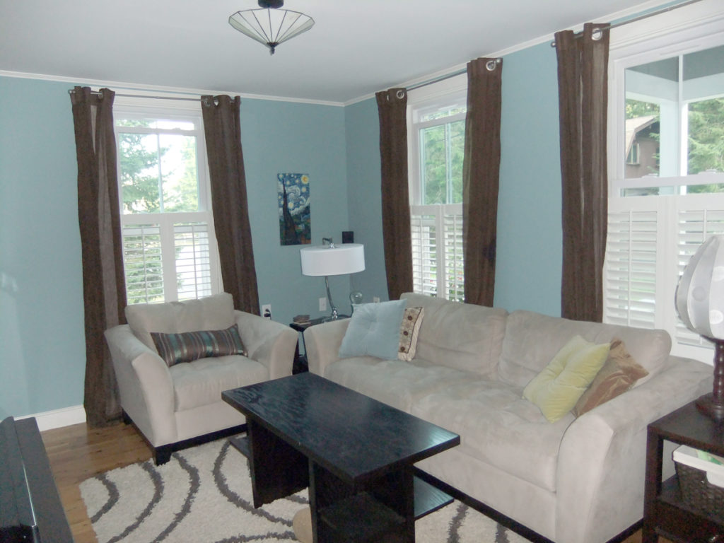
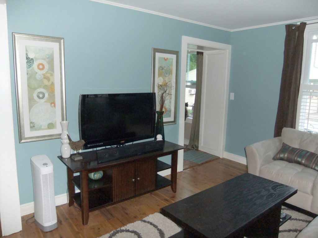
My style today is eclectic, modern vintage, but it didn't always shine through like it does today.  Let's take an awkward journey through my living room over the past almost 6 years.  I cringe so hard when I look at the first version of my living room.  Aside from a new tv stand, I tried to make the living room from my old apartment work in this new smaller space.  Spoiler alert: it didn't!!  To recreate this amazing space, mix undersized artwork with furniture way to bulky for a small room, and add a big splash of brown (please don't).

living-room-style-evolution-before-2

living-room-style-evolution-before


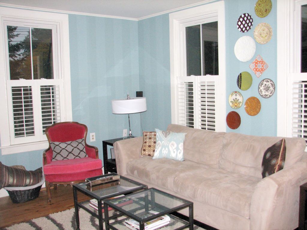
The next iteration of the room definitely had a bit more personality, but still had a waaaays to go.  The mistake I made for YEARS, and should have known better, was trying to make pieces that I previously owned (and they weren't great pieces to start with!) work in this space as opposed to assessing the space, THEN designing it.  Are you all impressed with my perfectly lit night shot?  Oh the things you learn through years of blogging....

living-room-style-evolution-progress-1


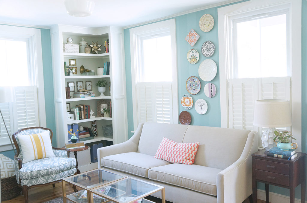
After years of tweaking small things and still not loving the room, I went back to the drawing board and decided to do what I should have done from the beginning and designed the room from scratch.  I coerced Hubby into a new sofa (huzzah!!!), painted the coffee tables gold, built a DIY corner bookshelf to fill the awkward space, and upgraded the boxy apartment left-over side tables with eclectic antique finds.  While I enjoyed this version, being the first room that you walk into from our front door, it was a bit of design overload in a small space.

living-room-style-evolution-progress-3


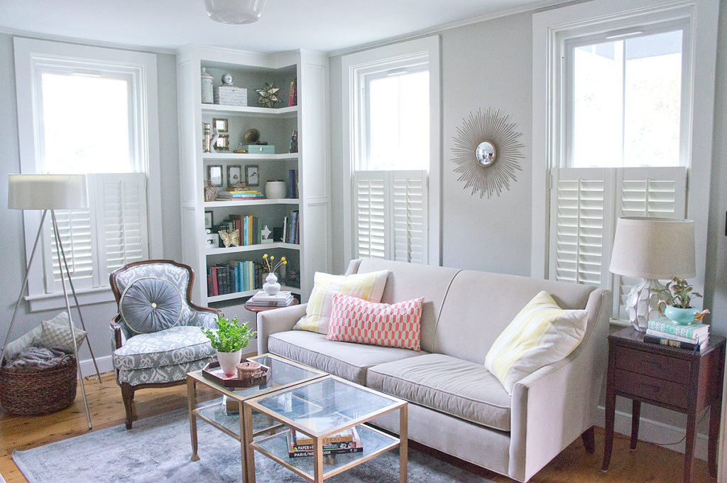
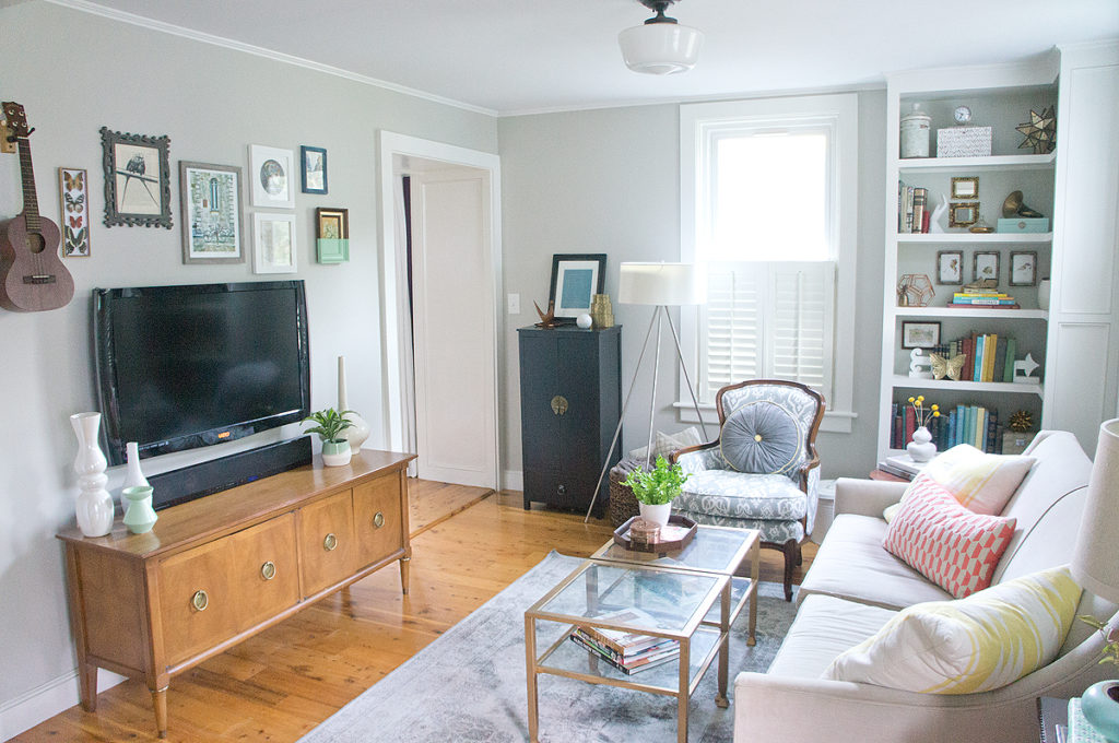
Which brings us happily to the end of our journey and what my living room looks like today.  It's a fun mix of modern shapes and patterns, vintage furniture and quirky finds: hence my label of "eclectic, modern, vintage."

living-room-style-evolution-after-3


living-room-style-evolution-after-4


living-room-style-evolution-after-7

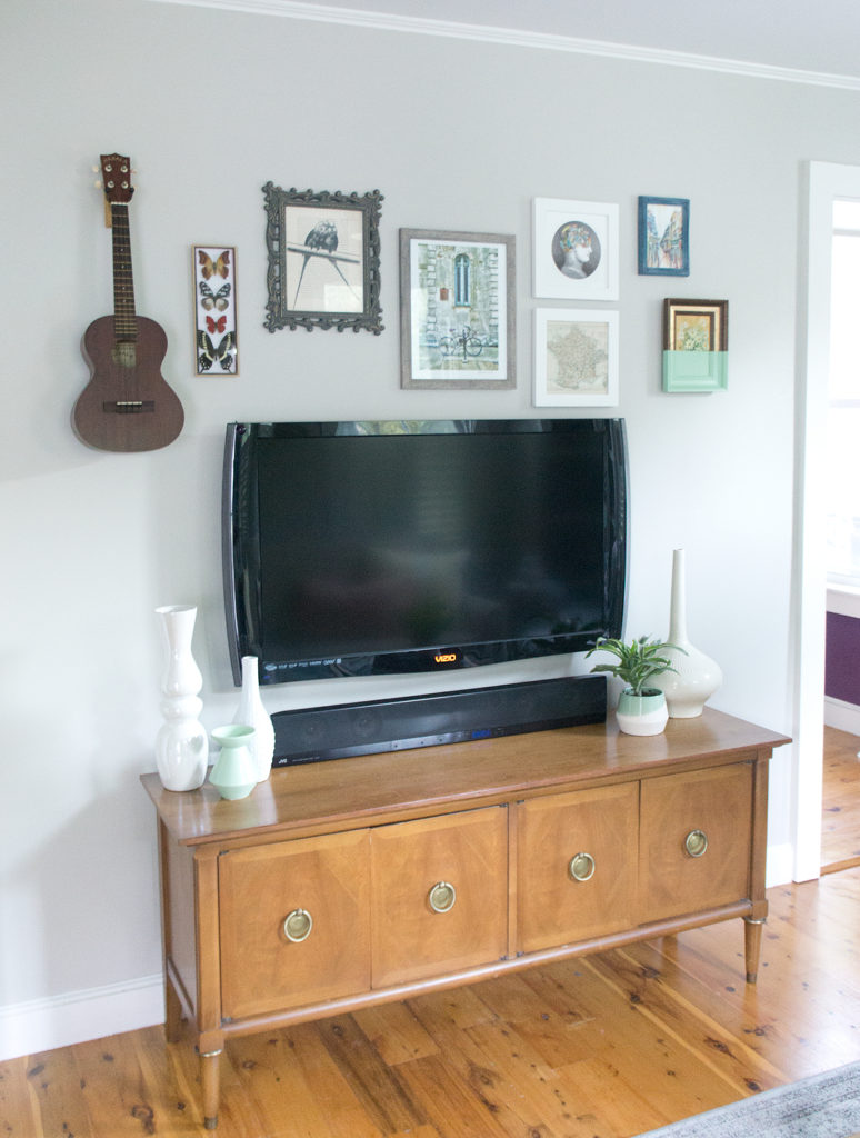
How can you get this look?  I recommend keeping staple pieces like a sofa and tv stand timeless.  In this case, I used a mid-century-modern inspired sofa and a vintage mid-century hutch-turned-tv stand to ground the space.

living-room-style-evolution-after-8


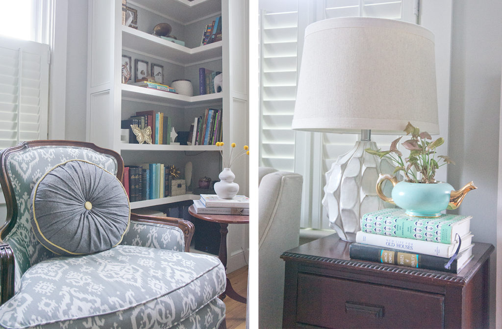
Especially in a small room like this one, think big to small: the bigger the piece, the more classic/versatile it should be, the smaller, the quirkier it can be.  This keeps the crazy-factor down to an interesting and intriguing level as opposed to sending your guests running.  For example- a hand-shaped vase as a book end: quirky.  a hand-shaped chair in a tiny living room: a bit too eccentric.


living-room-style-evolution-after-6

Shop this look:

Disclaimer: some sources below may contain affiliate links.  Shopping through these links will be at no additional cost to you, however will help support my design addiction so I can keep blogging about it.

While many pieces are vintage, finds from years ago, or HomeGoods finds that I can't find sources for, here are some similar items to get you started:

Furniture: Sofa, tv stand, coffee tables (painted gold), pedestal side table, side table with drawers, antique chair (needs reupholstery)

Lighting: Tripod floor lamp, ceramic table lamp, schoolhouse ceiling fixture

Decor: Starburst mirror, yellow stripe pillow, ukulele wall hook, vintage teapot (planter), wooden shoe mold, textured cookie jar, hand vase (painted matte white)


Hop on over to the next home on the tour, Kimberly's eclectic, boho, glam style on Swoonworthy.  Be sure to check out all the amazing style evolutions the rest of this week!

Save

Save

Save

Save

my-home-style-before-after-edition-1


MONDAY

Casa Watkins Living

Polished Habitat

Lovely Etc.

Blue i Style

Organize Nashville

TUESDAY

Roots North and South

My Life From Home

Monica Wants It

The Striped House

WEDNESDAY

Pocketful of Posies

Up To Date Interiors

Copper Dot Interiors

Swoonworthy

PMQ for Two

THURSDAY

The DIY Mommy

Boxy Colonial

The Happy Housie

Domicile 37

Willow Street Interiors

FRIDAY

Cassie Bustamante

House Full Of Sunshine

Farmhouse 40

Iris Nacole


Save

Save

Save

Save

Save

Save

Save

Save

Save

Save

Save

Save

Save

Save

Save

Save

Save

Save

Save

Project Flashback: UP-Dated Built-in

built-in-styled-4.jpg

Without a flip going on currently, I'm really itching to build something.  I think I get a bit twitchy when I haven't touched power tools for too long.  For YEARS I've been talking about creating a built-in bookcase in my dining room, but I'm still mulling over ideas, gameplans for building it, and thinking about all the details.  The idea has been nagging at me lately, so when timehop popped up to remind me of a post from 2 years ago where I had a bit of fun with a built-in in one of the flips, I thought it would be fun to share again! Here's the original post from 2014 when I was working on the fliphouse Grover:


WARNING: long post ahead!  But don't worry- it'll be informative AND have a few pretty pictures!

When I'm coming up with my plans for my flips, there's a delicate balance between keeping original charm and getting rid of dated design features.

Exhibit A

Dated scalloped built in before

Built-in = original charm..... almost arm-deep = awkward......scallops = dated!

I think the scallops were the first thing I ripped out in the house.  I attempted to remove the fake wood paneling from all 3 sides of the shelves, but I just couldn't get in there without causing injury (even my attempts caused several bruises and band-aids).  For the past 4 months, the poor built-in has sat in this sorry state:

build-in-demo

build-in-demo-ceiling

But I had a plan for it!  And now, I think it's hitting all the right notes!

Dated built in after via year of serendipity

Original charm- CHECK

Fresh and clean-CHECK

Usable space-CHECK

Free of awkward and dated design features- CHECK CHECK!

Dated built in styled via year of serendipity

It surprisingly only took me a day to build.  Wood working projects are probably the most fun for me- that and tiling.  You see things come together right before your eyes.

Supplies:

2x4s for structure

thin plywood for the sides, back and 'ceiling' on the top shelf (I actually used materials left over from the bathroom paneling)

1x2 pine decorative trim

Screws and nails

Half of the work in projects like this is just the figuring out and planning what you want to do.  The other half is playing with power tools (fun AND fun!)

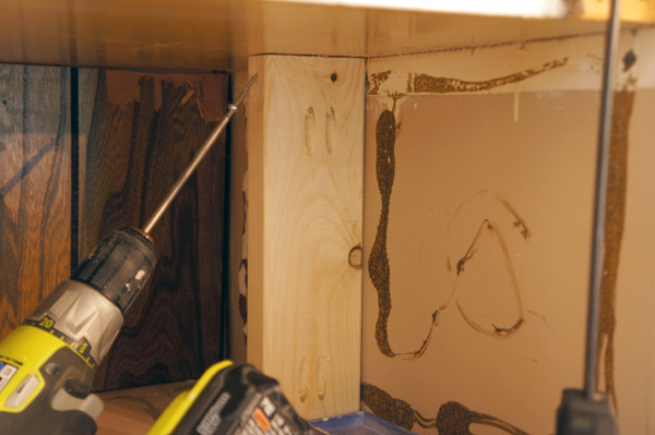
My first step to make my plans happen was to create a new structure with 2x4s to reduce the size of the shelves.  I pre-drilled screw holes using my Kreg jig, however, even the best laid plans don't always work out.

built-in-building

I forgot to take into account the size of the drill and it wouldn't fit in the 2 shorter shelves to allow me to use my carefully planned holes.  Womp womp.  Luckily, I was able to screw in the side and no one will be able to tell in the end.

When installing the 2x4s, I made sure to use my level so that each piece of the hidden structure would be straight.

built-in-structure

Next it was ply-wood's turn.

build-in-plywood

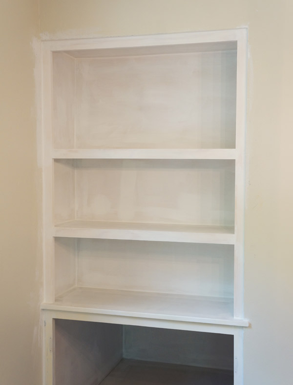
I put a piece of plywood on the new back as well as on both sides since the side walls were a bit damaged.  I'll admit, the back 'wall' between the 2x4s is a little bouncy, but since the back is purely decorative, I opted not to add additional structure.

build-in-plywood-done

Looking better already!  Next it was time for the finish trim.  This was the part that really modernized this project.  Sides first, then I measured in between.

built-in-trim1

To install the trim, I used my nail gun and 2" finish nails, to attach them both the the walls and the shelves.

built-in-trim2

To spare you additional boring pictures, I patched holes, primed, and then sanded before getting to caulking all the corners.  I used my go-to caulk method: a squeeze tube of caulk (easier to maneuver than a caulk gun), and a small bucket of water.  I use the bucket to both dunk my hand before wiping down a bead of caulk, but to also wash the caulk off my hand as I go- it get's very sticky otherwise.  The caulk magically filled all the gaps at the joints and gives it a professional, finished look.  In the pic below, just look at the contrast between the bottom, caulked shelf and the top uncaulked shelf.

built-in-caulk

Ta da!

built-in-sans-paint

Meanwhile across the room, the doors were getting fresh paint and new pulls.

built-in-paint-doors

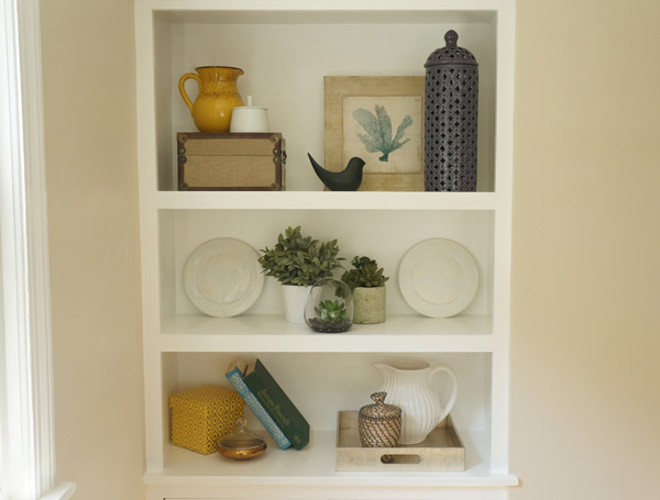
Once all the caulk was dry, the built-in got several layers of white semi-gloss trim paint. I allowed the paint to dry overnight before I layered on the tchotchkes..... I mean styled it.

Updated built-in styled via year of serendipity

Updated built-in styled via year of Serendipity

Faux plants Dining room styled via year of serendipity

Just updating the built-in makes the entire open living/dining area look clean, fresh, and updated, but will still charm the pants off of any buyer.

Built-in styled and updated via year of serendipity


Even years later, that project makes me smile.  Such a small, inexpensive update, made a HUGE difference in the room.  Check out the entire space when it was done:

Grover-dining-kitchen-after-2


I'm hoping that building one in my own dining room will have a similar positive impact.  I'm such a sucker for dining room built-ins!

Have an awesome weekend!!


Save