Decor

Art Musical Chairs

natick-map-reframed2.jpg

There is finally one room in my house that has all the desired art on the walls and has NO empty frames.  Huzzah!! After getting the new living room rug, I started rearranging the art a bit, leaving it rather unbalanced.

For the past year, this print and it's brother have been flanking the tv waiting to be a completed composition.

Flashback to a year ago:

With the new rug, the "brother" print ended up at the end of the couch.

I've been drawn to images on pinterest that draw attention away from a tv with a gallery wall.  Since we have our enormous gallery wall in the office, I decided a mini one was in order here.  There was a bit of trial and error.  My initial plan for the wall looked kind of awesome as composition itself, but when I looked at it with the whole room it got a little nutso busy.  I don't want the tv wall competing with my plate wall, afterall!

I was planning to paint all the frames white or silver to unify them, but after living with it this way for 2 days, it just didn't feel right in the room.  That actually makes me sad, because looking back at these pictures, the wall itself is really successful.  I really like it, a lot, but I wasn't willing to sacrifice my other design elements to make this the feature.  The whole room was starting to look crazy overdesigned.  Not good.

Luckily I used 3M picture hangers instead of nailing everything into the wall, so I was able to very very carefully pull off the adhesive and move all the art.  (I'm currently having a love affair with the 3M picture hanging strips.  That's what we used in the cutest nephew ever's nursery, and they're awesome and easy and they should totally sponsor my blog.  hint hint.)

So I simplified.

It's not as dynamic on its own, but it makes so much more sense with the rest of the room.

Did you also notice the other art switcheroo?

The repro map of our town from the 1800s (that I got at a tag sale for $2) earned a place of honor after a spray paint make-over.

I am also pleased to report that the dining room is painted and I've started cutting the picture rail pieces.  I can't wait to see this room come together like the living room has!!

Art: Generic to Custom

In an effort to try and 'finish' my living room, I wanted to introduce a mini-gallery wall surrounding the TV.  After taking inventory of the art in my house piled up and waiting to be hung, some made the cut.  To my surprise, most of the framed pieces we have are around the same size.  I wanted to play with sizes a bit, so I headed to HomeGoods (as usual) to scout accessories.  I absolutely love HG for most accessories, but their framed art can sometimes look cheap and generic. When I found this lotus print, the colors called to me.  The plastic on plastic frame, though was just about as classy as Jersey Shore.

The print and frame was only $20, so I decided to play with it a bit.

By cutting the print into 3 pieces, I was able to create a playful triptych in exactly the scale that I was looking for.

I have a few finishing touches in order to really pull together the art on this wall, but I'm excited to show it to you next week.

Have an amazing weekend!

Nixing the Shag

When we last visited the living room it looked like this:

It looks unfinished and kind of cold in this picture.  Although it did look better in person, it never really 'clicked'.

Until now.

I'm a little excited for this change.  I've been waiting for this since the day we moved in.

Check it out today!

Say it with me:  Aaaaahhhhhhhhhhhhhh

The room didn't miraculously get bigger, but a new rug definitely makes it feel that way!  Even Hubby agrees, shockingly.

Just to highlight how awesomely awesome this new rug is, check out what the living room looked like right after we moved.

The old rug was shag.  It was bad. Just bad.  Don't get me wrong, it looked fantastic in our previous apartment, but the living room was much larger, so a heavy rug grounded the space.  In this tiny conservatively sized space, it just weighed it down.  We got this rug before the cats were even a consideration, too.  Shag + cat hair = impossible to clean.  Even our Dyson is powerless.

I'm also over the pattern.  The living room was just screaming for something more sophisticated.  Something like this, perhaps?

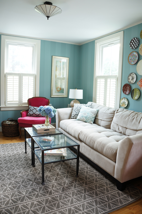
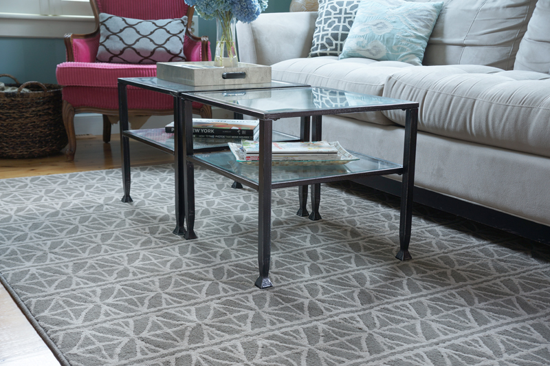
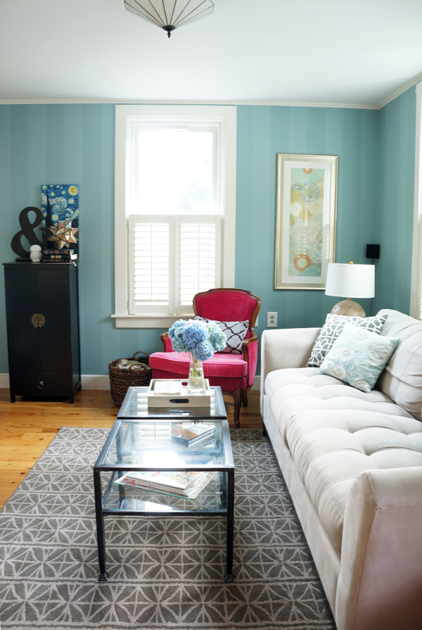
I got the new rug from Joss and Main for $155 including tax and shipping.  Not too shabby for a 5x7 if I do say so myself.  I still have more plans for this room, but WOW, what a difference a new rug makes!  I'm really pleased with the pattern.  It's not so large (like the previous) that it will get dated or boring- it's just the right scale to make a statement and not compete with my planned bold patterned or colored chair.  Massachusetts tax free holiday is this coming weekend- chair shopping may need to happen.  I've already warned Hubby.

I'll leave you with one last gratuitous living room shot.

Random un-rug related thought: I am SOO happy with my big girl camera!  I know I still have a lot of technique to learn, but the difference in quality is already obvious.  I guess I'm not as bad of a photographer as I thought!  I bet you couldn't tell, but these pics were taken at dusk- you know, that time when its still light out, but completely dark inside.  The manual setting on my camera is a miracle worker.