Design

Crash! Modern Cozy Chic

vibrant-nursery-4.jpg

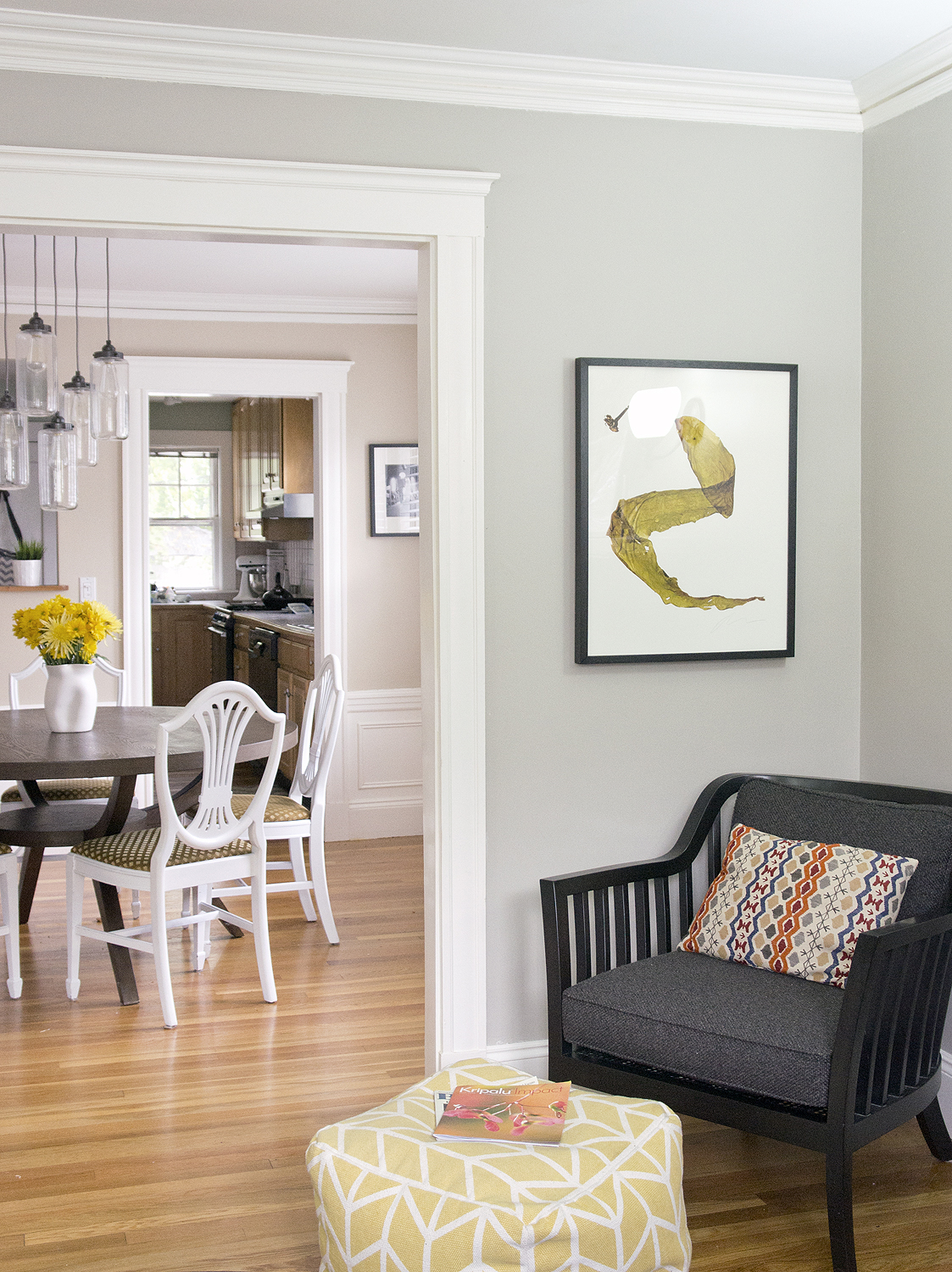
My friend Jen graciously let me come Crash! her home just before she started packing it all up for her impending move.  As an interior designer too, she definitely has a natural talent for an effortlessly chic space, but guys, you're gonna die over her little guys nursery! (*metaphorically only- please don't actually die over a room*) As this living room clearly shows- the key to using several colors in a room cohesively is to have something to unify them all.  In here it's the center pillow and the artwork.  And hello 6 patterns?  It doesn't look crazy or busy, just modern, cozy, and welcoming.  Well done, Jen!

Vibrany Way Interiors Living room via Year of Serendipity

Vibrany Way Interiors Living room via Year of Serendipity

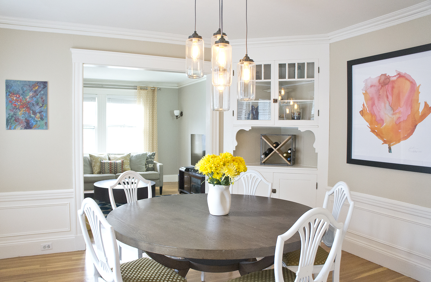
Statement lights and large artwork are my current fave for any dining room- the right art and lighting can make a space!  And who are we kidding, I'm always a sucker for antique home details and molding.

Vibrany Way Interiors Dining room via Year of Serendipity

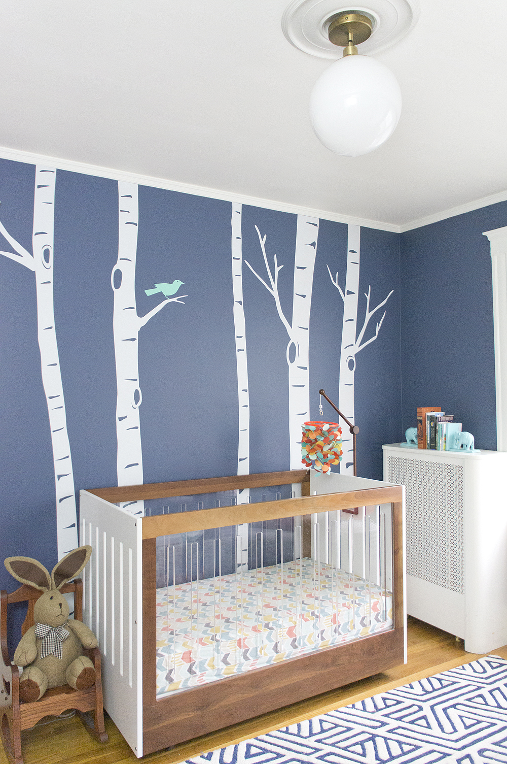
I'll stop beating around the bush, though, the real show-stopper in the home is the dwelling of the littlest resident.

Vibrany Way Interiors Nursery via Year of Serendipity

I dare you to try and find a more stunning crib!  He's a lucky little man.

Vibrany Way Interiors Nursery via Year of Serendipity

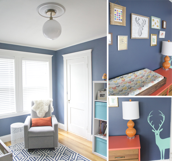
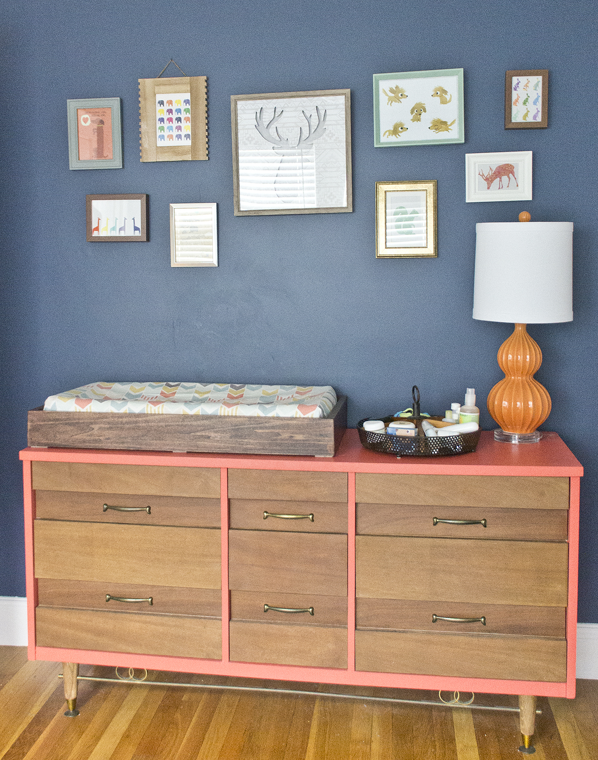
Mod crib and a vintage dresser?  He'll be the coolest kid on the playground.

Vibrany Way Interiors Nursery via Year of Serendipity

Thanks Jen for letting me share!  Pop over to her new site, Vibrant Way Interiors and say HI.  Good luck with the move, Jen and I can't wait to see what the next home looks like!


Crash! A NEW Era

It's been quite a while since I posted a "Crash!" feature- almost a year actually!  Let's not do that again.  This time, I was a house crash-er at my parent's new (ish) house. About 3 years ago, I shared a mini home tour (which was looking back was mostly vignettes) with you just before my parents moved out of the home I grew up in.

parents dining room

For some silly reason, they wanted to live closer to their children and grandchildren.  So they sorted through 30 years of living in one home, held a huge tag sale, packed up the rest, and moved about 2 hours away.

Flashing to the present, Mom is just about as addicted to blogs as I am.  She decided to take the new house as an opportunity to reinvent her style, and reinvent she did!  She used to gravitate toward antique and Americana and now, while the antiques are still present, the home has a fresh, airy feel.

House Crash! Airy Cape Living Room via Year of Serendipity

House Crash! Airy Cape Living Room via Year of Serendipity

I am definitely a product of both my parents.  Example: the white bookcase above.  The base of the bookcase showed up in the last tour, but looking a bit differently:

Red antique buffet via Year of Serendipity

My dad built the hutch top/bookshelf and my mom refinished and painted the whole thing.  I kind of love it.  Like the true librarian she is, Mom uses stacked books throughout the house to tell a story with the titles. Notice: Homes, Not so Big House, Living in New England, and House of Dreams

House Crash! Airy Cape Book Story via Year of Serendipity

Mom's most recent furniture refinishing project shows up in the dining room.  The antique table that I grew up abusing using, got a fresh coat of paint on the base with some light distressing.  It looks like it was meant to be this way all along!

House Crash! Airy Cape Dining Room via Year of Serendipity

House Crash! Airy Cape Dining Room via Year of Serendipity

House Crash! Airy Cape Vignette via Year of Serendipity


House Crash! Airy Cape Plant Window via Year of Serendipity

House Crash! Airy Cape Bathroom via Year of Serendipity

House Crash! Airy Cape Bedroom via Year of Serendipity

House Crash! Airy Cape Bedroom via Year of Serendipity

Mr. Fiddle Leaf Fig there is the sibling to my dying IKEA one.  Clearly Mom's doing something right because he's more than doubled in height!

House Crash! Airy Cape Bedroom via Year of Serendipity

Mom's styling stamp is all throughout the house (with Dad's approval of course), but his styling is evident on his dresser: vintage toy car, cut book "P" that he and Mom made a la Anthro, and a vintage cast iron mailbox bank.  Mom might have had her hand in the pile of books, though.  I believe one of the books is titled Man of my Dreams.  How delightfully cheesy are they?? (xoxo)

House Crash! Airy Cape with a Story via Year of Serendipity

Even the outside has their touches all over it.  A pop of color door with new, beefier trim around it, neutral shutter, a bountiful garden and a sweet house number sign off etsy (if my mind serves me right).

House Crash! Airy Cape with a Story via Year of Serendipity

House Crash! Airy Cape with a Story via Year of Serendipity

While they had 30 years to personalize their last home, I think my parents have done quite nicely in the relatively short amount of time they've been in this house- isn't it beautiful??

If you live in the central MA or Boston area and want to see your home Crash!ed on the blog, e-mail me (karen@yearofserendipity.com) a few pics and a bit of the story of your home.  I'd love to make this a regular feature! 

Save

Meanwhile at Copper Dot

In the midst of dealing with this crazy winter and my flipping frenzy, I've also been keeping myself busy(er) with my design business, Copper Dot Interiors.  I did a dining room install over the weekend and snapped a few quick shots as I was on my way out that I'm eager to share. My clients hadn't really touched the dining room at all since moving in a little over a year ago and the previous owners clearly hadn't done much since it was built in the 90s.  Don't you just love builder-grade brass chandeliers??

soph-quirky-dining-before

My clients weren't sure what their style was, but they knew it wasn't this.  Turns out they were looking for a quirky yet sophisticated room with some color that could be used by the whole family (including small children).

There are still a few small tweaks to be made and I'll be getting better pictures when I'm there next, but what a contrast!

soph-quirky-dining-after1

The trim color stayed the same off white since it runs throughout the entire home, but aside from that I was given a blank slate to play with.

soph-quirky-dining-after3

soph-quirky-dining-after4

In just switching out the maroon walls for Benjamin Moore's St. John's Bay, the room feels instantly about 5 thousand times brighter.  It's amazing what a swift injection of color can do to a space!