Inspiration

Pin and Tell: Regency Rustic

Welcome to my “Pin and Tell” weekly series. If you missed my previous “Pin and Tell” posts, check them out here. ___________________________________________________

This week’s Pin

rustic regency

Why

I love the balance of this space.  Half the elements are very formal and traditional, and the other half are weathered and rustic.  The balance of these two seemingly opposite aesthetics creates such a sophisticated, relaxed vibe.  As a color-phile, I do want to throw in a few bright accessories, however, but that's just me.  The map is amazing, don't you agree?  I'll admit, though, I don't quite get the karate-chopped pillow look that I keep seeing everywhere...  What did the pillow do to deserve such violence??

I picked this space today because my personal obsession focus has really switched to my bedroom.  Since the introduction of my amazing new bench, I feel like the rest of the room needs to live up to it!  I got new bedside lamps (the jury's still out- I'll blog about it later this week), and most of the elements in the space are currently kinda formal.  Since we're not formal people, I need to find items that will add a relaxed aesthetic into the mix.

What room is your current design focus?

Pin and Tell: Bold Dining

Welcome to my “Pin and Tell” weekly series. If you missed my previous “Pin and Tell” posts, check them out here. ___________________________________________________

This week’s Pin

Why

We're going to pretend that the disco ball doesn't exist.  If you subtract that monstrosity, I think the dining room is near perfection.  My opinion of the room actually surprises me, it's not the usual type room that I die over, but I'm totally swooning.  It's completely an unexpected composition and it.  is.  awesome.

I think it's the colors that really reach through the computer and grab me.  That green.  Oh, that green.  *sigh* I know that green doesn't float everyone's boats, but I'm drawn to it like a squirrel to a bird feeder.  In fact, we painted our office very close (although not AS bright).  The crown moulding of brown at the top grounds the green and gives a very contemporary color a more traditional vibe.  The blue sideboard and the cranberry on the chairs are supporting players and just look sooo rich.  I, for one, would NEVER have thought to put those colors together in that composition, but I'm so glad they did.  Those birds!  Did you expect me not to comment? I want to be a part of that flock.

Apparently it is possible to be regal and whimsical at the same time.  This room is proof of that.


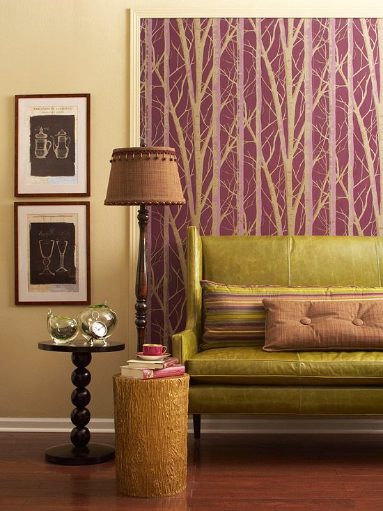
Pin and Tell: Plum and Chartreuse

Welcome to my “Pin and Tell” weekly series. If you missed my previous "Pin and Tell" posts, check them out here. ___________________________________________________

This week’s Pin

purple and green

Why

First of all, I'm a sucker for this color combo, I even used it for my wedding tables (although my green was less chartreuse-y).

I find this space to be very simple and sophisticated.  The lines are very simple, but there is interest in each piece.  The settee pops with its color and fantastic aged leather.  The pillows accent it perfectly.

Take note of the section of wallpaper behind.  That's an easy way to add architectural interest in a room.  Frame out a section with moulding that you can by at your friendly local hardware store, and simply wallpaper or paint inside.  You could even take it one step further and make it a fabric-wrapped panel framed out.

I could live without the pom-poms on the lampshade, but because everything else is so amazing, I'll forgive it.

___________________________________________________

So far these have all been living room/seating areas- I guess that's what's on my mind lately.  Next week I'll switch it up with a different subject matter, I promise.