Journey

Dining Evolution

dining-current1.jpg

I am pleased and astonished to announce..... the dining room is DONE (well, as done as any room in this designers house gets) In the 3 years we've lived in this house, the dining room has been through several evolutions to get to this point.

The first iteration was the "drop what we have in the existing space" method.  Not terrible, but it always felt dark and drab (aka SO not us!)

dining room beginnings

The second iteration was a HUGE step in the right direction.  I added picture rail around the room and painted the walls an awesome (in my humble opinion) purple.  Even though the walls are a darker color, somehow the room felt larger and brighter.


dining room progress

Then I made an attempt to finish the space with chairs and a new chandelier, but something felt off still. *coughTABLEcough*

dining room updates

Which brings us to today.  A proper photoshoot of this space is necessary, but I'm just so excited to share the space with you that I can't wait!

bright fun dining room

Well hello, sexy, refinished, correctly proportioned table.  (Check it out pre-modification/refinishing here)

refinished dining table

I have also started using the picture rail for its intended purpose- imagine that!

dining room redesign

Of course since I never leave well enough alone, I may modify the chair color at some point, and install a built-in liquor cabinet on the far wall.  But for now, the space finally feels appropriate to us and the house.  It's about time!

I really apologize for the quality of these photos- with the high color contrast and the position of the room in the house, I just can't figure out the best light and camera settings- any suggestions??

At Home in Montreal

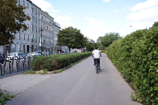
Hubby-bike-Montreal.jpg

At the end of last week, Hubby and I fled the country for a few days and were able to check off 1/5 of my 30 Before 30 #2 goal: Visit 5 places I've never been.  Since Montreal is only about a 5 hour drive away, we thought it was the perfect location for a quick getaway. One of the highlights of the trip for me was the Griffintown Cafe.  The design-nerd in me had found home.

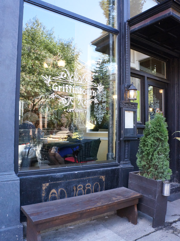
Griffintown

It definitely had a vintage European- meets hipster vibe to it (without trying to hard or being snooty) and I dug it.

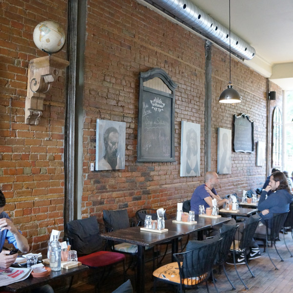
Griffintown-Seating

Not only was the food awesome (Hubby got a gruyere grilled cheese sandwich, and I got a salad with grilled veggies and goat cheese), but they mixed antiques and modern elements in the decor expertly.

Griffintown-Bar

The environment was very casual with chalkboard menus, exposed brick, and vintage-inspired "whiskey" water bottles.

Griffintown-Water

The exposed kitchen sported a punched tin clad vent-hood (which I regrettably wasn't able to get a decent picture of) and mason jars filled with spices.  One of my favorite things probably was the mix of cabinetry.  The kitchen side had light lower cabinets with dark stained doorless cabinets above while the adjacent bar was a mid-tone wood with open shelving.  If it hasn't been obvious with my recent kitchen renovation, mixing tones like that makes me weak in the knees.

Griffintown-Kitchen

My affinity for this cafe certainly wasn't hurt by the fact that it's in a neighborhood with several fascinating antique stores.

The Griffintown Cafe will definitely be a must-stop if we ever take another trip to Montreal!


National NYC

Hubby had a rare 2 days off in a row Friday and Saturday (he always gets 2 days off a week, but never in a row), so we decided to take a last minute trip to NYC to harass visit his sister. One habit Hubby and I have gotten into when in NYC is to visit Iron Chef's restaurants.  Hubby loves analyzing the food, I love analyzing the decor (and may enjoy the food a bit too).  Last time it was Morimoto's and Butter, this time, The National owned by Iron Chef Geoffrey Zakarian, and it's definitely our favorite so far.  Not only was the food amazing (although I would expect nothing less from an Iron Chef), but we both loved the vibe of the restaurant.

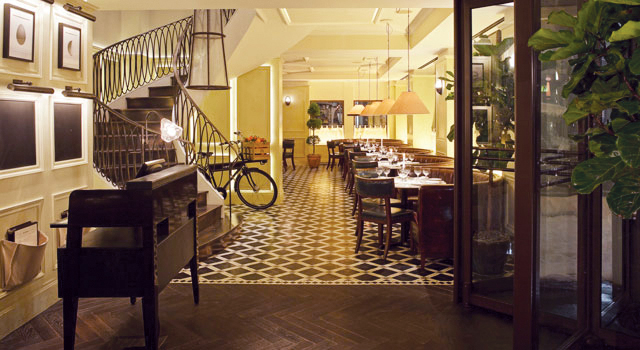
NATIONAL-Rockwell-1

It's sophisticated and polished but still has a relaxed vibe in both the atmosphere and the decor.  We sat at a small round banquette that felt more like a piece of furniture and I loved the blend of traditional (herringbone wood floors, picture frame mouldings, etc) with more funky elements like antiqued mirrors and Edison bulbs.  I actually liked it more in person than in the pics on their website.  The pics seem a bit more formal than it actually is.

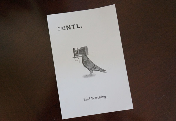
To show that they definitely don't take themselves too seriously, they gave us the check paper-clipped to this charming little postcard.  How cute is this half-bird, half camera? I say very.

The-National-postcard

Hubby and I must be a good team, cuz we both had the same idea- Frame it!  Luckily I'm a hoarder and happen to have several frames hanging around just waiting for a pretty picture to fill them.

framed bird

Such a cute little keepsake from a fun mini-vacation.

I hope you had a great weekend too!  Any impromptu vacations or treasure hunting?  I'd love to hear!

The National pic via their website here