Projects

Cole the Flip House: Before and After!

I hope you enjoy these weekly updates as I navigate through the business of flipping houses one house at a time!!  If you’re new here (Hello!!!) or just enjoy walking down memory lane, you can see my 7 previous flip houses here.  Thanks for coming along for the ride as I jump into flip #8!!!  Check out previous posts about this house here and follow along on my insta-stories for more behind the scenes goodness! This post may contain affiliate links.  For more information, see my disclosures here.

I know you've been eagerly waiting to see the "afters" and although I know some of you have cheated and found the house listing, let's do this!  It's going to be a long post so I can fit it all in, so have a seat, make yourself comfy and stay a while!!

While we focused the budget inside, we couldn't ignore the exterior all together.  When we bought the house 15 weeks ago, he was dwarfed behind a forest of overgrown shrubbery.

Aside from landscaping, the exterior got new shutters (which needed to be larger than the previous to cover holes.....), new exterior doors with a great paint color, new lights, and some concrete patching.

Handy dad jumped in to make this adorable house number planter to add a little character to the main entry.

Inside this house is really where the magic happened.  Normally, I like to save the best for last, but I'm going to shake it up a bit this time and walk through the house like you would when in person, so that means that the first room you get to see is the KITCHEN!!!  EEE!  But first, memory lane.  So much potential in this "before" kitchen, but that's about it.

I KNEW this kitchen could be the stunner of the home, so I needed to make everyone else see what I could!  I maximized cabinetry, took down the wall between the kitchen and dining rooms, closed off a doorway to the living room, and shuffled the stove location.

The MOST fantastic thing about this house now is the connection of the spaces on the first floor.

Before we head into the dining room, we need to visit the main bathroom which is off the kitchen.  It wasn't the worst I had to deal with, but it could be SO much better!

This new bright, clean bathroom comes complete with original built-in, antique medicine cabinet, and new everything else.

Heading back out into the dining room, it originally was dark and closed off.  The below view is the view from the living room with the kitchen through the doorway on the right.  The same view as the first "after" pic down below.

Now open and spacious, I can really see holidays being hosted here whether with family or friends.  It could easily fit a long, expandable table!

The living room brightened up the second we took down the old paneling, but this room almost feels unrecognizable.

The old pass-through to the kitchen got closed up to allow space for a wall-mounted tv.  The bigger difference here is with the stairs opened up and the dining room now open to the kitchen, the entire floor feels open and connected.

Heading upstairs to the 2 bedrooms, the rooms themselves didn't undergo huge transformations, but we all know what miracles paint and details can be!

The smaller bedroom is worlds brighter with a new door into the *NEW* powder room.

The original master bedroom didn't seem very masterly to start with.

I definitely rectified that, however, putting almost 12 feet of closets along the wall.  Just staging it with a queen size bed and nightstands makes it feel so much cozier!

The biggest change upstairs was definitely in this closet.

Which is no longer a closet.  The space was perfect for a small jack and jill powder room!  The walls didn't move at all to allow for this space, just some new doorways.  We were lucky that the footprint was already here!

So what do you think??  Did you see the potential in this house 15 weeks ago?

The key to this entire house was MAXIMIZING.  Maximizing the usable space, maximizing it's potential, and maximizing our budget!  We're hosting 2 more open houses this weekend, Saturday and Sunday from 12-1 so if you're in the market, message me for the info!!!

If you made it all the way down here, congrats and THANK YOU!  XOXOXOXO

Have an amazing weekend and Thanksgiving week!

Latest Dining Plans

dining-room-16.jpg

With my latest finds for the dining room, I have a new resolve about designing this room once and for all!  My dining room has never lived up to it's potential and it's about time I let it.  Aside from finishing up a few previously unfinished projects around the house, the dining room is sitting at the very top of my project list.  I know I showed it to you last week, but just to keep it fresh in your head, this is the room I'm working with: dining current

I'm not changing direction in here entirely, but refining, focusing, and generally polishing it up.  Aside from the dining table and floor, almost everything is getting at least a tweak.

Dining Room To Do list:

dining-room-16

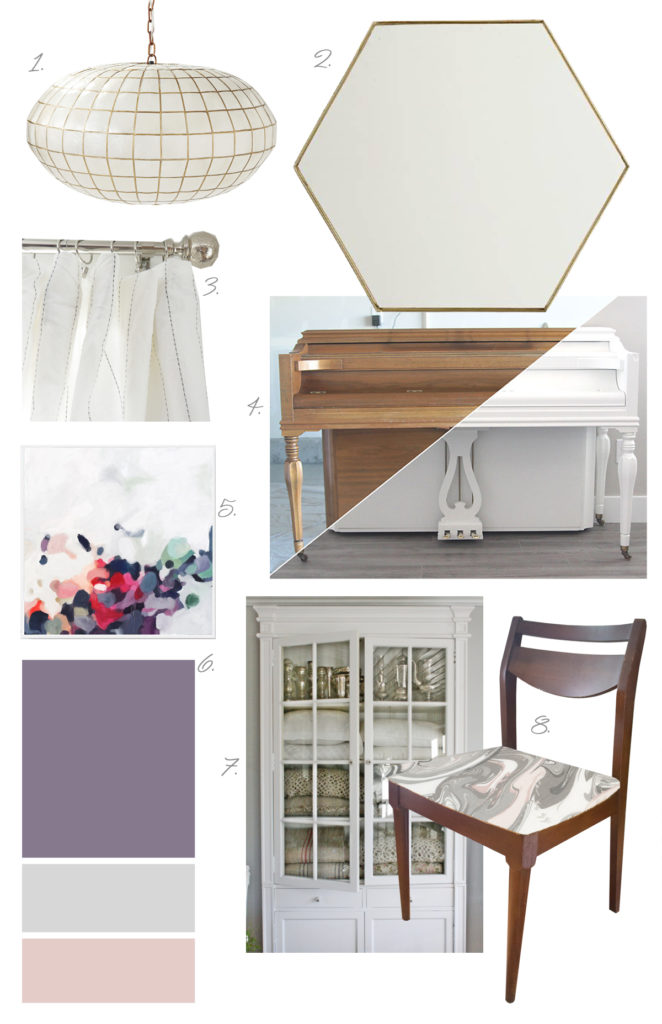
  1. Install new larger scale light fixture- I've been swooning over the Capiz Globe Chandelier from Serena and Lily for years.
  2. Hang oversized hexagon mirror (check!)
  3. Hem existing curtains from IKEA (no longer available)
  4. Paint piano!!! Yup, I'm finally going to bite the bullet and paint the piano I grew up with.  It's far from heirloom and is looking a bit worse for wear.  I think it will get a new lease on life when it gets a fresh coat of white chalk paint (piano image source: It's Always Autumn)
  5. Brightened up artwork like this etsy print from ParimaCreativeStudio.
  6. Repaint walls with BETTER purple paint
  7. Custom built-in china cabinet
  8. Refinish and reupholster side of the road dining chairs.  Possibly with this dreamy Kate Spade Marble Swirl fabric.
  9. Not shown- new captains chairs... TBD!

Now that I've made some design decisions, I naturally want it all done yesterday.  The reality is, though, that the room will probably come together over the next month or 2.  I really can't wait to get to the finished product and a photo-worthy room for the first time!!  I'll be sure to share each project in this space as is all comes together!

Save

Save

Dining Room Serendipity

hexagon-mirror.jpg

Our dining room has never felt "done" in the 5.5 years that we've been in this house.  Even when I declared it done previously I think I was just trying to convince myself unsuccessfully.  There's a reason that I've never taken proper photos of this room- it's never been worthy.  It's been through several evolutions and I'm super excited about my latest plans for it!!  I swear, either the universe or the side-of-the-road trash gods have been smiling on me.  My plans have been evolving slowly for this room, then suddenly fell into place Wednesday.  

dining-room-serendipity


Let's see if I can quickly catch you up on this space....  Our dining room has changed a bit over time, but it's always felt unsettled and never a room that I wanted to shout from the rooftops or post to instagram.  It doesn't look like an interior designer's dining room.  This is what it looked like back in 2013 when I last did any major work in here.  I feel like my style has grown so much in the past few years that this room is just an ancient relic constantly reminding me of design missteps (melodramatic much?).


dining current


A few small things have changed since that photo such as adding a second curtain panel to each window (why in the world did I think just one panel per window would be chic??), banishing the painted chairs for calmer, matching chairs, and switching up the mantle/piano top decor.  Yep, in 2.5 years, that's all I've touched in here.  We don't use the room a ton, but we walk through it every time we need to get to the kitchen- I just put my blinders on and envision the dining room of my dreams.

Things that have ALWAYS felt off to me about this space are

  • too small light fixture
  • 'temporary' art over the piano has long overstayed it's welcome
  • the paint color.  The bane of my dining room existence.  I love a purple dining room, but this is not the right purple or sheen.  It's not bad in person, but it's positively horrific in photos.
  • the piano and liquor cabinet compete with each other
  • the captain's chairs are a chenille fabric which is very enticing to kitty claws and shows every little pull.

While I've been itching (more like twitching) to do something about this room, I've been trying to curb house spending since Hubby recently joined me in self-employment as the best darn Realtor you could ever work with.  Thanks to several side of the road finds, though I can finally make big changes in this space for a reasonable budget!

My first side of the road game-changer was a set of chairs.  Before I go on, let me say, it's not that I live somewhere where there's always amazing stuff on the side of the road- I just ALWAYS have my picker radar up.  It's a keen skill that I thank my parents for.  SO over the winter when I saw a pile of furniture around the corner from my house, 4 of these midcentury chairs just jumped into my car.  Chairs jumping into my car has been a longstanding issue, however I think this time it was well worth it.  They need refinishing and clearly reupholstering, but we've been using them for months as is.


roadside-dining-chairs


To address another issue- the competing and crowding piano and liquor cabinet, I'll be building a built-in china cabinet similar to this one:

027

source: Vibeke Design

Instead of building it from scratch like I did with my living room built-in, I plan to use vintage doors and a vintage dresser if I can find one the right size.  Much like the living room shelving, though, I've had this idea stuck in my head since shortly after moving.  When an idea sticks for that long, I really need to listen to it.  That's actually what lead me to my second roadside revelation.  After scouring Craigslist, I drove 45 minutes to pick up these vintage wood doors complete with hardware for a whopping $4 total.


china-cabinet-doors


On the way to the pick up location, I passed a trash pile.  Not a pile of furniture like with the chairs, but a literal trash pile.  A trash pile with a 3' tall hexagonal gold, framed gem sticking out of it.  I don't even want to know what was smeared all over it, but I'm still in complete disbelief that I found this on the side of the road!  This mirror is seriously huge and dreamy.  And with that find, my dining room plans are falling into place.


hexagon-mirror


The moral of today's post is keep your eyes peeled and you'll find treasures is all kinds of places!   And ugh that color.  Yes I chose that color 4 years ago and was over it 3 years ago.  I personally think that purple is one of the best colors there is, but it needs to be toned down a notch, a bit more gray, and most importantly matte and not semi-gloss.  #liveandlearn

I'll be back next week with my complete vision for the room.  Until then, have a great weekend and happy picking!!


Save

Save

Save

Save

Save

Save