I hope you enjoy these weekly updates as I navigate through the business of flipping houses one house at a time!! To catch up on the progress on Nessie, check out her previous posts here. If you’re new here (Hello!!!), or just enjoy walking down memory lane, you can see my 6 previous flip houses here. Thanks for coming along for the ride!! *This post may contain affiliate links*
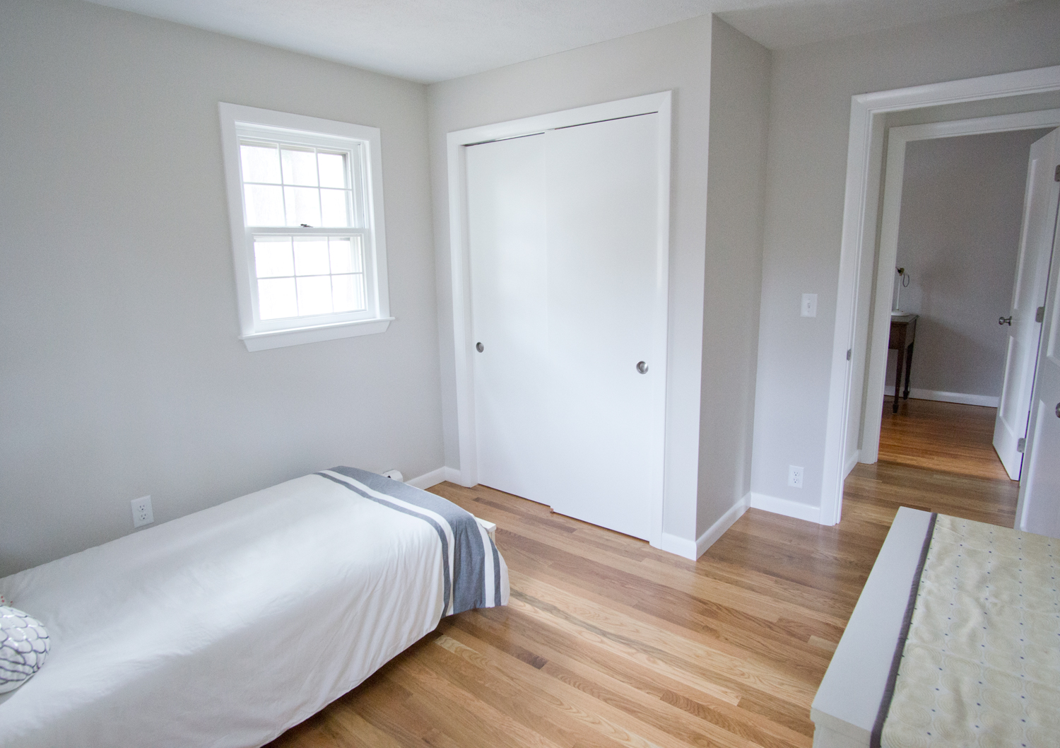
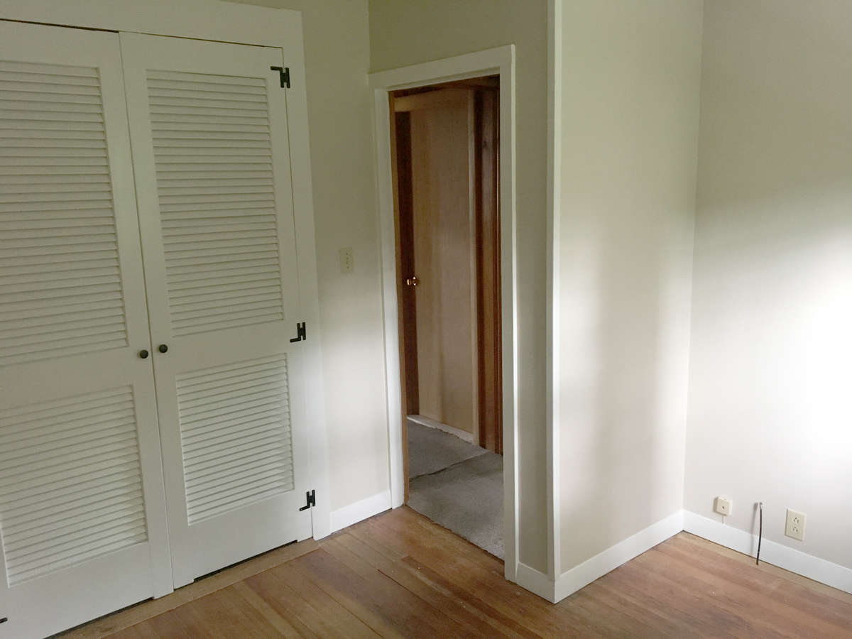
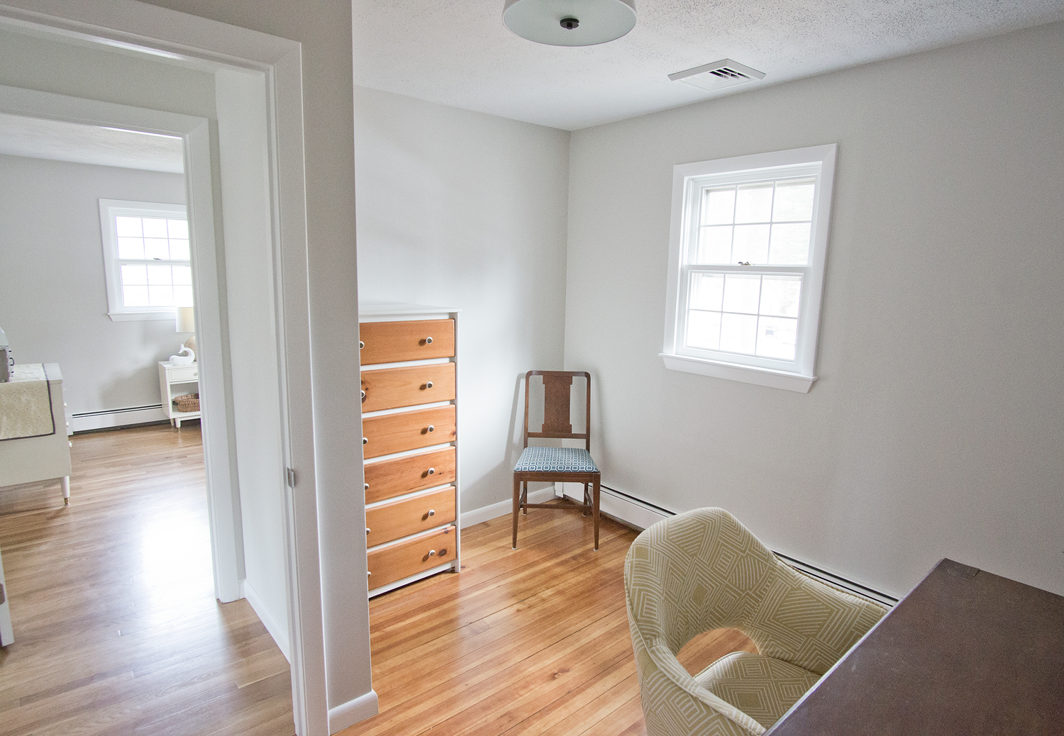
So far today I've shown you the transformation of the outside, bedrooms, bowling alley, and bathrooms, but now I get to show you my favorite part of all and the spot that will sell this whole house: the open concept living area and kitchen!!
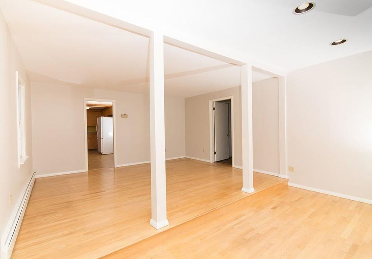
The space before was closed off and pretty dark.
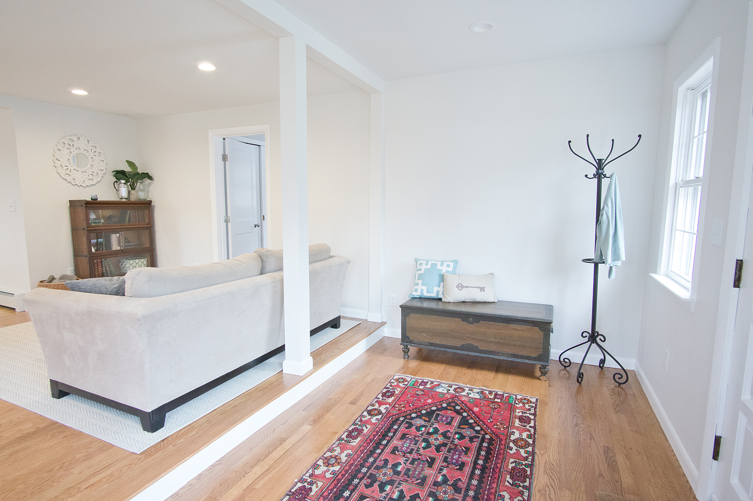
Not so dark anymore! With one wall missing and new recessed lights throughout this house doesn't feel sleepy any longer.
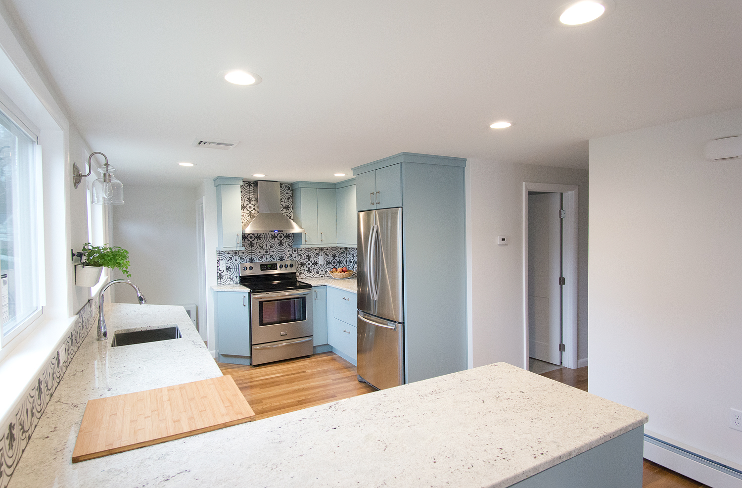
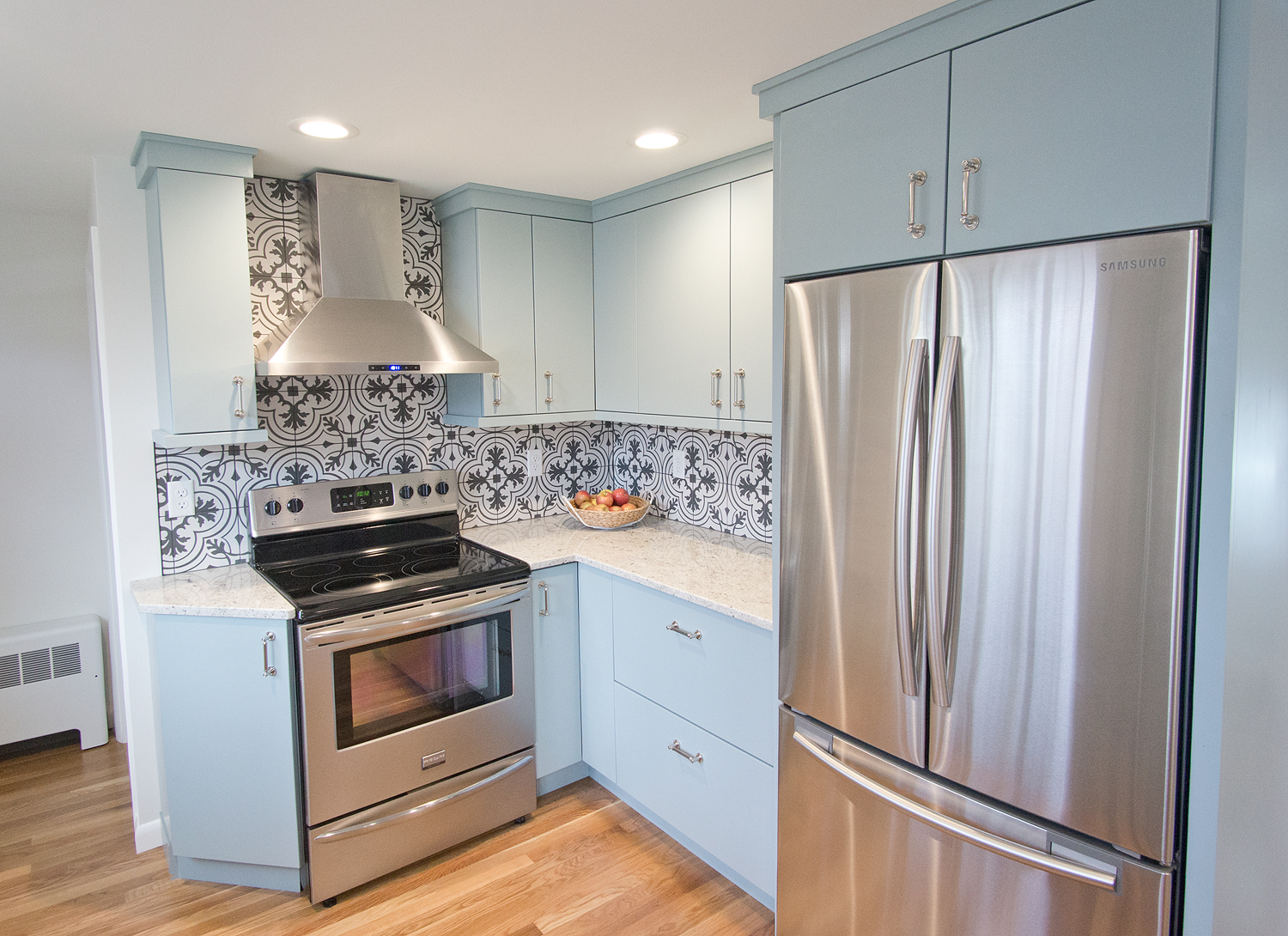
From the front door you can see all the way into the kitchen. Just as I was hoping, that backsplash tile is a show stopper!
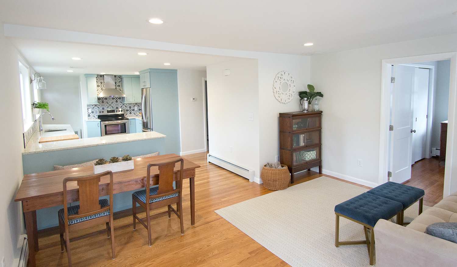
You may have seen on instagram about my happiness in finding JUST the right table for my new dining bench. With the PERFECT dimensions, and a side that drops down to consolidate even more space, I had thought I missed out because someone beat me to it. Luckily their inability to pick it up in a timely manor lead to me getting a message right after the movers dropped off the rest of the staging furniture. It was meant to be!
Seriously, though, a table like this was exactly what I had in mind when I was planning the bench. I'm not sure anyone saw my vision on that one while we were working on the house- everyone seemed surprised that I wasn't doing a breakfast bar at the counter, but I had bigger plans.
THIS kitchen is the reason that I don't do cookie cutter kitchens in my flips. You need to give buyers something to fall in love with! In this house, it wasn't going to be the square footage, or spacious bedrooms.... it is the kitchen. And it wasn't before:
I really hope it is now! I'm in love with this kitchen... but I say that about every new kitchen that I design. Either the newest is always the favorite because it's the freshest in my memory, or I keep trying to outdo the last... probably a combination of the 2!
It was an awkward space to start with, but by shuffling the stove and sink, I was able to open up the floorplan a bit. The only thing I usually try not to do that I had to do was put the sink in front of a wall, but it was the best spot 100%. What I did to make up for the fact that whoever is at the sink would be staring at a wall is to give them a wall-hung herb garden. It is currently sporting mint, rosemary, and parsley. Yum!
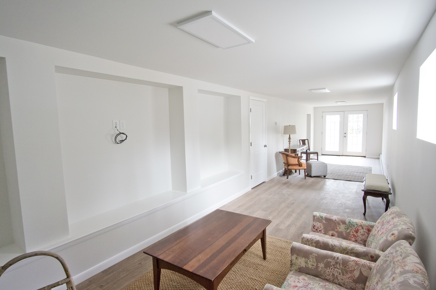
Now that I've shown you all the before and afters, and you've hopefully fallen in love with this latest house, it's time to sell her!!! Between the awesome kitchen and the spacious entertaining space in the bowling alley, I hope someone falls head over heels! If you know anyone looking for a new home in the metrowest Boston area, Nessie is up for sale with an open house Sunday!!
Kitchen Sources:
Cabinets // Backsplash! with Raven Grout // Vent Hood // Sink Light // Herb Garden // Paint Color: Benjamin Moore Classic Gray mixed at 50%










 helps too. It's really the window, though. I swear.


