Styling

Niece Nursery Plans

Niece-Room-plan.jpg

It's been a very long while since I mentioned anything about my soon-to-be niece's nursery.  For reasons beyond my control, it looks like she'll get here before her nursery is completed, but we had a chat and she told me she doesn't mind as long as I knock the room out of the park.  You got it, little lady. This is definitely one of those spaces that will evolve once we get the staple pieces into it.  Even in putting this board together, it doesn't look like it's fully jiving just yet, but have faith!  I know the accessories and little touches here will pull it all together.  My vision for this little girl is an eclectic but classic space with a very slight vintage twist.

The craigslisted dresser (that I finally decided on) is mid-make-over in Millie's garage and is coming out better than I hoped for.  I can't wait to show it off!

Niece-Room-plan

Why yes, I do plan to put a vintage Kilim striped pillow in a nursery as long as my sister lets me (pretty please, Sis?  It'll be amazing, I promise!!).  The room will be getting a fresh coat of yellow paint this weekend and then the pieces will start to fall into place!

I'll provide sources with the room reveal when the time comes, but feel free to ask if you just HAVE to know now!

I'd love to hear what you think!  Is my vision making sense yet, or are you waiting to see how I tie it all together?

5 Ways to Style a Shelf

Yeah, I'm a little one-track-minded right now.  If you don't want to talk flip, we probably shouldn't have a conversation until late next week.  We're listing Grover a week from TODAY and I'm in Git-r-done mode!  That being said, I'll attempt to pull my head out of the flip for just a little bit to bring you the latest installment of 5 Ways!  Since I showed you my updated and styled flip built-in on Monday, I thought we could keep with that topic: 5-ways-to-style-a-shelf

1.  Group like items to show off a collection.  For my updated built-in, I grouped these 3 not-so-real-but-not-too-fake-looking plants to add a bit of life and greenery.  Each having a different height and material makes it interesting, while the faux (sounds so much more sophisticated than fake) greenery unifies them.

built-in-close-up-3

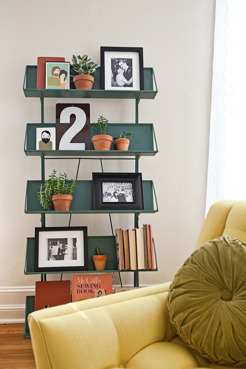
2. Speaking of height... Make the eye travel.  High-low-high, low-high-low, high-low.... you get the idea.  If you vary the height of the items, it will help the eye travel along the shelf.  This keeps it from being stagnant and boring.  Elsie's living room shelves are a shining example of this- via A Beautiful Mess

a beautiful mess- elsies living room shelves

3. Odd numbers are more pleasing.  Don't as me why, they just are.  3 and 5 are my golden numbers usually.  Check out this styling from Centsational Girl- each shelf holds an odd number of items (i'm counting small items, like the little towers as one visually)

bookcase-styling-centsational-girl

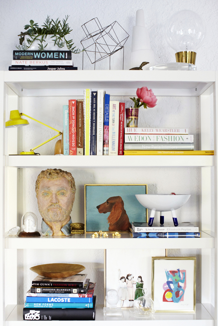
4. Layer.  Lining up your treasures all in a row might look nice and ocd, but imagine how amazing they'd look if you overlapped them a bit.  Over lapping just a little helps to create groupings, depth, and interest without obscuring the items.  Emily Henderson is probably the queen of layering decorative objects- just look at this bookcase from her prior living room.

Emily Henderson shelf layering

5.  Break all the rules!  What??  That's right, I said it!  Styling a shelf, above all is about showing off what you love.  Do you have 4 photographs you want to display?... but that's not an odd number.  Who cares.  Do you like the way it looks?  Good.  Do it.  That's right, I have 2 gold mirrors on my bookshelf.  Gasp... an even number! I'm a rebel.

styled plant hand shelf via year of serendipity

Happy styling!!

2 Weeks and $1000

It's been a good few days on the flip front.  Friday, after 2 weeks of scrambling, I got Frankie all staged and ready to show off for his Saturday showing.  The Saturday showing lead to a second showing Sunday and an accepted offer!  And Hubby and I sighed a collective sigh of relief.  We've learned several expensive lessons with this house: 1- purchase price has to be right for the neighborhood.  2- the best offer is the one you have in front of you.  We would have made more profit if we took the first offer... ce la vie. and 3- staging is totally worth the time and money (plus it's fun). When faced with a non-selling house, we didn't want to sink any more money into renovations, so reluctantly we agreed that staging was the way to go.  We had resisted previously because we weren't convinced that the time and cost were worth it (spoiler alert: they are).  I may be able to envision furniture in the space, but sometimes I forget that not everyone sees a space that way.  So I gave myself the challenge- 2 weeks and $1000.

Frankie staged living room

Admittedly, it was trying to rein myself in- I wanted to design the whole space with the absolute perfect pieces!  I had to force myself to do just enough to make it feel cozy and to work with the pieces that I could get from craigslist for next to nothing.

Frankie staged living room vignette

Frankie staged mcm bedroom 1

I hung IKEA curtains in all the bedrooms using Sarah M. Dorsey's hook method and they totally helped the entire house feel finished.

Frankie staged mcm bedroom 2

Frankie staged mcm bedroom 3

Frankie staged mcm bedroom 4

If you didn't see on face book, I'm kind of madly in love with the mid century modern twin bedroom sets (yes, setS) that I found.  Eventually they'll get refinished, but the lines are dreamy and they're SOLID.  Sadly, the nightstand was missing it's original knob.  I may have to find a suitable replacement in the near future.

Frankie staged master 1

Frankie staged master 2

This dresser may end up being a future project too- polish up the knobs, repaint it (the finish is the victim of a poor refinish attempt) and add legs which apparently were there originally.

Frankie staged mcm bedroom 5

Frankie staged mcm bedroom 6

I shopped my own house for the majority of the accessories including lamps and trays.

Frankie staged mcm bedroom 7

My absolute favorite view is the view you get when walking down the hall:

Frankie staged hall view

It certainly doesn't look like a house that's lived-in, however just adding the furniture and a few strategic accessories, help to make it feel like it could be a home.

Aside from the kitchen/dining witch I had staged when we listed, I totally met my own challenge and was able to furnish and style a living room and 3 bedrooms for under $1000

Here's the cost breakdown:

Living room:

Sofa, craigslist-$50

Side chair, craigslist-$50

Rug, craigslist-$40

Lamp, already owned-$0

Side tables-$30 + spray paint

Living Room TOTAL: $170

Bedrooms:

2 twin beds, 2 dressers, 1 nightstand, craigslist-$100

Queen headboard & metal frame, craigslist-$50

2 Twin mattresses, craigslist-$50

Queen mattress, craigslist-$25

Queen split box spring, craigslist-$FREE

Nightstand, tag sale-$5 + spraypaint & new knobs

Dresser, craigslit-$30

Bedding, pillows, & accessories-$328.33

Bedrooms TOTAL: $588.33

TOTAL STAGING COST: 758.33