In the series, Make it Work , I show you how to take a seemingly random thrifted find and hypothetically 'make it work' in an awesome space. WWTGD (What would Tim Gunn do?) On to today's Make it Work!
I've been scouring Craigslist a lot lately. I mean a lot even for me (and that's an awful lot for most people). Aside from a few things that will probably work for eventually staging Millie, I haven't been coming across any total gems. Sometimes not being WOWed by a piece gives you the opportunity to add the WOW yourself, however.
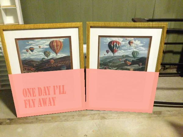
I present to you: dated 70's hot air balloons currently on sale on our local craigslist for $20
I'm betting about 87% of you are questioning my vision right now. Am I in the midst of a stroke? Losing my eye sight? Nope, I truly think these stuck-in-time pictures have potential. With some modifications. Something about the hot air balloons draws me to them. Something about the current color scheme and the frame scares me away.
First, I'd start off by correcting the hideousness that's scaring me. Paint the mat white and use a gold rub-and-buff on the frame. Now the only color issues reside in the paintings/prints themselves. My solution for this? Dip it!
image credit: insidecloset.com
In reality, the process would be less of a 'dip' and more of a 'tape off half the painting then use a brush or spray paint' but the effect is still the same. Our previously questionably hot air balloons would suddenly look ethereal and modern. Here is my not-so-perfect photoshop rendition to give you an idea of what the balloons would look like. Picture the frames shinier and the paint wouldn't look so flat.
You could also take it one step further and stencil or paint on a favorite quote or phrase. I like the idea of a tone-on-tone.
Now what's one to do with this bizarre revived art set?
Personally, I think it would make the perfect statement over the sofa. Large enough to fill the space, the new paint gives it a night weight, and it demands attention without screaming for it.
side table: target/frames: target/sofa: mitchell gold + bob williams/pillow: caitlin willson textiles/lamp: ikea
I know the dipped look isn't one to please everyone's tastes, but it's a great way to make a statement on a budget.
Are you on board or do you think it still looks like junk? I'd love for you to weigh in!


