Welcome to a new series: "Designing with..." This series is going to to all about showing you how you can incorporate challenging, bold, or offbeat elements seamlessly into your home. Stripes are such a bold design statement, but it can be a bit tricky incorporating a big stripe into a space without overpowering it. With bold stripes, the trick is to let the stripe be the star.
On a wall:
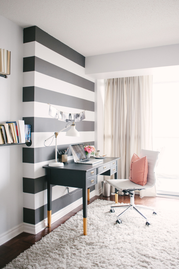
I wouldn't recommend an entire room with bold horizontal stripes for fear of it turning into a carnival attraction, however a single focal wall with bold stripes? You got it! Choose a wall that is already a natural focal point or is a focal point due to furniture placement: behind a bed, surrounding a fireplace, or in this case, behind a desk.
source: Style Me Pretty Living, Lark & Linen Home Tour
On a floor:
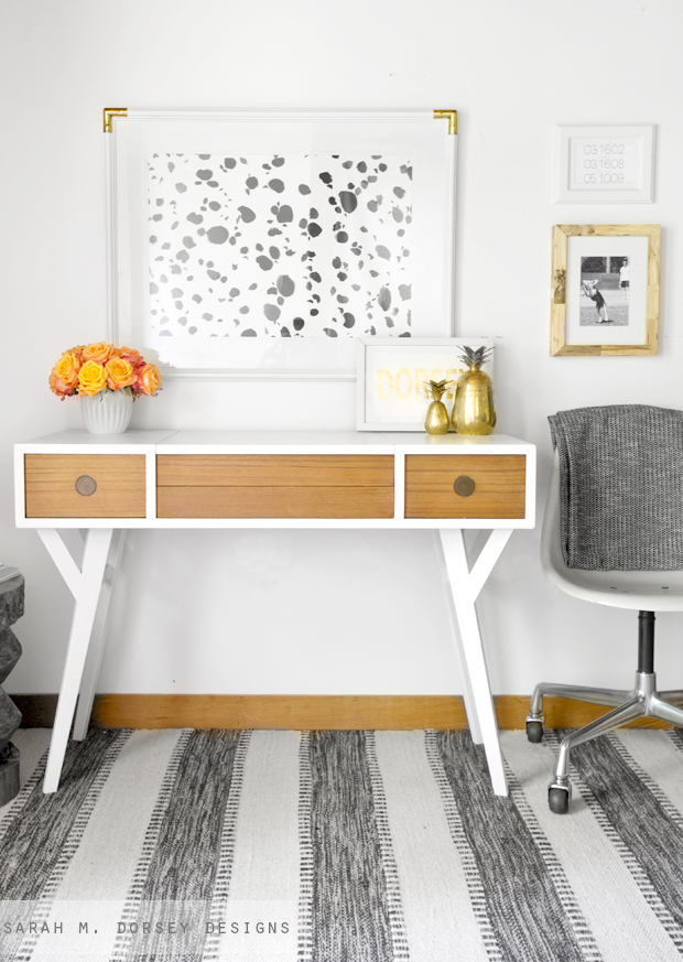
Draw attention to the floor without overwhelming it. To balance out a pattern-heavy floor, bring the eye up with other interest and pattern in artwork or accessories. Vary the scale so that nothing competes visually.
source: Sarah M. Dorsey Designs, Mid Century Modern Vanity | Adding Custom Legs
On furniture:
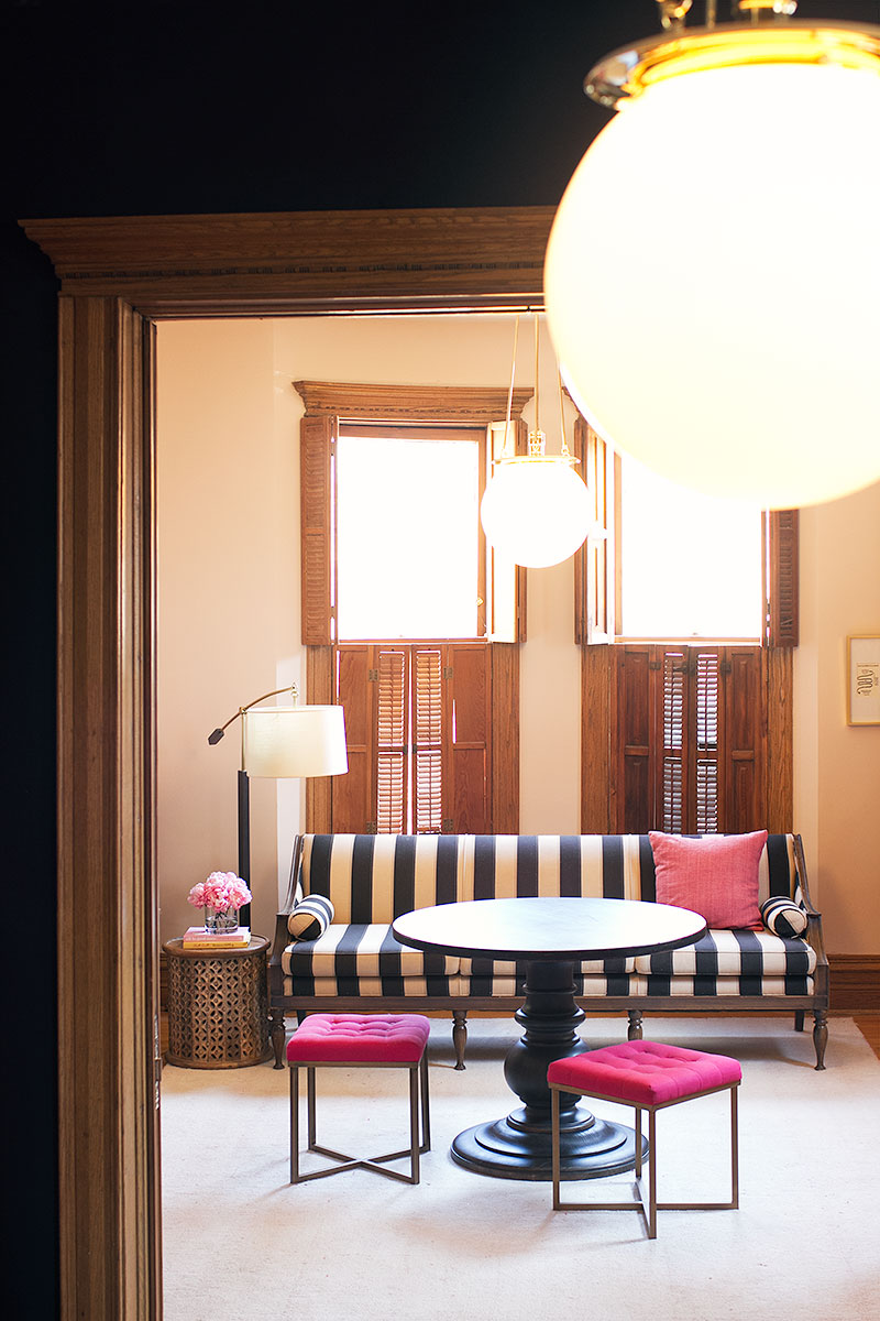
If you're feeling bold, a striped piece of furniture can be such a swoon-worthy element if done right. Plan for the piece itself to become the focal point and other ancillary pieces should be supporting players. Use pops of color, smaller patterns, and organic elements to balance out the space.
source: Making it Lovely, New Lighting in the Library
On a table:
The striking linear quality of a stripe paired with natural elements is a match made in heaven. Opposites attract for a reason- the organic grouping of flowers softens the harsh lines, while the rigidity of the stripes keeps the flowers from feeling too dainty.
source: The Knot, A Whimsical Kate Spade-Inspired Wedding in Dallas, Texas
**Design disclaimer** As with all things in design, rules are made to be broken. These guidelines are just a start, however once your stripe skills have been developed, possibilities are endless!
Future "Designing with..." posts will include polka dots, brass, and florals to name a few. I'd love to hear what design topics you're stumped by and would love to see in this series (or in a separate post if applicable)!


