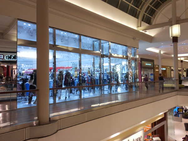
....you can't shop in certain stores because of poor design. I actually wasn't planning to blog today, but the mall decided otherwise.
Have you ever heard of the store Love Culture? Me neither, but apparently one recently opened at the mall by me. I was intrigued and wanted to check it out- until I took two steps in.
The design was promising. The entry portal was an amazing patterned mirror/glass glowing element. (Although it took me a minute to find the name of the store on the entrance... not the best branding). Please excuse the poor cell phone pictures, but I just had to share/vent.
Your computer does not deceive you- that store is BLUE. I first thought it was glass tinted for effect.
Nope! This store is the WORST example of LED lighting I have EVER seen. The overall design of the store wasn't bad- it was your standard young/hip store. If you changed the sign it could be Forever 21 or Wet Seal or (insert generic "hip" store here) But WOW, the lighting. Being in that store hurt my eyes and my design sensibilities. If I was a lighting designer, I'd be crying right now.
LED lighting is the current thing in lighting and can be completely and totally amazing when done right.
This. is. not. right. Your store should not be blue.
Yes, LEDs are naturally blue, however modern technology allows you to get them in any color- including crisp white... even colors to mimic incandescent light.
Love Culture, you have now joined Hollister on the list of stores this design snob will not step foot in. Congratulations.


