5 Ways

5 Ways to a Luxurious Bath

This week's "5 Ways" post is brought to you by DecorPlanet.com. If you've been following me for more than a week, you have probably figured out that I have put a lot of thought into bathrooms as of late.  With Millie the fliphouse's bathrooms finally coming together, I thought it would be the perfect time to share some of my thoughts on successful and luxurious bathrooms that don't have to break the bank.

5-ways-lux-bath

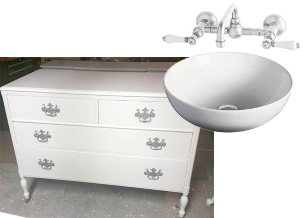
1.  Splurge on the sparkle.  And by sparkle, I mean fixtures.  Spend the money on what draws attention.  What could be a generic sink can be instantly transformed with the proper faucet.  Whenever I use a vintage or thrifted sink, replacing the fixtures is imperative to making it look high end.  Joanna Gaines executed this perfectly on an episode of Fixer Upper with this upcycled dresser/simple vessel sink combo.  With a generic faucet, it would be just a nice space and you'd instantly forget it.  With those faucets, it's a stunner.

9b089dc6bcbf20d52b10ee77bfe615f0

Similar to what I'm planning in the flip's new master bath, you can recreate this look with your own thrifted dresser, simple vessel sink  and a wall mount faucet such as this Rohl Acqui Bridge Faucet, both from DecorPlanet.com.

dresser-faucet-sink


2.  Tile- think outside of the box.  With most of my projects, I admittedly try and save a bit of money where I can.  Often times, that money savings opportunity comes with tile.  Thinking outside of the box with tile doesn't mean you have to think outside of the box store.  All you need to do is look at tiles a little bit differently.  This bathroom from Apartment Therapy shows that varying the shape of generic white tiles shows the power of tile.

00b291df9534d91c5be1af8c92c3b888


3. Enjoy the little luxuries.  If you don't have it in the budget for a whole bathroom reno, how about adding a towel warmer?  Who doesn't love getting wrapped in a warm towel on a cool day?  A little touch of luxe can go a long way to making the entire room feel more high end (plus you'll be all warm and cozy: win-win!)

amba_swivel_jill-b002_stock_01-web_385

4.  Maximize your storage.  Nothing makes a bathroom feel less luxurious than piles of towels, toiletries, and grooming tools.  Even in a tight bathroom, it's possible to find a place for everything with some creative organization.  If you aren't blessed with tons of built-in storage space, furniture and other vessels can really do the trick.

1f0fdbcc9fa98d6356edf4b5d335ff96

image via BHG

I'm swooning over this Fresca Oxford Antique White Linen Cabinet from DecorPlanet.  Cross my heart and kiss my elbow, I'd be saying this even without this partnership.  With it's slim footprint and classic door style, it can fit into almost any space and be exponentially useful.  Zazz it up easily with some Anthro knobs.  I can just see 2 of these flanking a beautiful vessel sink and it would be pretty epic.  Tons of storage in a small space.

fst2060aw-4


5.  Accessorize.  Did you not expect me to go there?  It's always the last layer that makes a room, and it's no different in a bathroom.  In addition to a fun mirror and patterned or textured towels, think about what else might be useful and beautiful.  A vessel to stash your everyday items within reach, a stylish makeup mirror to make sure you're ready for your closeup (or selfies), and what about a basket with a few rolled towels for easy access for guests.

bathroom-accessories

mirror: DecorPlanet/ box: Target/ soap dispenser: DecorPlanet/ basket: IKEA/ towels: Target/ makeup mirror: DecorPlanet


Thanks, DecorPlanet.com for collaborating on this post!

5 Ways to Make a Room Bigger

I live in a small house.  It's perfect for Hubby and I, but it's small.  One of the keys to living large in a small space is making the most of the space you have.  But HOW?  I'm so glad you asked. 5-ways-to-make-a-room-look-bigger

**As always, please pin responsibly and from the original sources that I have linked to.  Muchos gracias!!**

1. Clear the clutter!  What what??  I know, revolutionary statement here!  The less visual clutter you have, the bigger the space will look for several reasons.  If your eye gets stuck on the piles of mail on the coffee table, you'll never notice the 12 foot ceiling.  Aside from distracting from positive features of your space, clutter will also make it feel like you have storage issues (and maybe you do, but who wants to be reminded of them).  I personally live by the old adage "a place for everything"... still working on the "everything in its place" part, though.  My point is- if you have a place for things, it won't look like you have run out of storage space.  It's a wonder what some good organization can do!

kitchen-reveal3


2. Scale furniture appropriately.  Just because you can technically fit a sectional in your tiny living room doesn't mean you should.  Try replacing the love seat side of the sectional with 2 slipper chairs.  Not only will they feel more appropriate to the space, but they'll provide you with more flexibility.

mcgill-design-portfolio-rathnelly-04

image via McGill Design Group


3. Taking another lesson from the image above- show off those legs.  If you raise pieces off the floor even by a few inches, it gives the illusion of more floor space.  If you can see more rug, the room must be bigger, right?

Hranowsky2011_1_JLynn1888

image via Angie Hranowsky


4. Make use of vertical space just like the image above and my built-in in my own living room.  Using vertical space not only gives you more of this coveted thing called storage, but it also draws the eye up, once again making it feel larger.

living-room-sketch-reality

This guideline is the reason that soffits above kitchen cabinets drive the bejeezus out of me.  Not only is it wasted space most of the time, but it's a missed opportunity for a more dynamic room.


One of my most important tips:

5. High and wide!  Here, let me jump onto my soapbox for a sec.  Repeat after me: high and wide.  If I haven't spewed to you about where you should hang curtains yet, let me now:  HIGH AND WIDE!

march-033

I couldn't have said it better than Erin Gate's Curtain PSA (also the source of the image).  If it's not screaming at you from this pic, hanging your curtains high and wide will draw the eye up, make your windows look larger and grander, AND allow in more light.  If you like small, dark, unremarkable rooms, by all means, hang your curtains on the window frame. If you've made this mistake in the past, it's not too late to change!  Your room will thank you! *steps off soapbox*


Would you add any items to this list?  How have you made your space feel bigger?


5 Ways to Style a Shelf

Yeah, I'm a little one-track-minded right now.  If you don't want to talk flip, we probably shouldn't have a conversation until late next week.  We're listing Grover a week from TODAY and I'm in Git-r-done mode!  That being said, I'll attempt to pull my head out of the flip for just a little bit to bring you the latest installment of 5 Ways!  Since I showed you my updated and styled flip built-in on Monday, I thought we could keep with that topic: 5-ways-to-style-a-shelf

1.  Group like items to show off a collection.  For my updated built-in, I grouped these 3 not-so-real-but-not-too-fake-looking plants to add a bit of life and greenery.  Each having a different height and material makes it interesting, while the faux (sounds so much more sophisticated than fake) greenery unifies them.

built-in-close-up-3

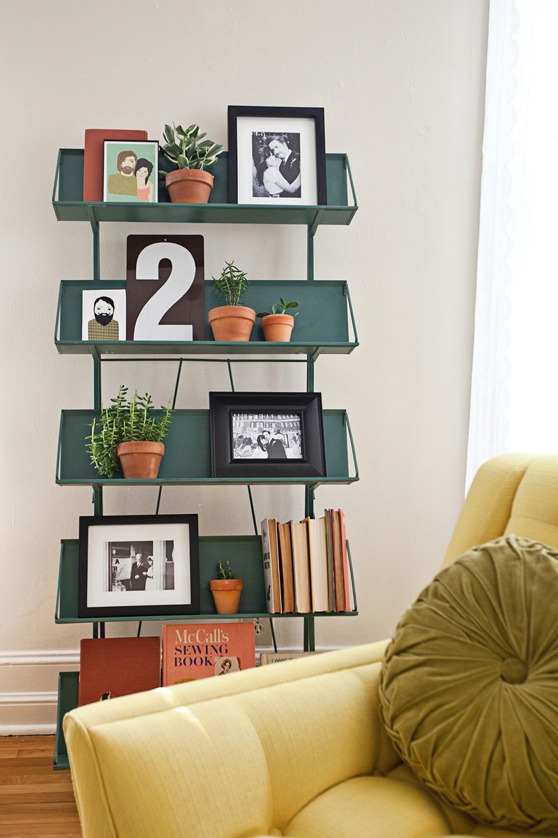
2. Speaking of height... Make the eye travel.  High-low-high, low-high-low, high-low.... you get the idea.  If you vary the height of the items, it will help the eye travel along the shelf.  This keeps it from being stagnant and boring.  Elsie's living room shelves are a shining example of this- via A Beautiful Mess

a beautiful mess- elsies living room shelves

3. Odd numbers are more pleasing.  Don't as me why, they just are.  3 and 5 are my golden numbers usually.  Check out this styling from Centsational Girl- each shelf holds an odd number of items (i'm counting small items, like the little towers as one visually)

bookcase-styling-centsational-girl

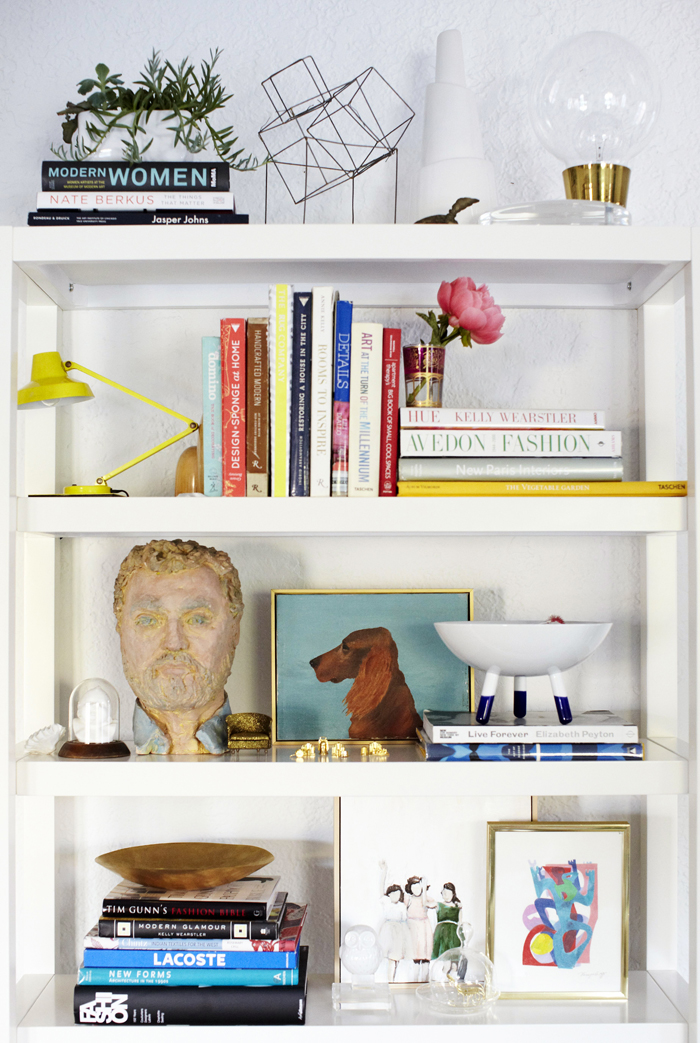
4. Layer.  Lining up your treasures all in a row might look nice and ocd, but imagine how amazing they'd look if you overlapped them a bit.  Over lapping just a little helps to create groupings, depth, and interest without obscuring the items.  Emily Henderson is probably the queen of layering decorative objects- just look at this bookcase from her prior living room.

Emily Henderson shelf layering

5.  Break all the rules!  What??  That's right, I said it!  Styling a shelf, above all is about showing off what you love.  Do you have 4 photographs you want to display?... but that's not an odd number.  Who cares.  Do you like the way it looks?  Good.  Do it.  That's right, I have 2 gold mirrors on my bookshelf.  Gasp... an even number! I'm a rebel.

styled plant hand shelf via year of serendipity

Happy styling!!