Before & After

Light Fight

From day 1 in the house, Hubby and I wanted to replace the hall light.  It was a dated, cheap looking, gold flush mount fixture.  I wasn't actively looking for a replacement yet, since there were other items that were higher on my list.  The perfect light, however came into my e-mail via Rue La La a few weeks ago. It's the right balance of modern with a vintage flair and it's looks make me very happy.  It's installation did not.

On moving day when we said "Good Riddance" to the ceiling fan, the installation of the new dimmable light was speedy.  I left the room as the first fan screw was being removed and came back a few min later to find that Hubby and the dads had the new light fully installed.  I had high hopes of the hall light being as easy......

Here's what we started with:

After waiting patiently for a few weeks until I couldn't wait anymore we had time, I we decided to give the new light a try.  The game changed the moment we removed the old light.  Let me first remind you- this house is over 110 years old but looks like its been totally updated.  Key work in that sentence is LOOKS.  This is what we found when we took down the ugly old light:

What??  It even had my handy dad stumped!

Hubby and I first attempted to attach the new light the same way the old light was attached.  That didn't go over so well.

After a little thinking and figuring- Handy dad asked me to hold off fixing it until he came up this past Friday.  He has much more electrical experience than I do and he was afraid I would open a can of worms if I delved deeper.  It was torture having a half installed light for an entire week!

A day off from the 9to5 Friday was such a whirlwind of projects that I neglected to take progress pictures like I wanted to, but we (helpful parents and I) got a TON done!

The old 'box' or whatever you may call that relic, was screwed to the lath, behind the plaster, behind the drywall, yet it wasn't recessed enough to install a modern light fixture properly.  After removing it, and doing some poking around with a flashlight and tape measure, dad discovered there was a stud behind the lath we could attach a modern electrical box to!  Huzzah! So we bought one, and Handy dad took a hack saw to the plaster and lath in his way.  Not too long later, we had a working light fixture what was installed properly and looked pretty!

Ta da!!

Sadly, though the new perfect hall light and the living room light aren't on the same page.  Although I still very much like the living room light (and its WORLDs better than the previous fan), I think it may be destined to be in the office ultimately.  Not any time soon, but eventually.

Chair Tease

$4 at a yard sale and hopefully a priceless outcome... only time will tell. The chair I purchased a few weeks ago got a few coats of fresh white paint over the weekend.  It requires some filler in a few spots and touch-ups in other spots before it gets its finished white lacquer coat (so excited!). I'm hoping to be able to do the touch-ups evenings this week then go Lacquer-happy next weekend.

As a tease, here's what it looked like before and what it looked like after the first coat of white.  Can you see my vision for it??

Now I need to find fabric for the seat so people can actually sit on it!

Gettin' my Gallery on

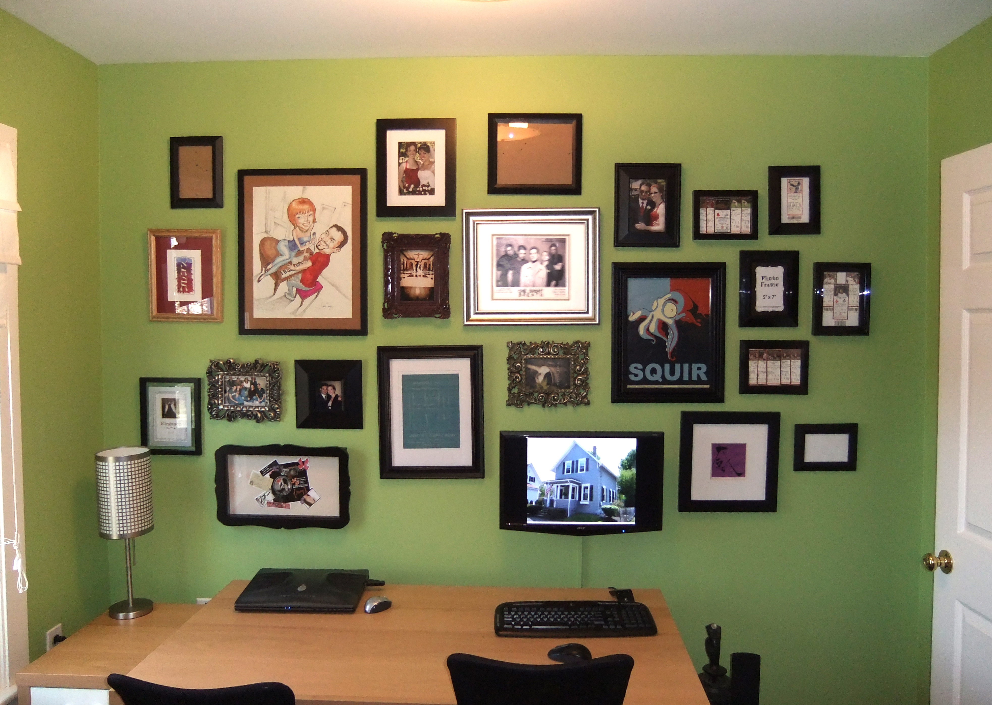
Hooray for weekend room transformations! The office now has its very own gallery wall (with my personal touch to make Hubby happy).

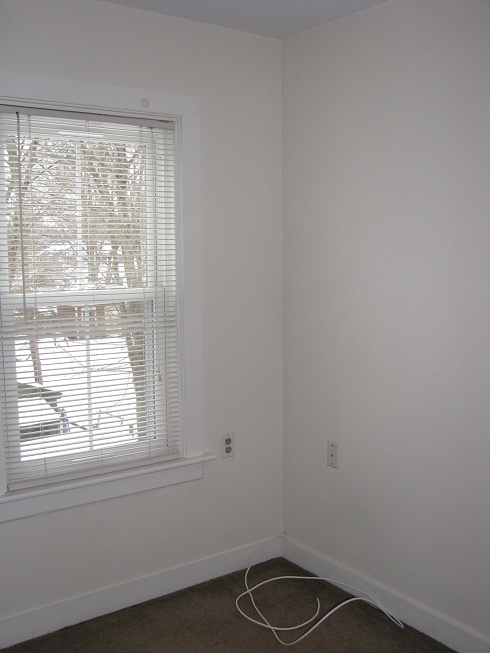
As a reminder, here is what the office looked like before we got our hands on it.

Office (other side)

Zzzzzzzzzzzzzz................  Oh I'm sorry, where was I?  Ah yes- the office was a snoozefest before.  After a good coat of *bright* green paint and our (sleepy IKEA leftover) furniture moved in, it was a little livlier.

My plan all along was to create a gallery wall behind the desks, so I made up my mind to tackle that this weekend.  Mid week, a lightbulb went off in my head when I was melting in front of the TV...  You never see computers in design magazines of offices and desks.  Occasionally you see a laptop or a cute little Mac.  But, the million dollar question here is: How do you make both an interior designer and an obsessed gamer (Hubby) happy?

Drum roll please!

...........................................................

Ta Da!!!

You mount the monitor amongst pictures giving it a place of honor to shut up make the gamer happy and make it blend with all the pictures and art to make the designer happy.  Success on both parts!  Huzzah!

THE PROCESS:

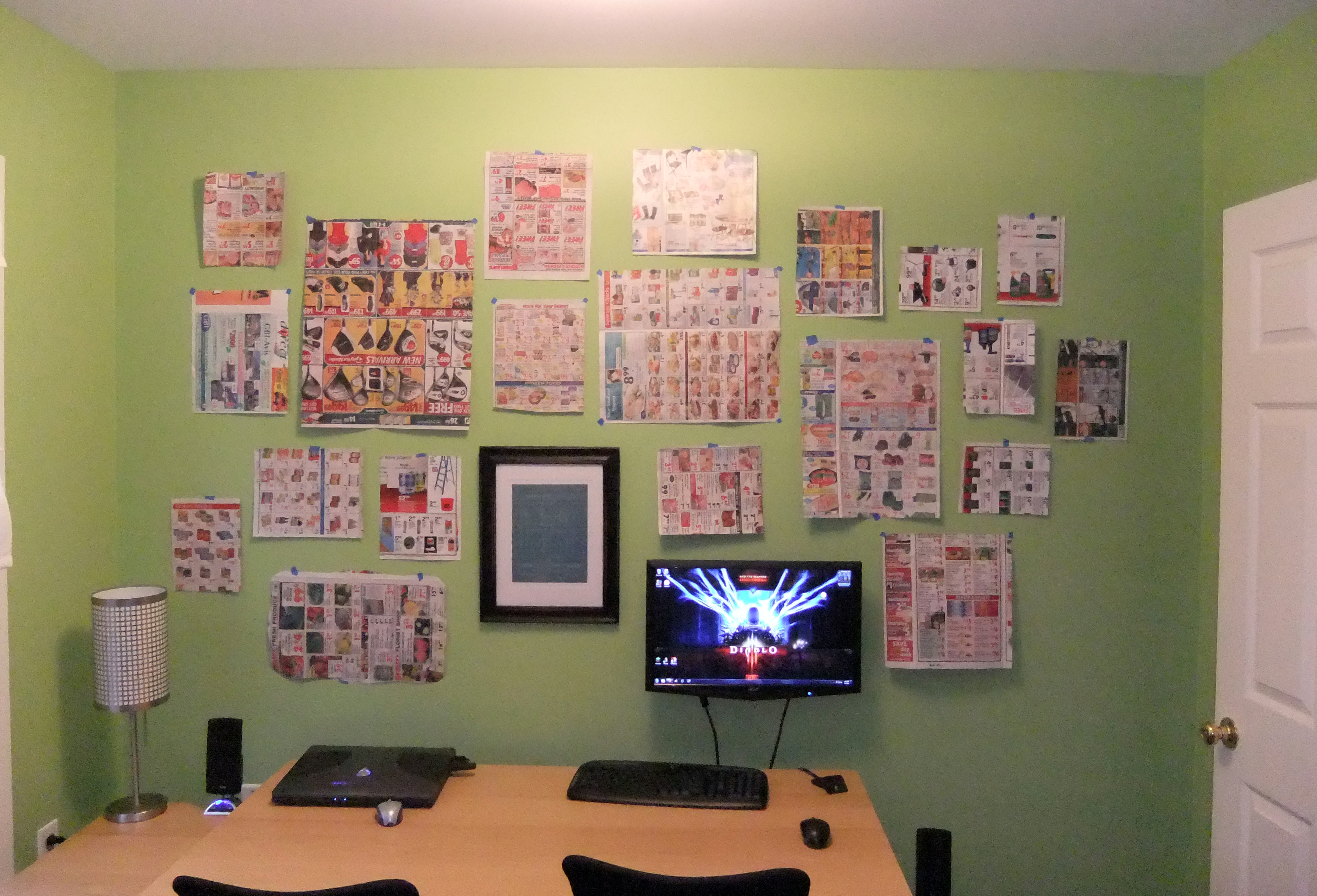
I started as most would recommend- cutting out paper the size of the frames and placing them on the wall to figure out placement.

The monitor got mounted first since it was the only thing that NEEDED to be in a certain place.  The other item mounted in the picture above is a plot plan blueprint of our property from 1917 when the house first transferred owners (to the best of my knowledge).  Very cool!  When we moved in, the last owners left us a box of appliance manuals and extra lightbulbs... in the bottom was an envelope labeled "Leave for new owner."  Inside was the plot plan and deeds from 1917, 1924, and 1956 (I think those are the right dates.  I'm far to lazy to dig them out of the basement to double check currently, sorry!).  Hubby and I agreed that we wanted the blueprint hanging in the house.  and Yes, we will leave it for the next owners, but until then we plan to enjoy it!

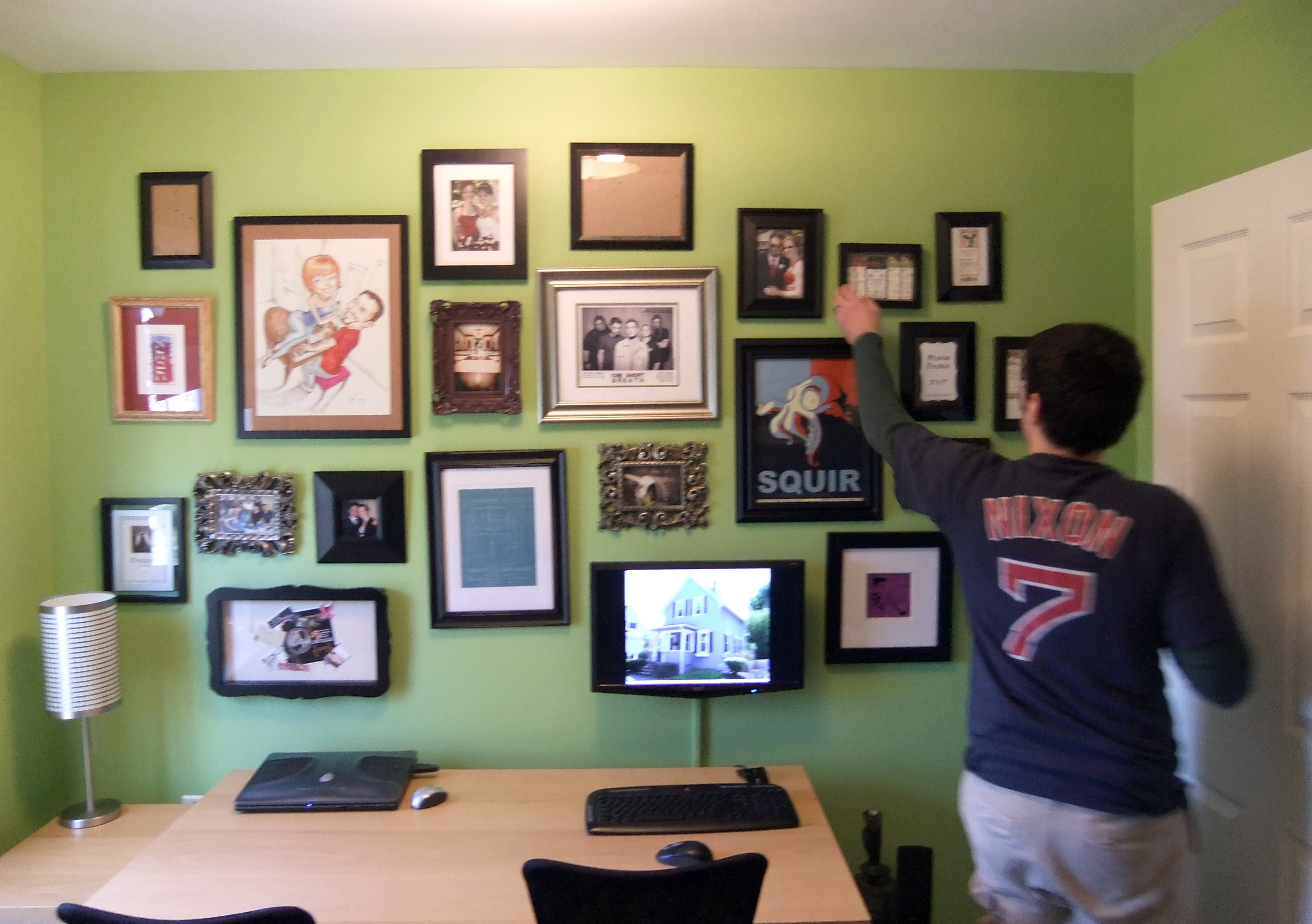
I put all the items up as planned, then switched a few around and moved a few this way or that way (more holes oops).  But I'm beyond pleased with the outcome.

When it came time to photograph the result, I had to politely kick Hubby off his computer game before I lost the remaining daylight.  I asked him to put a pretty picture on the monitor before he evacuated the chair, so he picked a pic of the house- thumbs up.  After a few test shots, I heard "wait, hold on"  and Hubby proceeded to straighten a few frames.  Maybe my anal retentive detail oriented side is rubbing of on him a bit.  Or maybe its just wishful thinking.

Yes, there are quite a few empty frames there.  I need to print some pictures or find some cool art to put in, but just getting it up makes me very happy.  My next plans for this space include a traditional style custom desk by yours truly, a few industrial looking drawer units from IKEA, and patterned side chairs to use as desk chairs.

This will look like an interior designer lives here eventually!