Before & After

My Office Updates (progress)

I was trying to hunt through my photo archives for some good "before" pics of my office, but for some strange reason they're all small vignette images.  Ok, not so strange- my office has never been fully photo-worthy so I just tried to show you pretty little snippets and hide the rest. office2

This one below from when I first switched out the light fixture is definitely the most true:  yellow walls from the last owner, cheap roman shade from our last apartment, a delightfully photogenic elliptical in front of a store bought, dirty brown cat perch, in a window with decorative trim that doesn't match any of the other trim in the house, and an awkward outlet on the wall with several power strips plugged into it for the computer and TV on the wall on the right.

old-office-light-3

It's other charming features included coax cable running along the baseboard on 3 walls, baseboard which also did not match any other trim in the house, the hideous old carpet, no real desk space, just a cubby I used to sit in front of,

IKEA-lamp-2

oh, and a yellow maple closet door that Bear is modeling here: (also note the baseboard and coax cable- sexy)

bear-carpet

I am beyond pleased to say that most of the offenses have been remedied and the office is on it's way to being a gorgeous, functional office/den/work out room.  There's still a ton to go decoration-wise, but the shell is set.

Daisy wanted to be a part of the progress shoot since Charlie (Bear) was in the befores...

No more orange wood closet door and trim and walls both got Ben Moore's Dune White (Satin on trim and matte on walls).

office-progress-1


Once I get the decoration on the office/TV wall set, I'll put some simple artwork above settee.  For the settee itself, I'll be making several new pillows with pops of color.


office-progress-2

My $25 Brimfield chair will get reupholstered and get casters for usability and the TV is going to be getting a fancy shelf unit around it with sliding art to hide the big black box when not in use.  I'm still working out those logistics.  The window now has appropriate square trim that matches the rest of the house and will (at some point in the nearish future) don a new DIY roman shade.

office-progress-3

The new desk was a craigslist find and needs a little love eventually, but there are other more pressing design matters in here.  The new IKEA cubby doors will be getting painted gray and get matching handles to their drawer counterparts.  As you can see, however, I already remedied the ugly brown cat perch with a custom built one (tutorial coming soon!) which the cats only chose to use a fraction of the time.

office-progress-4

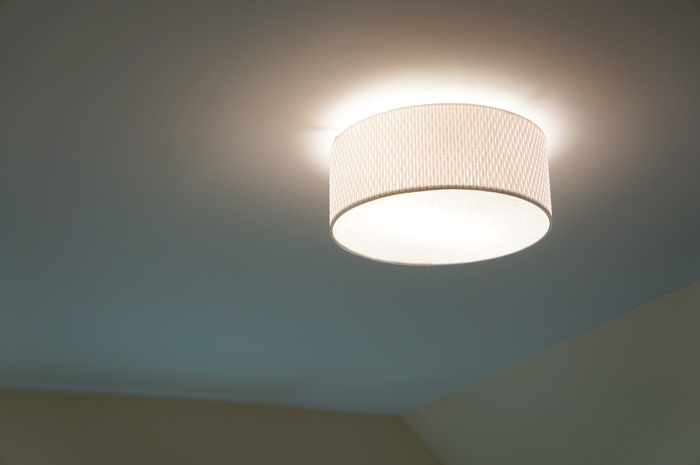
The overhead light needs to be replaced again too.

new office light 2

While I still like the IKEA light, the shade shines a yellowish glow on the new white walls.

As you can see my office has come a long way, but still has a way to go and several fun projects ahead!  Now if only I could stop working and focus on finishing my office, I'd have a beautiful space to work!  That might be a little counter-productive though.....

Antique Newel In Progress

I feel like I'm juggling 2 jobs right now- the flip and our own house reno which is seemingly never ending (aren't they always?).  Luckily we are able to function in our house now, but shockingly (or not) my 'little' floor refinish project has snowballed.  Aside from needing new baseboards with the new floors and replacing the railing on the newly finished stairs, I'm using the floors as an excuse to fix a lot of my annoyances with the house- one BIG project instead of ten thousand little ones- makes sense, right?  RIGHT?? The next big step in the project is the stair railing.  This needs to happen asap so Hubby and I don't take a header down the steep steps.  Before that can happen, however, these antique newel posts that I picked up need to be rejuvenated.

antique newel posts before

Aside from the degraded finish, I needed to patch several holes from old hand rails and these suckers needed to be about a foot taller.  People were apparently shorter 100 years ago... or didn't mind having low handrails.

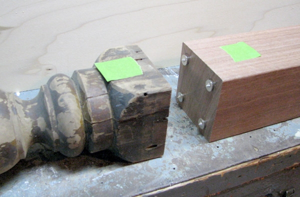
Handy Dad helped me to tackle the height issue and we devised a plan to marry the existing post with a mahogany 4x4.

First we cut down the bottom of the newel posts so we had a flat surface to attach the 4x4 to.

antique newel posts trimmed

Then, Handy Dad took over and doweled the newel post and the 4x4 together.  Essentially he drilled holes on one piece, then used transfer points to mark the other piece.

antique newel posts progress

Insert wooden dowels, wood glue, and clamp.

antique newel posts progress

Once the glue was dry, it was time for me to patch and sand my butt off.  I cut filler pieces out of the scrap we had from trimming the bases and glued them into the old slots- one on one railing and two on the other.

antique newel posts progress

And then sand for what seems like forever.  I started with a low grit and worked my way up to 220.

antique newel posts progress I would LOVE to be able to stain these newel posts and the railing to match, but sadly with all this patching regular stain is not an option.  Never fear, I have a plan!

While a solid stain alone would look flat and like I just painted the posts, a solid stain with a slightly darker stain/poly mix over it just might add the dimension that I'm hoping for.  Please disregard the ribs in the wood itself below- I was using the back of a floor board from my scrap wood pile.

antique newel posts color test

And since this is where I currently stand, this is where I leave you for today.

Will I be able to make these old newel posts look good?  Will my experimental finish work?  Stay tuned next week for the thrilling newel post conclusion!

Millie: Bathroom Reveal!

I hope you enjoy these updates as I learn to navigate through the business of flipping houses.  This flip, Millie is the most challenging and most exciting yet! You can find more about this house and about my 3 previous flip houses here. After a week of reveals, we've finally reached Friday and the last space inside the house to show you: the family bathroom!

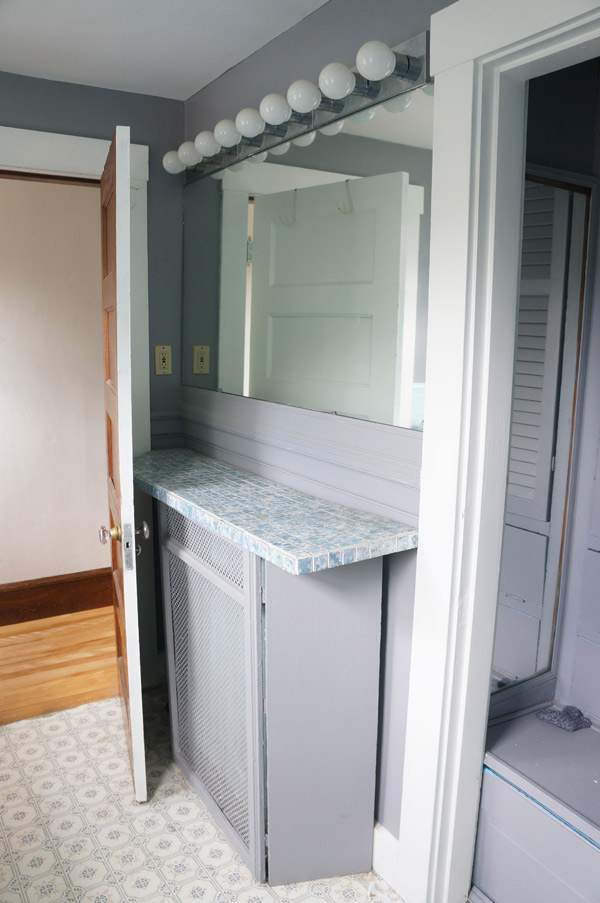
Originally it was giving me a bad case of the blues.  A very bad case.

millie-bathroom-before-1

But no more

Millie the Fliphouse family bathroom reveal via Year of Serendipity

millie-bathroom-before-3

Millie the Fliphouse family bathroom reveal via Year of Serendipity

millie-bathroom-before-4

Millie the Fliphouse family bathroom reveal via Year of Serendipity

millie-bathroom-before-5

Millie the Fliphouse family bathroom reveal via Year of Serendipity

One of the key things that I did in this bathroom to make it feel so much larger was to pull both the sink and the tub of the floor.  Now that you can see the tile floor continuously, the bathroom feels much more spacious.

Millie the Fliphouse family bathroom reveal via Year of Serendipity

Millie the Fliphouse family bathroom reveal via Year of Serendipity

And the shower curtain still makes me weak in the knees- SO perfect for the space!

Millie the Fliphouse family bathroom reveal via Year of Serendipity

Aside from my sheer excitement to be wrapping up all the interior work, I'm also very relieved that the yard didn't fare too terribly over the winter.  After all the time and energy that I spent on it last fall I was afraid that it would be back to a mess this spring.  Let's take a walk down memory lane.

Millie-Ext-1

Same house, same vantage point, but it looks a bit different, no?

Millie the Fliphouse exterior reveal via Year of Serendipity

Millie-Ext-6

While not in bloom quite yet, the view on this charming little street/walkway has changed for the better and the neighbors couldn't be more happy.

Millie the Fliphouse exterior reveal via Year of Serendipity

Who knew this...

Millie the Fliphouse exterior reveal via Year of Serendipity

was hiding under all this?

Millie-Ext-10

And this, I kid you not...

Millie-Ext-before-1

turned into this (disclaimer: when I say turned into, I do mean took many many hours of sweat and hard labor).  For a reference point- the holly filling up the left of the before pic is the nicely trimmed holly bush to the right of the porch.

Millie the Fliphouse exterior reveal via Year of Serendipity

I couldn't be happier with the transformation that this house has gone through!

If you missed the rest of my week of reveals, go check out the kitchen, bedrooms, master suite, and living areas.  I dare you not to want to live here!

I'll leave you with one last picture.  This image is of one of the basement murals and I think it's a great way to conclude this renovation.

Sunset and Journey's End

millie-journeys-end