Decor

Gettin' my Gallery on

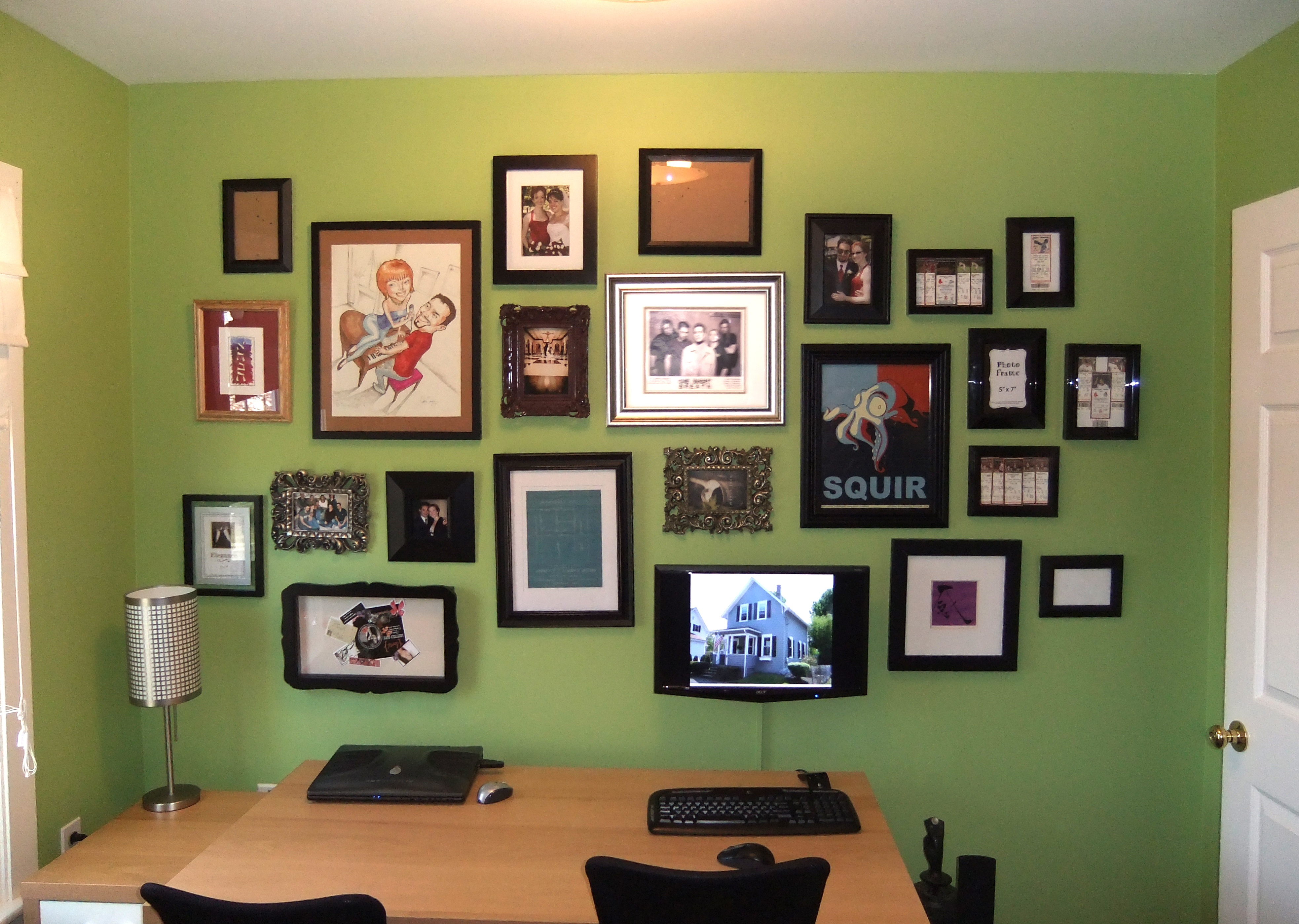
Hooray for weekend room transformations! The office now has its very own gallery wall (with my personal touch to make Hubby happy).

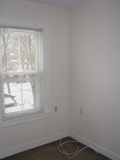
As a reminder, here is what the office looked like before we got our hands on it.

Office (other side)

Zzzzzzzzzzzzzz................  Oh I'm sorry, where was I?  Ah yes- the office was a snoozefest before.  After a good coat of *bright* green paint and our (sleepy IKEA leftover) furniture moved in, it was a little livlier.

My plan all along was to create a gallery wall behind the desks, so I made up my mind to tackle that this weekend.  Mid week, a lightbulb went off in my head when I was melting in front of the TV...  You never see computers in design magazines of offices and desks.  Occasionally you see a laptop or a cute little Mac.  But, the million dollar question here is: How do you make both an interior designer and an obsessed gamer (Hubby) happy?

Drum roll please!

...........................................................

Ta Da!!!

You mount the monitor amongst pictures giving it a place of honor to shut up make the gamer happy and make it blend with all the pictures and art to make the designer happy.  Success on both parts!  Huzzah!

THE PROCESS:

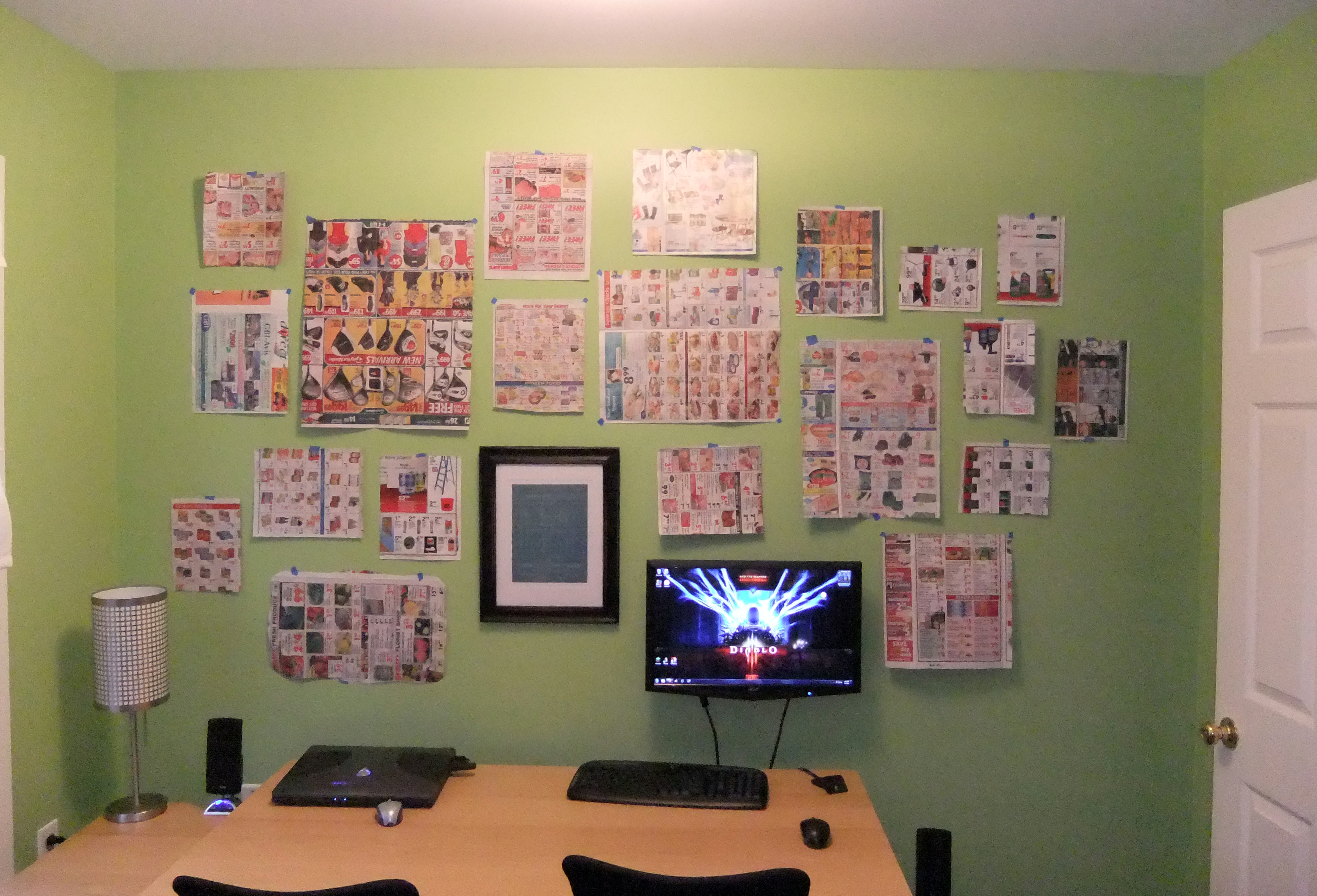
I started as most would recommend- cutting out paper the size of the frames and placing them on the wall to figure out placement.

The monitor got mounted first since it was the only thing that NEEDED to be in a certain place.  The other item mounted in the picture above is a plot plan blueprint of our property from 1917 when the house first transferred owners (to the best of my knowledge).  Very cool!  When we moved in, the last owners left us a box of appliance manuals and extra lightbulbs... in the bottom was an envelope labeled "Leave for new owner."  Inside was the plot plan and deeds from 1917, 1924, and 1956 (I think those are the right dates.  I'm far to lazy to dig them out of the basement to double check currently, sorry!).  Hubby and I agreed that we wanted the blueprint hanging in the house.  and Yes, we will leave it for the next owners, but until then we plan to enjoy it!

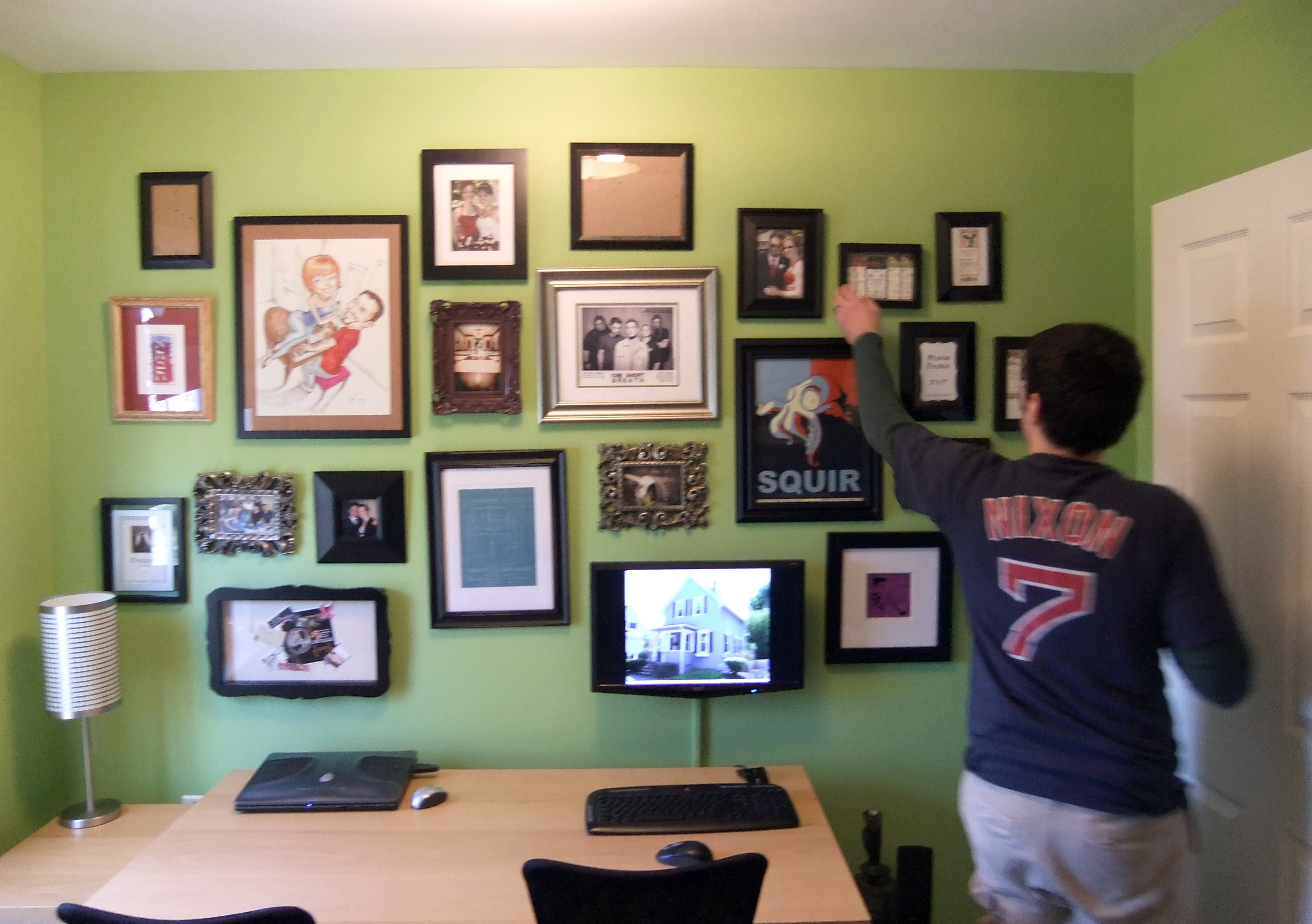
I put all the items up as planned, then switched a few around and moved a few this way or that way (more holes oops).  But I'm beyond pleased with the outcome.

When it came time to photograph the result, I had to politely kick Hubby off his computer game before I lost the remaining daylight.  I asked him to put a pretty picture on the monitor before he evacuated the chair, so he picked a pic of the house- thumbs up.  After a few test shots, I heard "wait, hold on"  and Hubby proceeded to straighten a few frames.  Maybe my anal retentive detail oriented side is rubbing of on him a bit.  Or maybe its just wishful thinking.

Yes, there are quite a few empty frames there.  I need to print some pictures or find some cool art to put in, but just getting it up makes me very happy.  My next plans for this space include a traditional style custom desk by yours truly, a few industrial looking drawer units from IKEA, and patterned side chairs to use as desk chairs.

This will look like an interior designer lives here eventually!

Objectified

Not in the usual sense of the term, of course.  Here I'm using the work objectified to represent the tchotchke-fication of a space.  Think- sexified with objects. Now that I've created a whole new vocabulary for my post and probably lost you within the first paragraph, I'll continue.

I've been thinking a lot lately(among every other house-related thing) about how to best utilize objects in a space to personalize it to add a WOW factor.  If you knew me back in middle school, you're probably thinking- "This girl has zero issues adding accessories (read: crap)."  My room was a tchotchke and color explosion.  Every surface was covered- horizontal & vertical.  Around the time I went to college, I woke up one day and realized how completely psychotic the space around me had become and proceeded to totally de-tchotchke-fy my surroundings.  Those 2 sides of my personality have been entrenched in a power struggle ever since.

In previous apartments, I've kept the accessories to a minimum (for me), but I'm realizing now that some of the spaces lacked a certain depth.  Just like Stacy & Clinton always preach on What Not to Wear, layering is the key to adding visual interest in an outfit space.  Layering requires a certain finesse that is admittedly my design kryptonite .  I get so distracted by the 'big idea' or little shiny objects that its hard to focus on the in-between.  I need practice in layering the big and little.  I am soooo tempted to run out and buy a bunch of brand new decorative items and start layering them, but I'm putting my own breaks on.  98.67% of the items* in our house are new(ish).  We have random items that have a history (a watercolor by Hubby's Nana, my Grandma's piano...) but most of the stuff we have just FEELs new.  Since we are striving for an eclectically sophisticated balance in the house, I need to even out the new pieces with vintage and vintage inspired.

I have a vision!

Well, I have many- generally multiple for each room of the house.  The specific vision I speak of is about candlesticks in the bedroom.  The other week at my successful IKEA trip, I also took home these beautiful silver glass pillar candlesticks.  So pretty (and shiny!) but on their own, they're lacking visual depth.

BUT as I mentioned, I have a VISION!  Those mixed with vintage ones acquired through tag sales** will be divine!  I've wanted to have this collection of candlesticks for years.  A couple years ago when I was designing my wedding center pieces (holy crap, where did the time go), my first choice was a collection of mismatched candlesticks on each table.  My plot was foiled by time (to collect them all) and by the fact that the location wouldn't let me put unenclosed candles (sadface).

Now I have a house and NO ONE (except maybe Hubby) can rain on my parade!

Did I mention I am excited for Spring and the start of Tag Sale** season??

How do YOU objectify your space?

---------------------------------------------------

* Totally accurate percentage, I promise

** or Yard Sales, or Garage Sales, or whatever you call them

*** images from ikea.com, brides.com

Belated Weekend Update

I am pleased to say I finally have the house in a place where I won't be embarrassed to have friends over for dinner!  So if you are one of my loyal yet patient friends, give me a call and we can plan a date.  If you aren't, maybe we should be friends ;-). Friday's weather was a tease... it SNOWED here yesterday.  Just when I finally got rid of every last bit of white on my property...   Winter sends me to the doldrums and I'm ready for green, warm, and SUN!  I'm solar powered.  But I digress (for now).

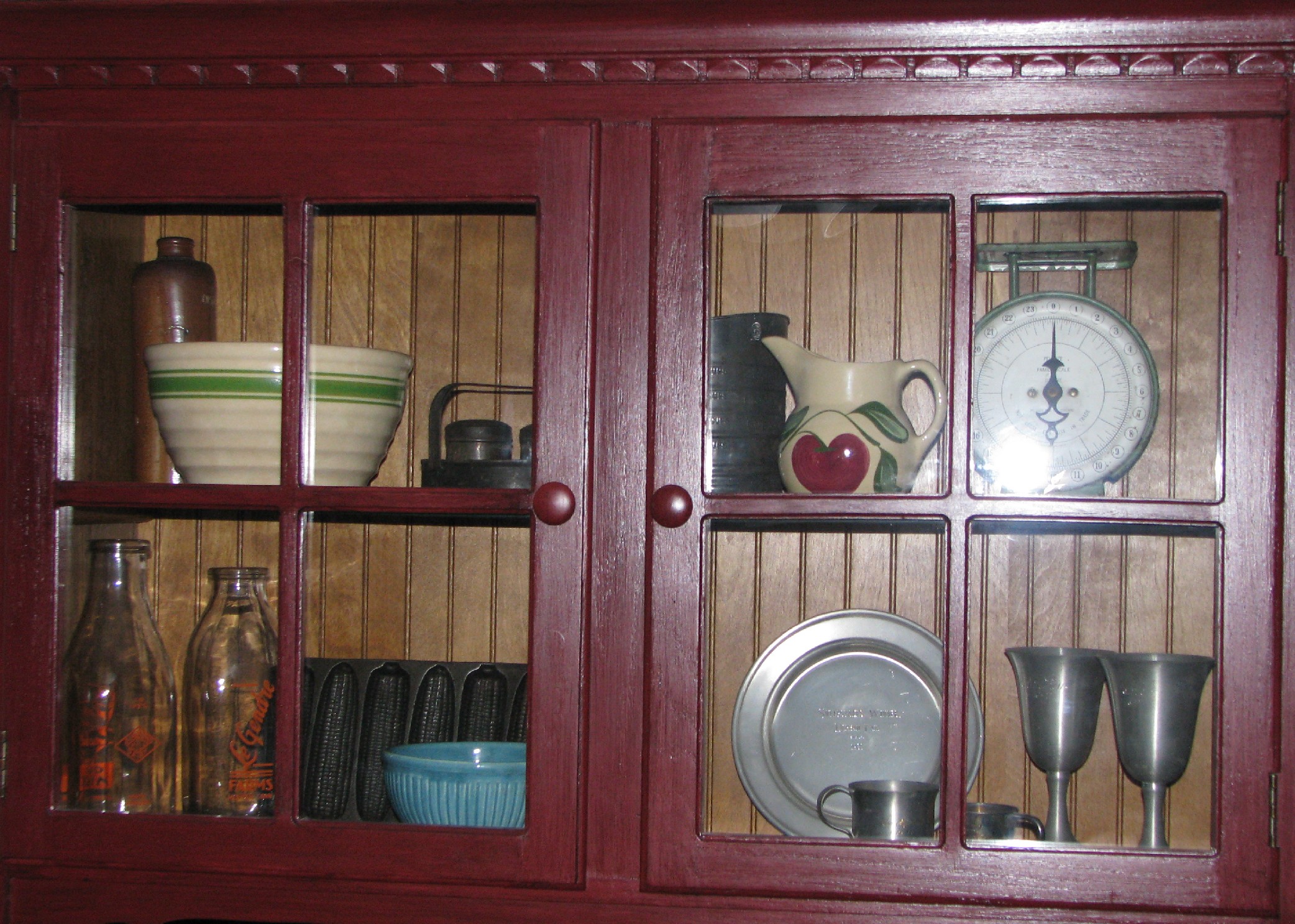
Back to the point of this post.  Saturday my loving parents came to visit for the first time since moving day- and I didn't put them to work!  Shocking, I know, but after painting 2 rooms and shoveling feet from my driveway before we even moved, I thought they deserved a reprieve.  We did take an adventure to the Cambridge Antique Market.  Fun place to check out, but I sadly walk out with nothing.  Mom was the only one who bought something- a bowl for $17.   Doesn't it look so cute in her cabinet (refinished curb-side find) surrounded by the other antiques?

Sunday was productive and frustrating.  I've finally started to hang some curtains and pictures, and at least move items to their destination room.  The living room got 2 new pieces of art I found at... you guessed it... HomeGoodsI've hung the aforementioned brown curtains in there as well and it just looks wrong.  I'm on the hunt for something lighter, brighter, and textural for the windows, but after going to just about every store I could think of that would carry inexpensive curtains (this was the very frustrating part of my weekend), I've accepted that they'll be an online purchase.

In moving art and misc decorative items to their respective rooms, I was able to clear them out of the dining room and actually see the space as it was intended for the first time.  The dining room is the only room that will fit the piano, so that forces the table off-center from the space.  We'll have to get a new chandelier and swag it above the table at some point.  I have BIG plans for the old chandelier, but you'll just have to wait and find out!  Seeing the space finally clutter-free, I'm even more convinced of my plan for the dining room table: a bench on one side, 2 matching(maybe) chairs with arms (possibly uphostered) on either end, and 2 other mismatched chairs.  All the seating elements will be tied together with a common color or fabric or something.  Tag sales (or garage sales, or yard sales, or whatever you call them) HERE I COME!

Last room that I'm getting excited about is the bedroom.  I can see a Hollywood regency theme coming together before my eyes (or at least in my mind, lol).  Hanging up this mirror between the windows made me very happy.  Ad that to the sexy gray walls and the oversized black furniture and I know exactly what the room needs.  Whether or not I can find the items I want will be the real battle.  I need to do some local investigating for awesome off-the-beaten-path design resources.