Flipping

Shorty the Flip House: Exterior Reveal

I hope you enjoy these weekly updates as I navigate through the business of flipping houses one house at a time!!  Come back every Friday to see how this house, aka Shorty, progresses from week to week.  To catch up on the progress on Shorty, check out his previous posts here.  If you’re new here, (Hello!!!) you can find more about my 5 previous flip houses here.  Thanks for coming along for the ride!!  

After checking out the living spaces, the bedrooms, and the bathrooms, before I show off the kitchen, let's pop outside and check out a bit of curb appeal.

The exterior of the house was literally the last thing to get finished.  First of all, the spring weather was less than cooperative with snow, rain, and cold that barely left us with a long enough stretch to do exterior work.  Add that too an exterior painter who kept changing his story which left us scrambling for someone to do a few repairs and someone else to refinish the deck with less than a week to spare.  Luckily, I have some great guys that I work with and my contractor squeezed the repairs into his schedule and my flooring guy found time to sand and stain the deck for us.  A bit too close to deadline than I like to be, though.  This time, it wasn't some self-imposed deadline, though.... it was for selling the house!  If you follow me on social media, you've been let in on the secret: we closed on selling Shorty on Tuesday!!!  We never even officially listed and had an offer while we were still in construction a month ago!  **Happy dance!!**  Having the deck stained the day before closing, however is something I plan not to repeat.

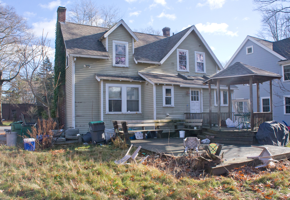
Even with all the headache of getting the exterior redone, the result was worth it.  The house started as a bland beige box with trash everywhere.
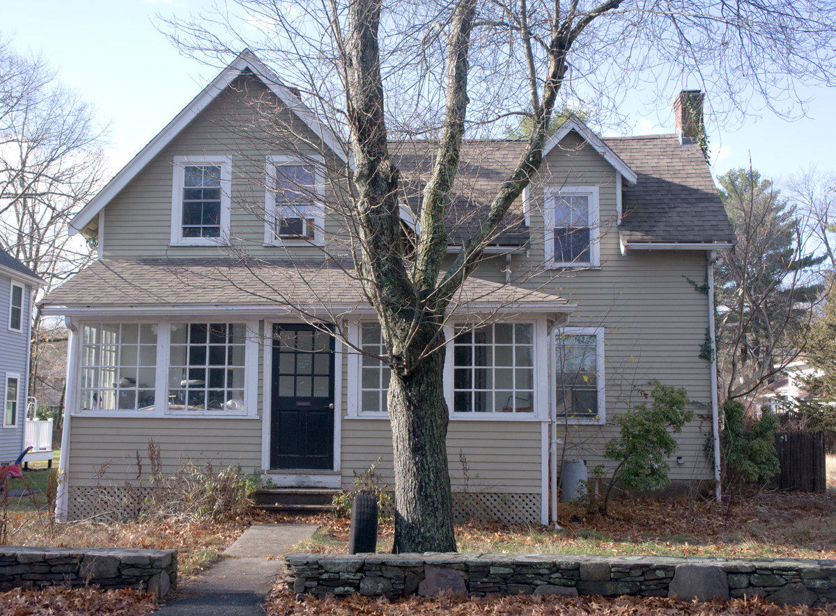
 

With some minor exterior repairs, taming the jungle a bit, clean windows, paint, and new gutters Shorty looks so welcoming now!
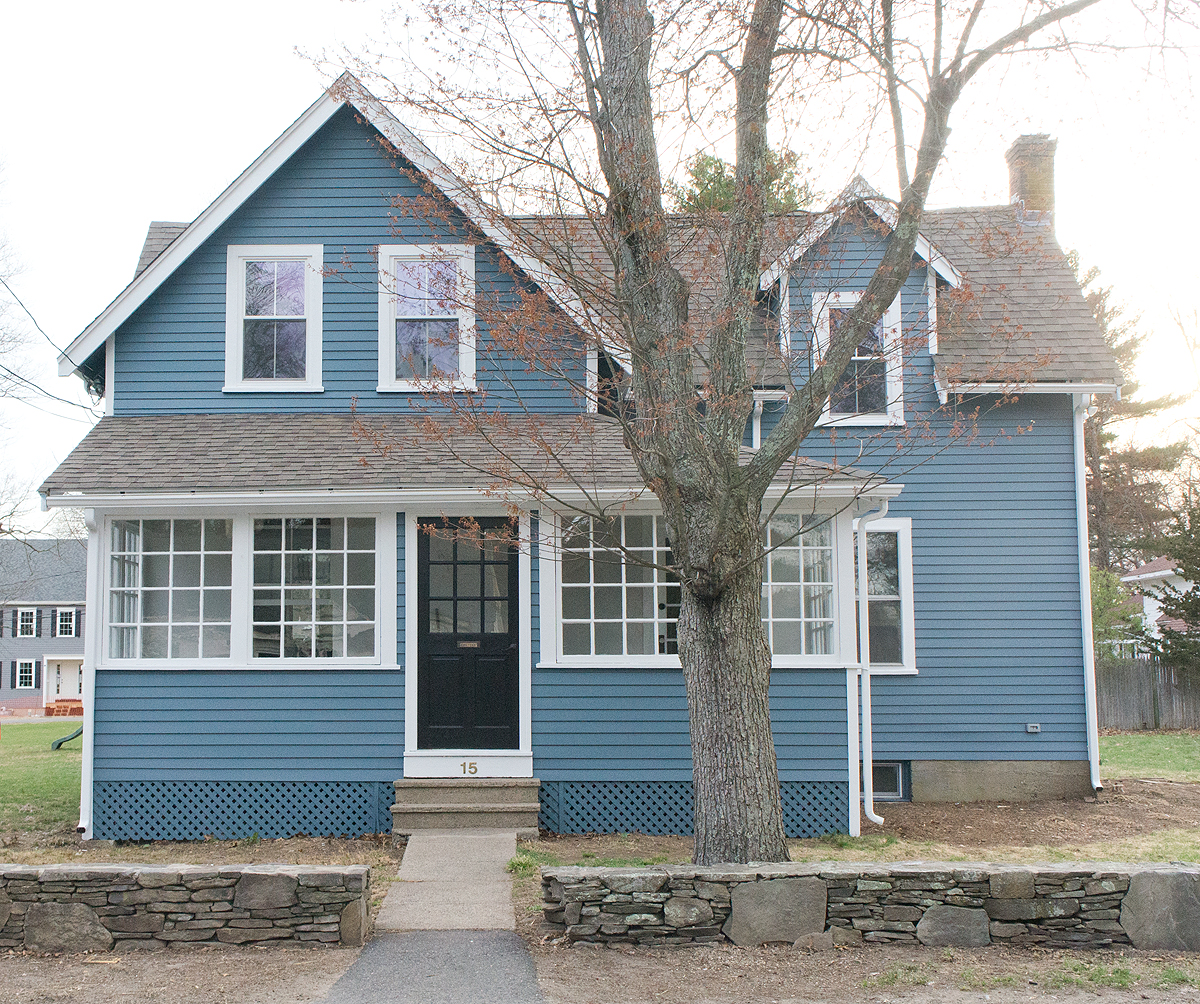
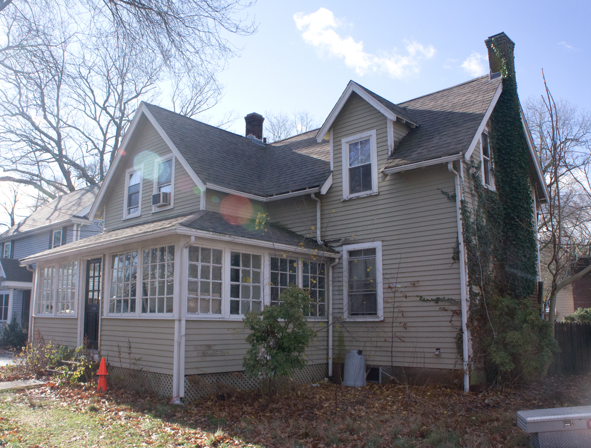


The house feels like it has a bit more presence.  We didn't add any square footage, but somehow it looks larger with the exterior refresh.
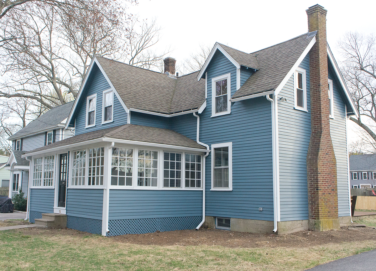


Much like the interior, the biggest impact was made with just clearing out the trash (and the neighbors rejoiced).
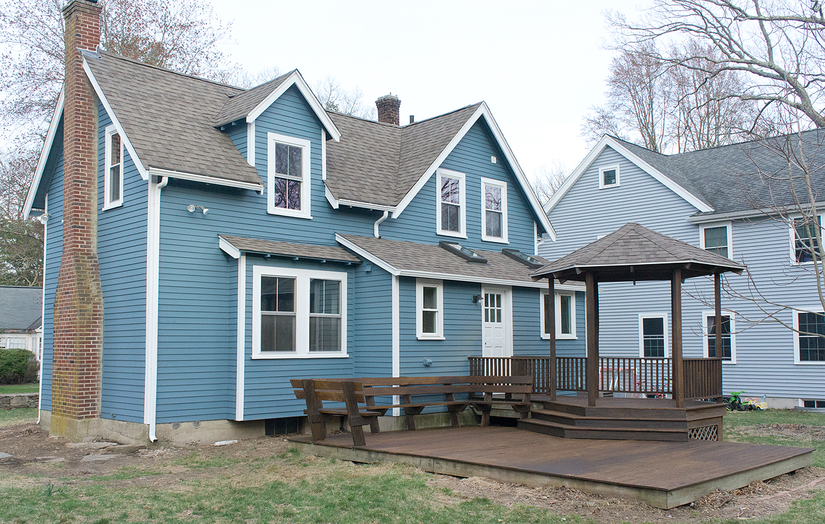
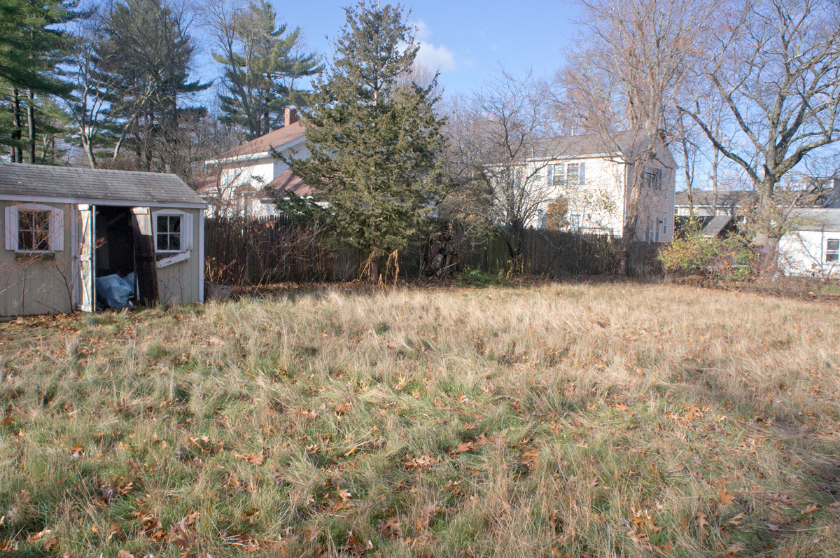


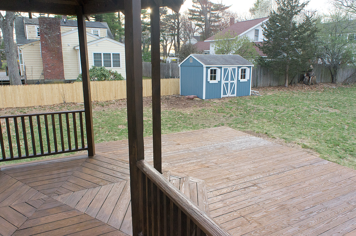
The back yard looks a bit safer for kids to play in now.  Shed and fence repaired, jungle tamed, trash cleared, and repaired/refreshed deck, all just waiting for the new owners to play and enjoy!
 

I'm excited to have handed the keys over to an excited young family.  It makes me so happy when I know that my buyers really love the house and appreciate the effort and care that has gone into the restoration.


After building anticipation all week, I hope you're ready to see the kitchen tomorrow!  It will be well worth the wait, I promise!!


Save

Save

Shorty the Flip House: Bathrooms Reveal

I hope you enjoy these weekly updates as I navigate through the business of flipping houses one house at a time!!  Come back every Friday to see how this house, aka Shorty, progresses from week to week.  To catch up on the progress on Shorty, check out his previous posts here.  If you’re new here, (Hello!!!) you can find more about my 5 previous flip houses here.  Thanks for coming along for the ride!!  

Reveal day #3!  If you missed the past couple days, check out the before and afters of the living spaces and the bedrooms.  Today we delve deeper into the bathrooms.

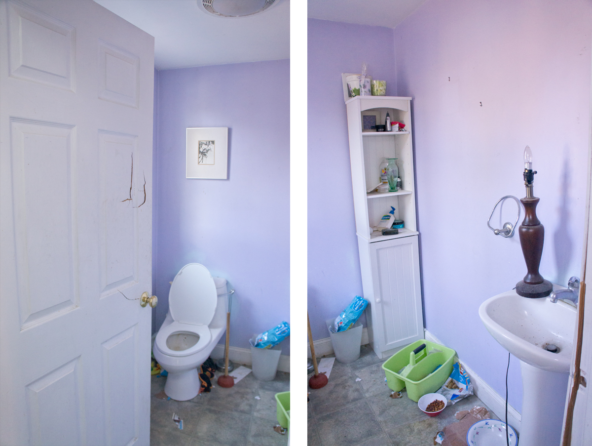
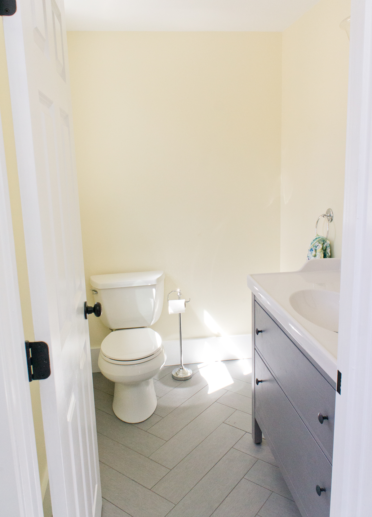
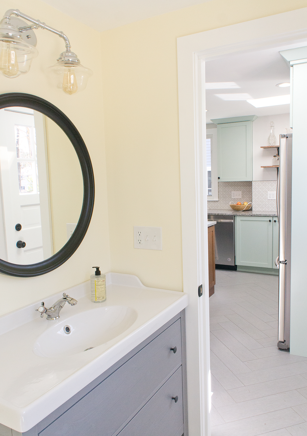
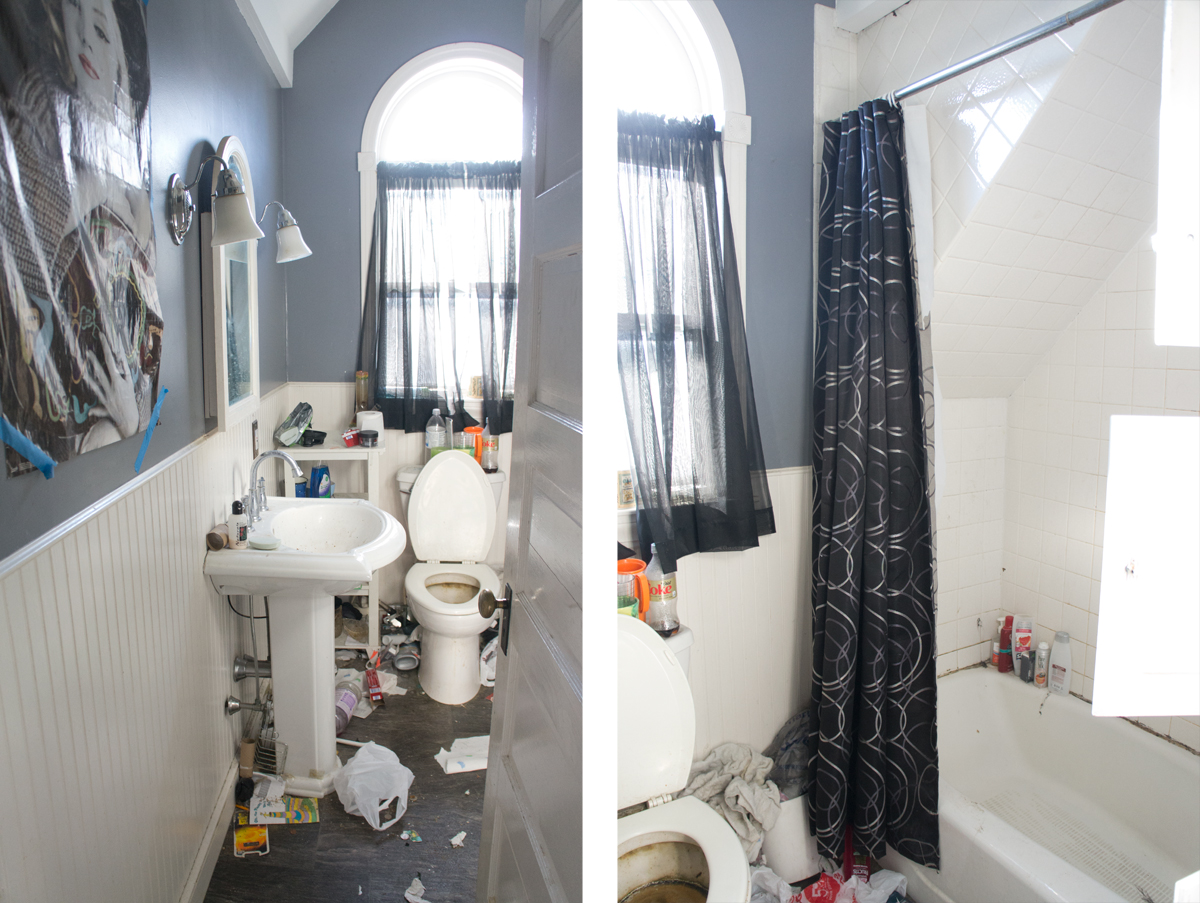
This house's bath and a half needed it all.  Since bathrooms and kitchens tend to sell houses, these spaces got pretty much everything new.  They were a bit of a challenge to photograph, though since both are rather narrow spaces.


Now with a new floor, toilet, door, and vanity (with storage!!) it's a whole new sunny space.


To make room for the narrow depth vanity, I had my contractor narrow the door and shift it a touch to the side, buying us JUST enough space.


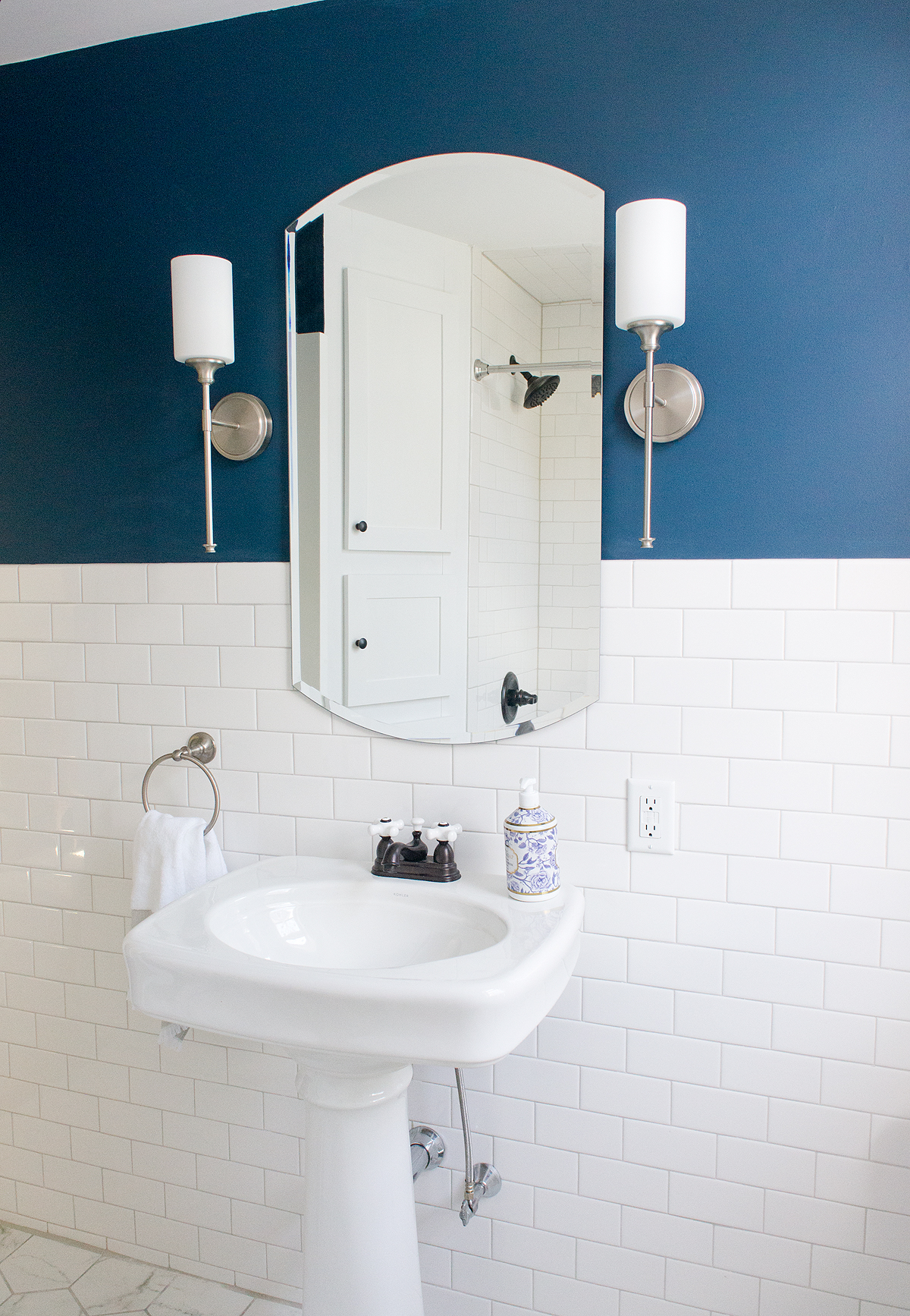
The upstairs full bathroom is a much more interesting space.  Where it started, not only was it in rough shape, but it also didn't feel like a bathroom that belonged in a 97 year old house.  If you know anything about me by reading this blog, you know that while I don't want to create a museum out of a historical home, I do think each modern space should have touches that help keep it grounded in the style and era of the house.  Little things like consistent trim throughout the house and timeless subway tiles can have a big impact in keeping a space like this from looking like a 90s bathroom in a 20s house.


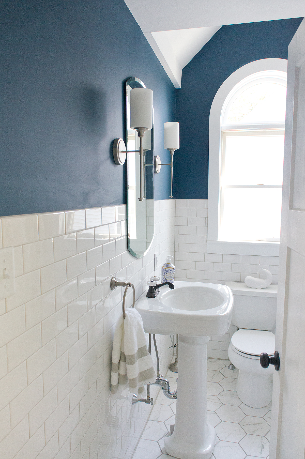
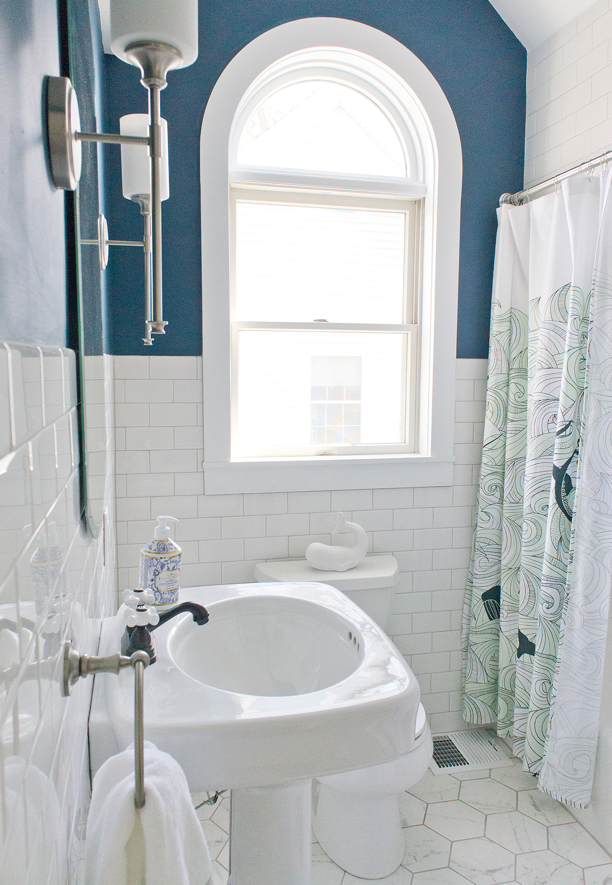
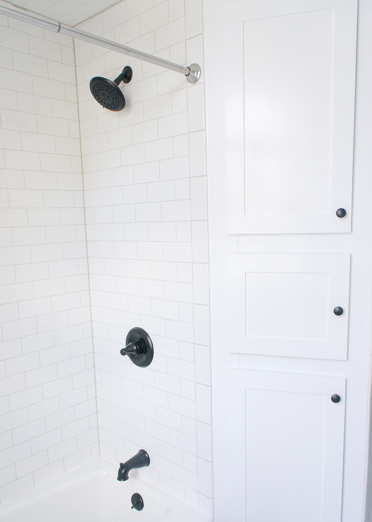
Again, this bathroom got new everything- floor walls, pedestal sink, toilet, lights, built-in doors, etc.  This is one of those spaces that I wish you could see in person and not just through my camera lens.  It's such a narrow space to try and capture, but I think it works so well in person!


My favorite view of the room- tall mirror and sconces to emphasize the height, vintage style pedestal and tile wainscoting to nod to the history of the house, and a bold wall color to make a modern statement.


Quite a difference in these rooms, isn't there?  Both rooms- but especially the upstairs bath- really put a smile on my face.


I hope I'm not torturing you too too much with the broken up reveals, but it helps to avoid a novel of a before and after post and I get to include more pictures- win-win for both of us I think.  Check back tomorrow to see the how different the outside of the house looks (spoiler: very) and then my FAVORITE space on Friday... the kitchen!!!


Save

Save

Save

Save

Shorty the Flip House: Bedrooms Reveal

I hope you enjoy these weekly updates as I navigate through the business of flipping houses one house at a time!!  Come back every Friday to see how this house, aka Shorty, progresses from week to week.  To catch up on the progress on Shorty, check out his previous posts here.  If you’re new here, (Hello!!!) you can find more about my 5 previous flip houses here.  Thanks for coming along for the ride!!  

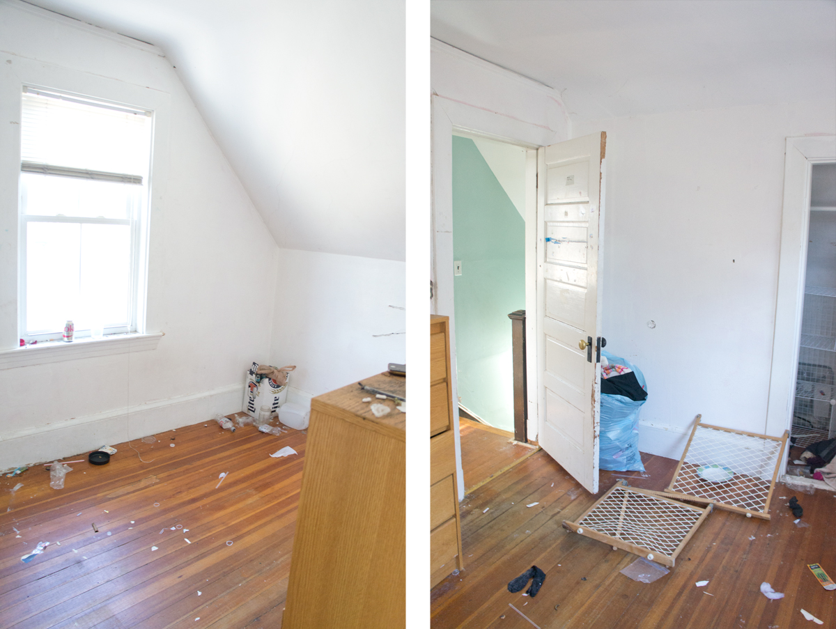
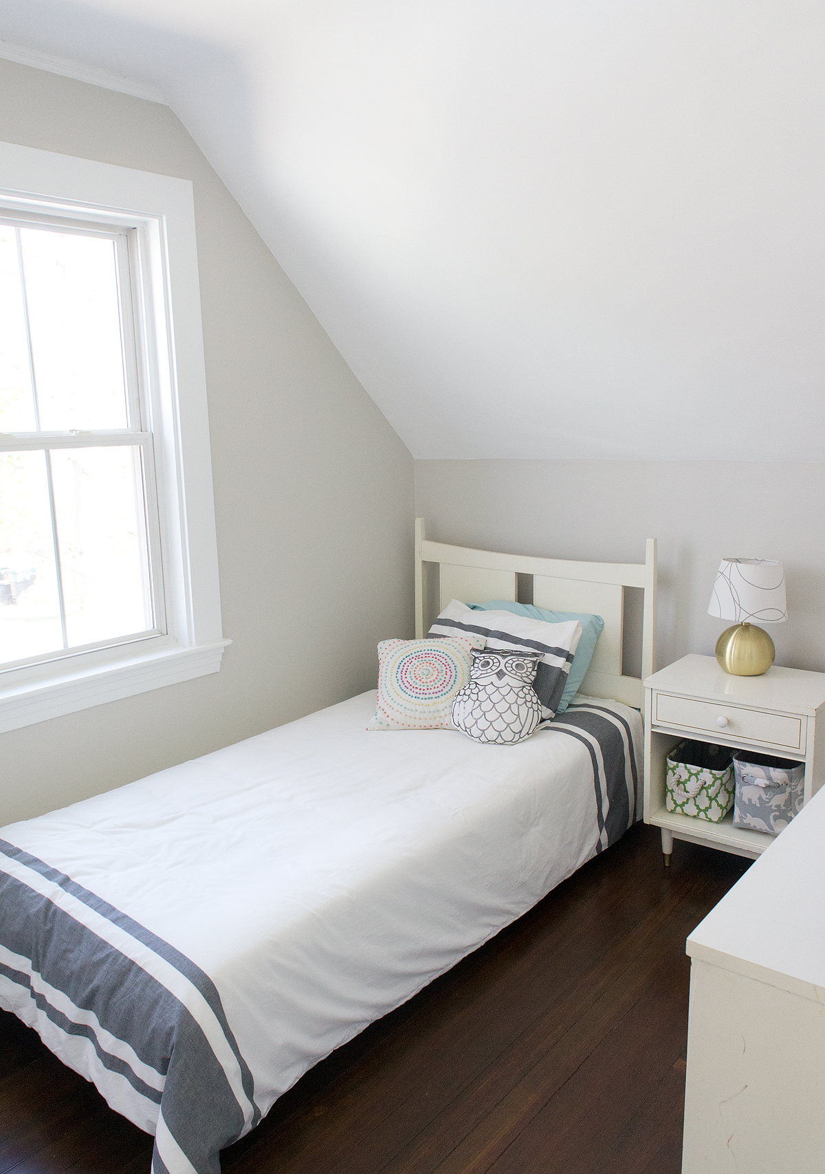
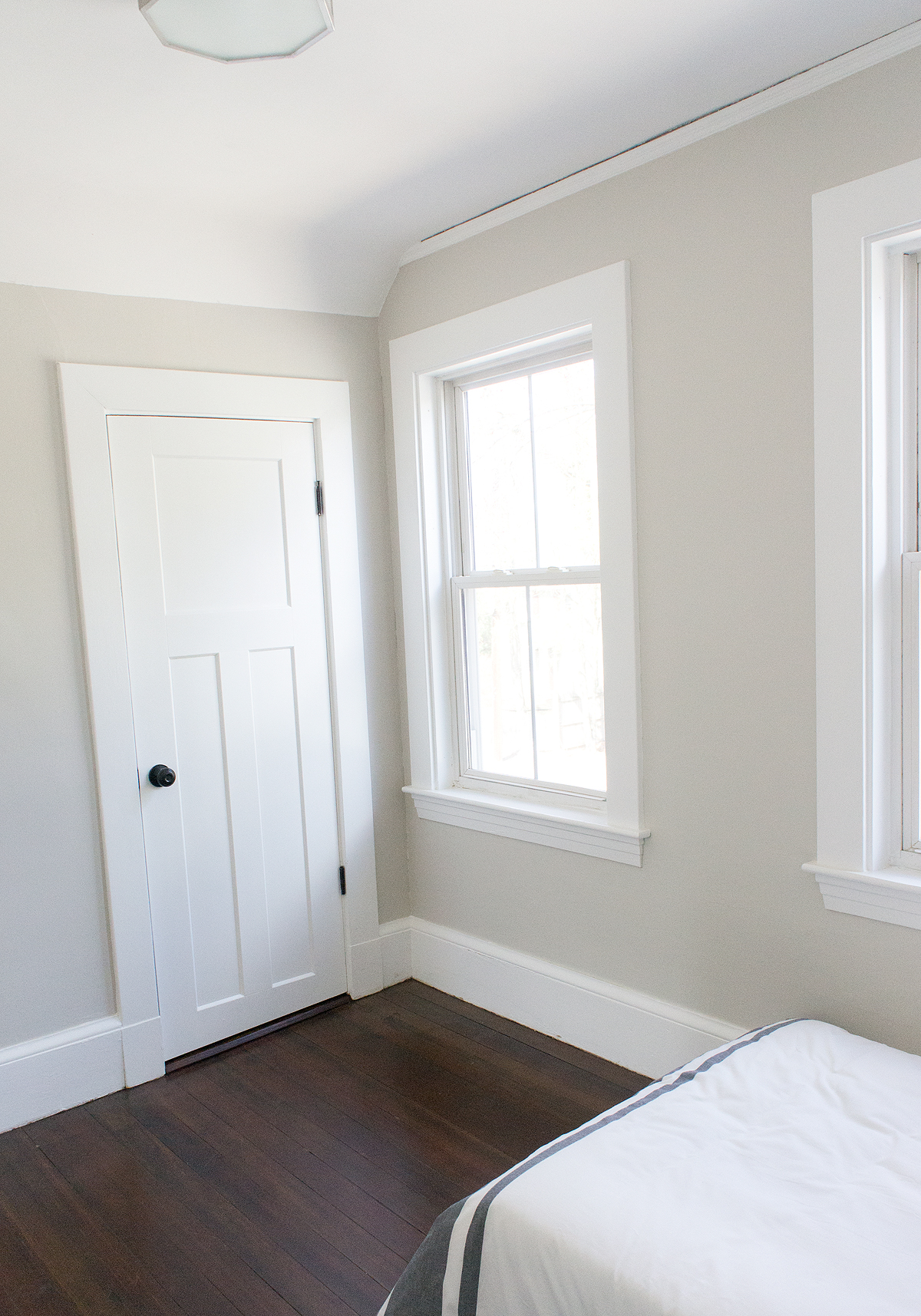
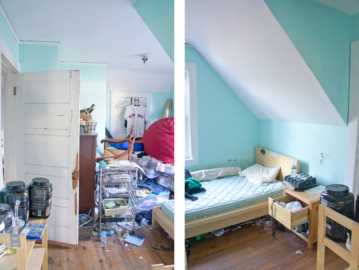
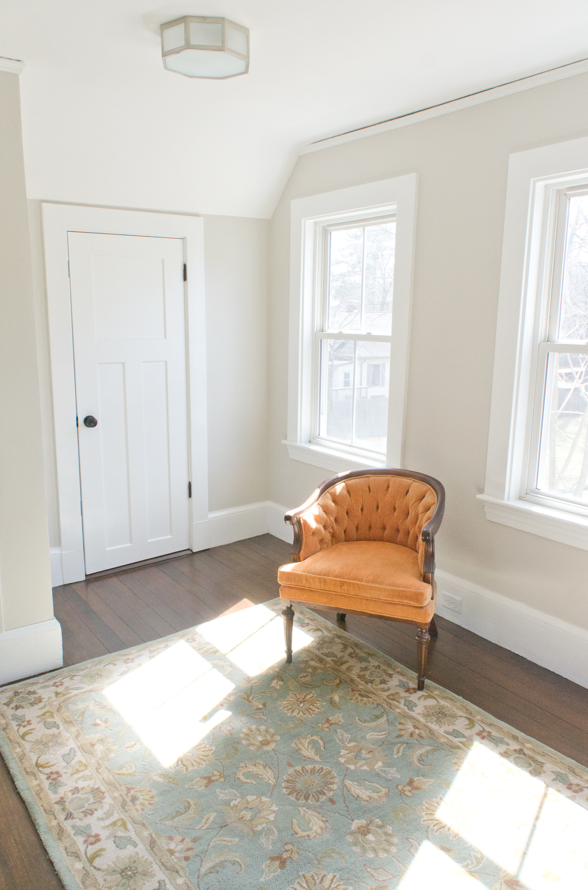
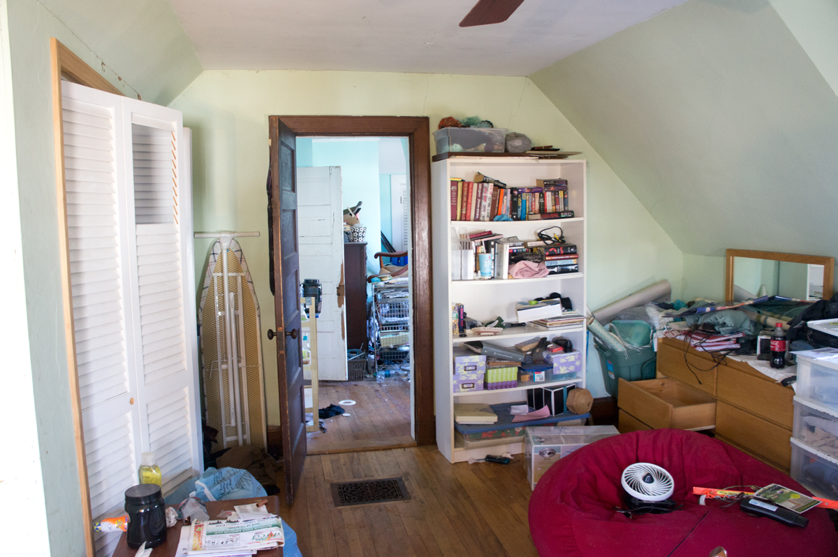
Are you guys ready for the next installment of Shorty the Flip House's reveal??  Did you catch the living spaces reveal yesterday?  Today is bedroom show and tell!  Shorty has 3 bedrooms according to town records.  One of those bedrooms is a bit atypical and you need to walk through a small bedroom to get to the much larger master- perfect for a nursery or office space.  Staging-wise, I kept it all minimal throughout the house and used items I already had.

Without further ado, we'll start in the first bedroom:


Refreshed just a bit...


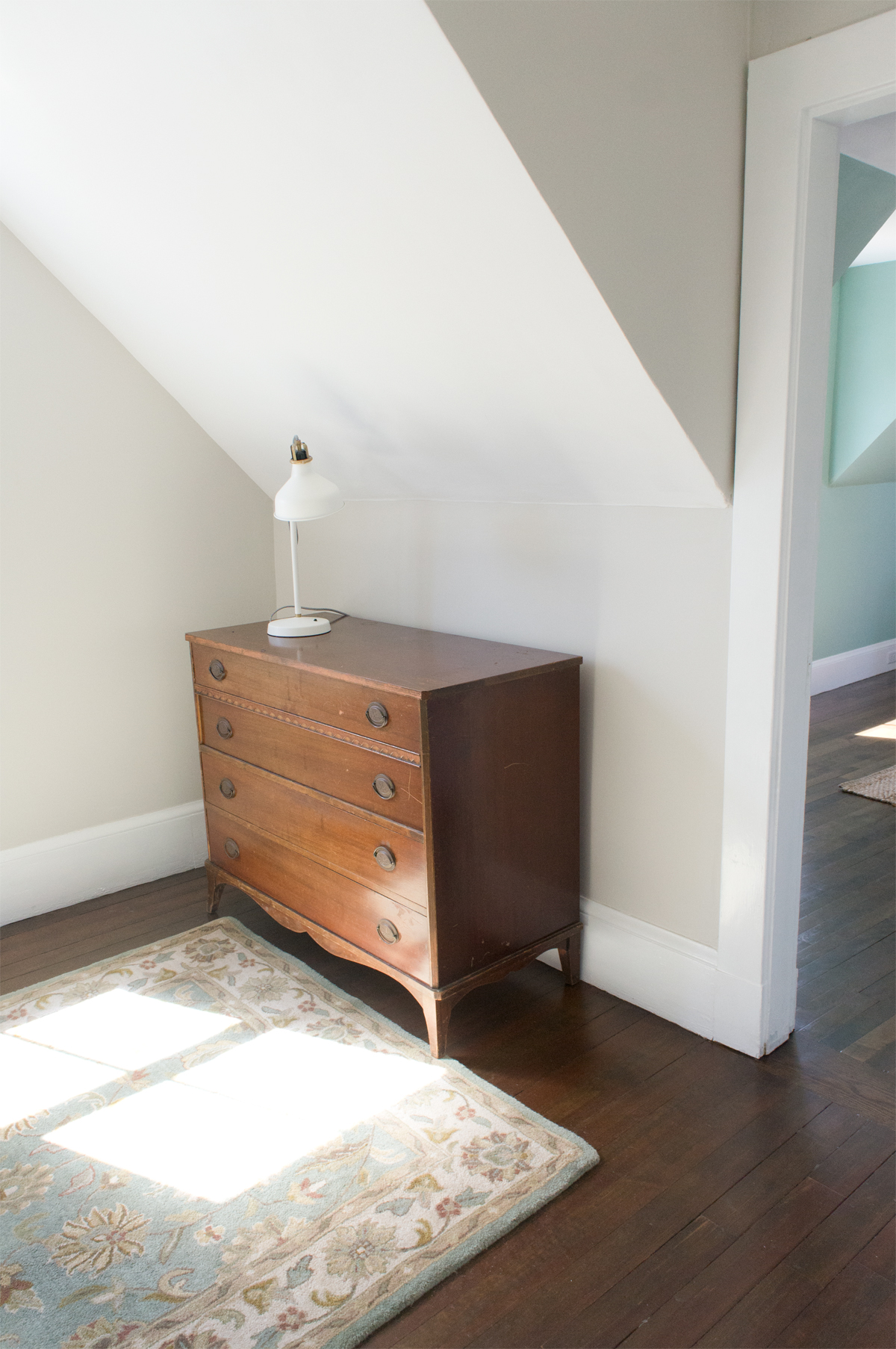
The walk-through bedroom, bedroom #2:


I was actually planning to stage this room as a home office with the desk that has now been ousted from my home office-turned-nursery, however we changed our plans last minute.  Moving the large desk that I had in mind would have been more than a little cumbersome to get up the stairs and into the space, so we opted for "minimal seating area."


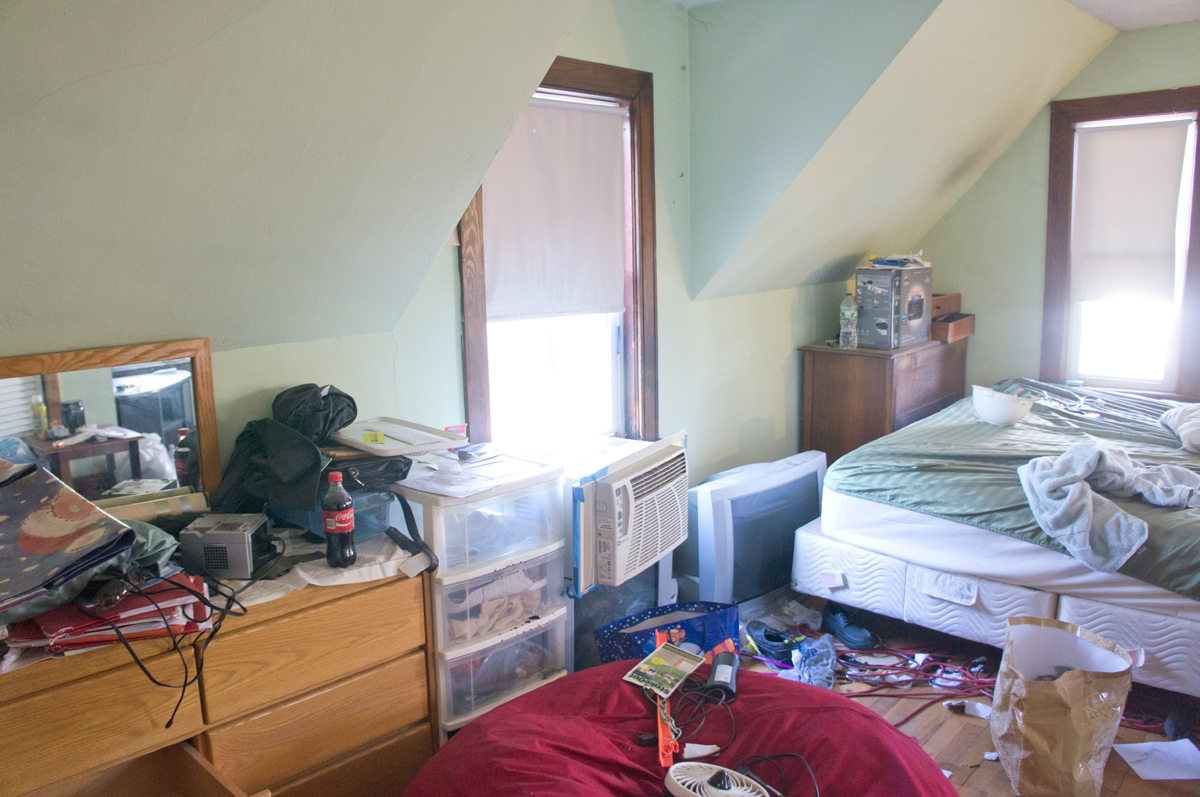
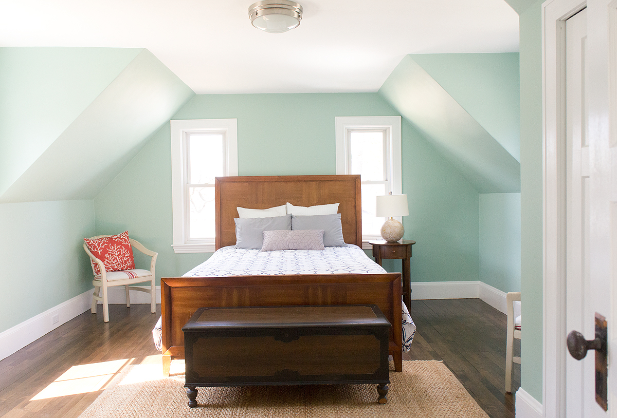
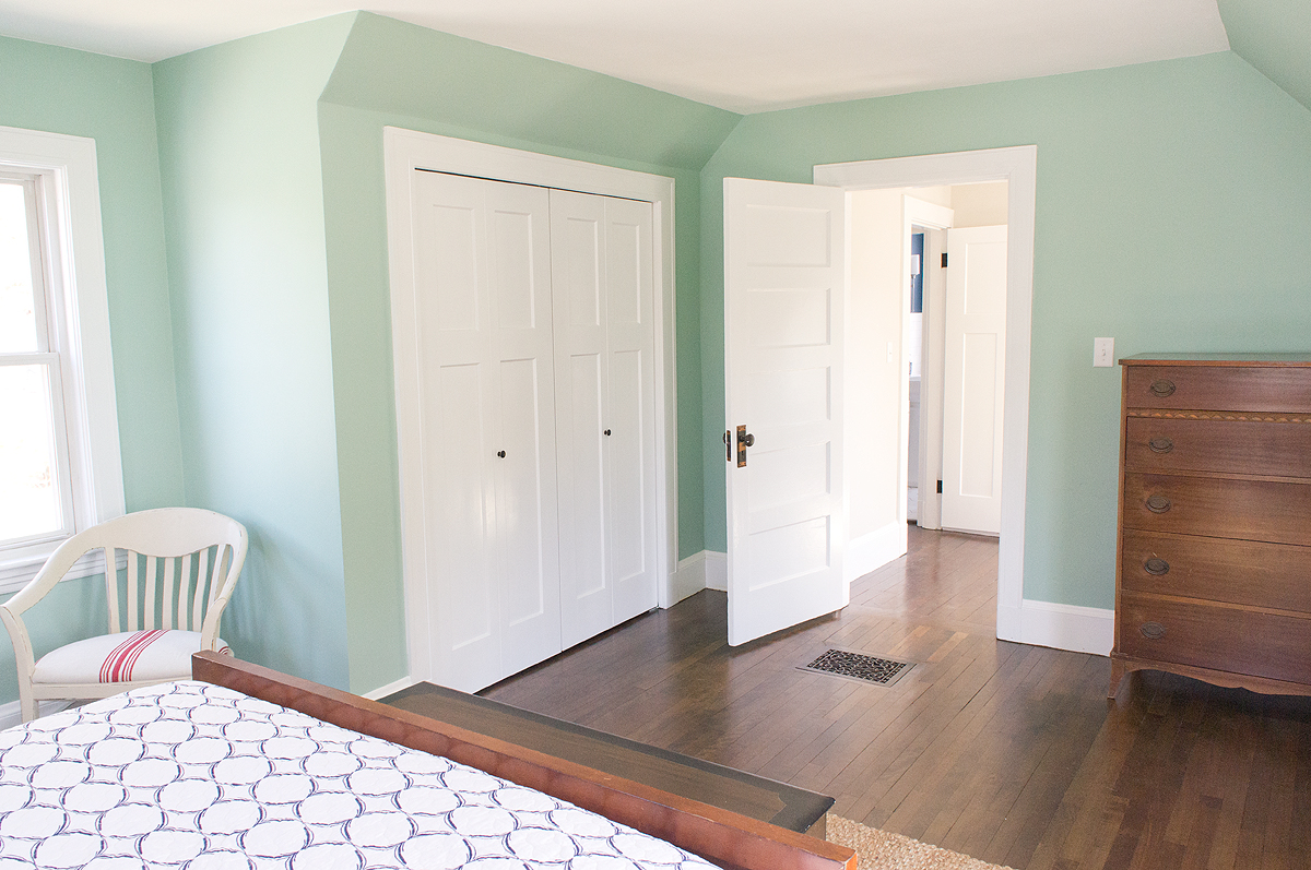
Lastly for the bedrooms, we find the spacious master bedroom (and I say that non-sarcastically)


For a house of this age (built in 1920), this is quite a spacious bedroom.  It's also nice to see an antique home with decently sized closets in all rooms- it wasn't a priority back then, so closet space is often a compromise you need to make in an antique home... luckily not the case here!


Totally fresh and livable bedrooms now!  Not the spacious bedrooms that you might find in a new construction home, but so cute, oozing character, and will be perfect for a young family if I do say so myself.


My favorite transformations are coming over the next few days.  Tomorrow, the bathrooms; Thursday, the exterior; and because I'm trying to build anticipation, I'm saving the kitchen for Friday.  Kitchens sell houses, and this is no exception.


See you tomorrow and we can get personal in the bathrooms!

Save

Save

Save

Save

Save

Save

Save

Save