I hope you enjoy these weekly updates as I navigate through the business of flipping houses one house at a time!! Come back every Friday to see how this house, aka Shorty, progresses from week to week. To catch up on the progress on Shorty, check out his previous posts here. If you’re new here, (Hello!!!) you can find more about my 5 previous flip houses here. Thanks for coming along for the ride!!
Reveal day #3! If you missed the past couple days, check out the before and afters of the living spaces and the bedrooms. Today we delve deeper into the bathrooms.
This house's bath and a half needed it all. Since bathrooms and kitchens tend to sell houses, these spaces got pretty much everything new. They were a bit of a challenge to photograph, though since both are rather narrow spaces.
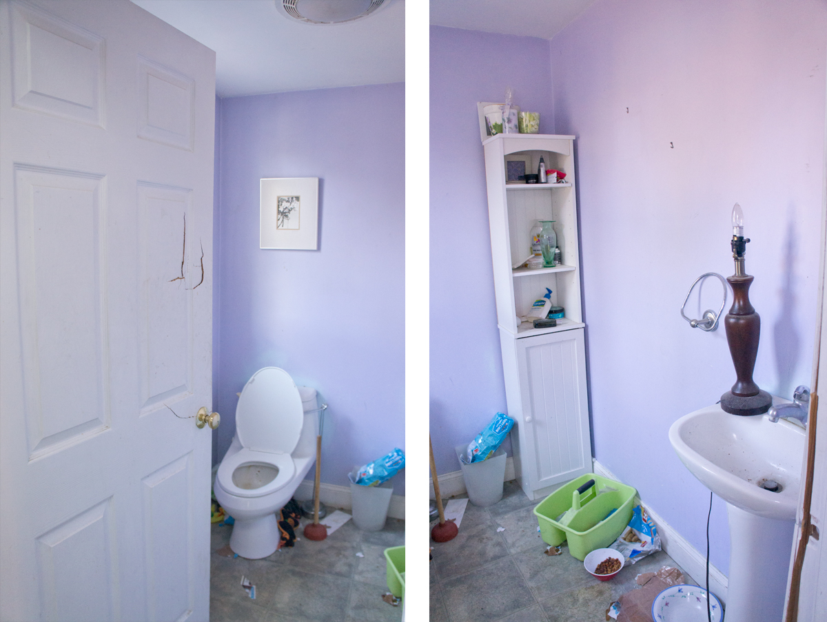
Now with a new floor, toilet, door, and vanity (with storage!!) it's a whole new sunny space.
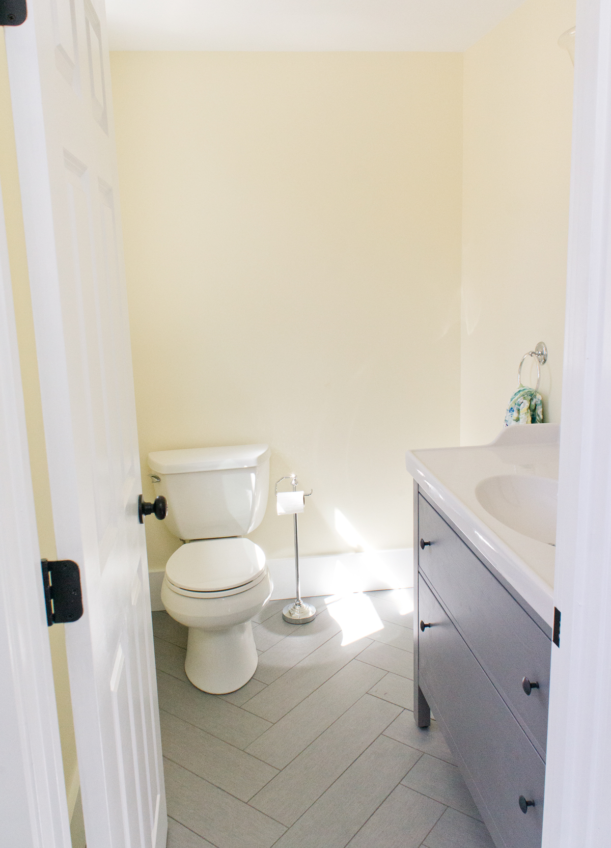
To make room for the narrow depth vanity, I had my contractor narrow the door and shift it a touch to the side, buying us JUST enough space.
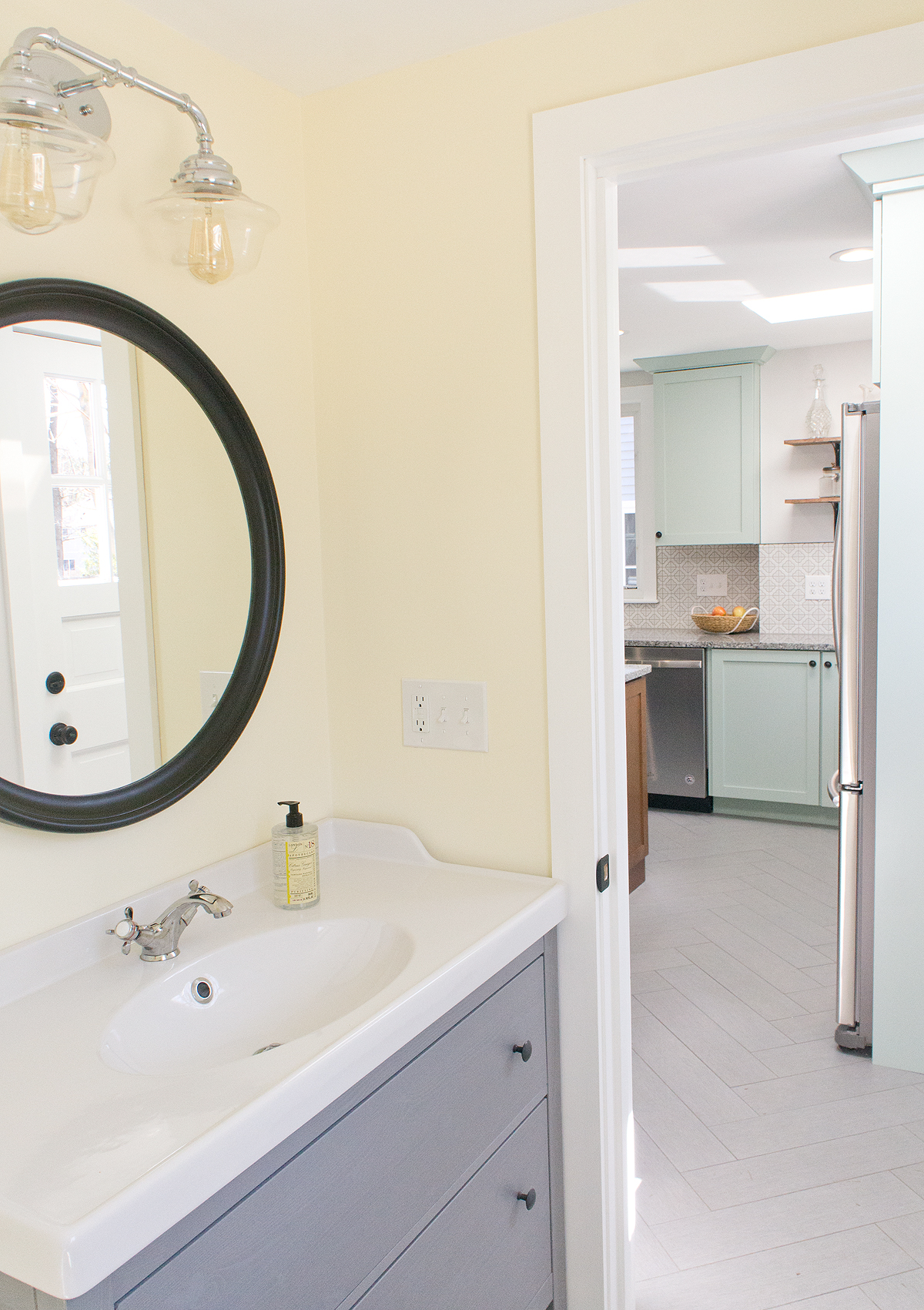
The upstairs full bathroom is a much more interesting space. Where it started, not only was it in rough shape, but it also didn't feel like a bathroom that belonged in a 97 year old house. If you know anything about me by reading this blog, you know that while I don't want to create a museum out of a historical home, I do think each modern space should have touches that help keep it grounded in the style and era of the house. Little things like consistent trim throughout the house and timeless subway tiles can have a big impact in keeping a space like this from looking like a 90s bathroom in a 20s house.
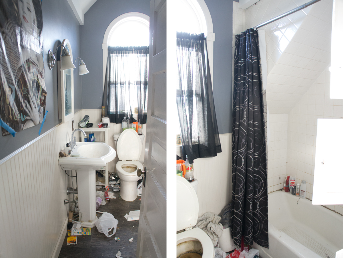
Again, this bathroom got new everything- floor walls, pedestal sink, toilet, lights, built-in doors, etc. This is one of those spaces that I wish you could see in person and not just through my camera lens. It's such a narrow space to try and capture, but I think it works so well in person!
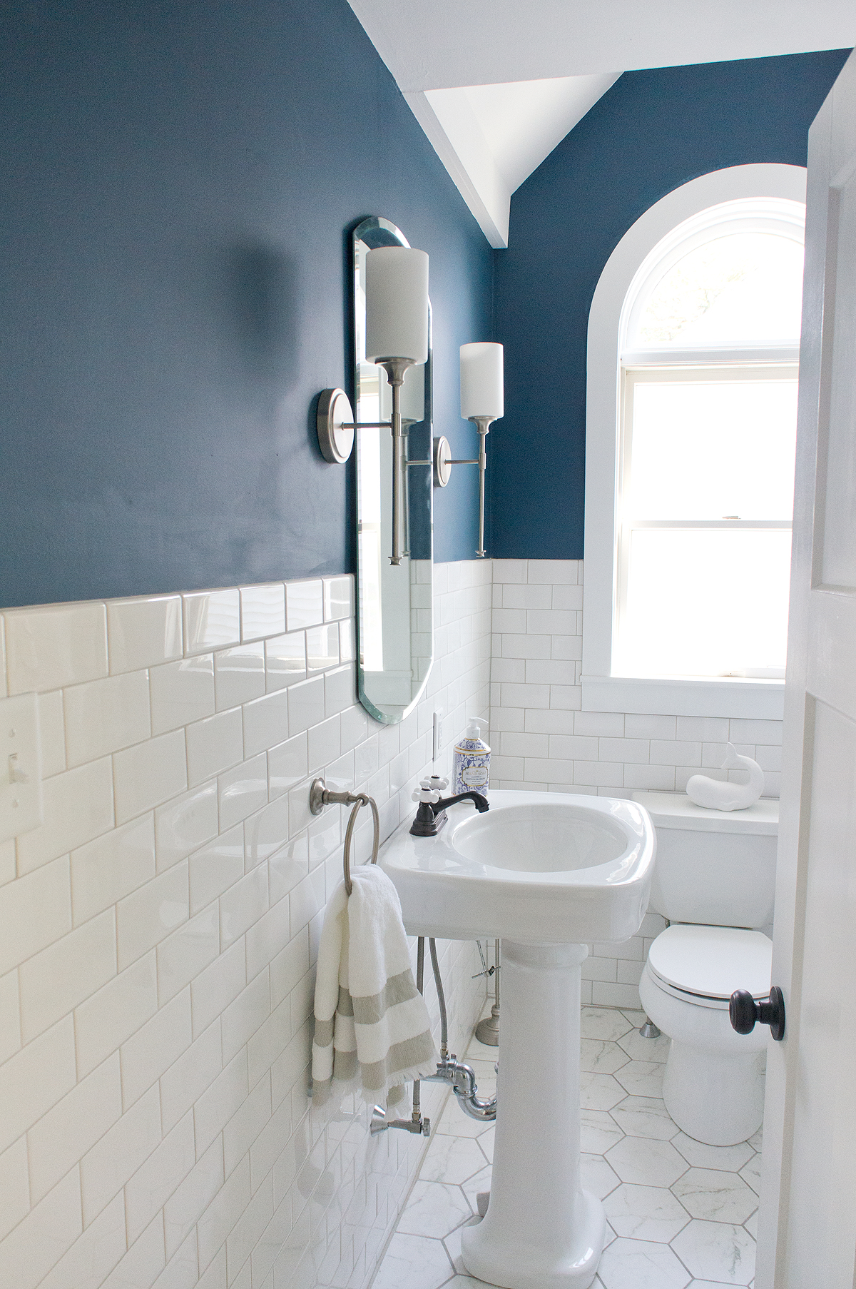
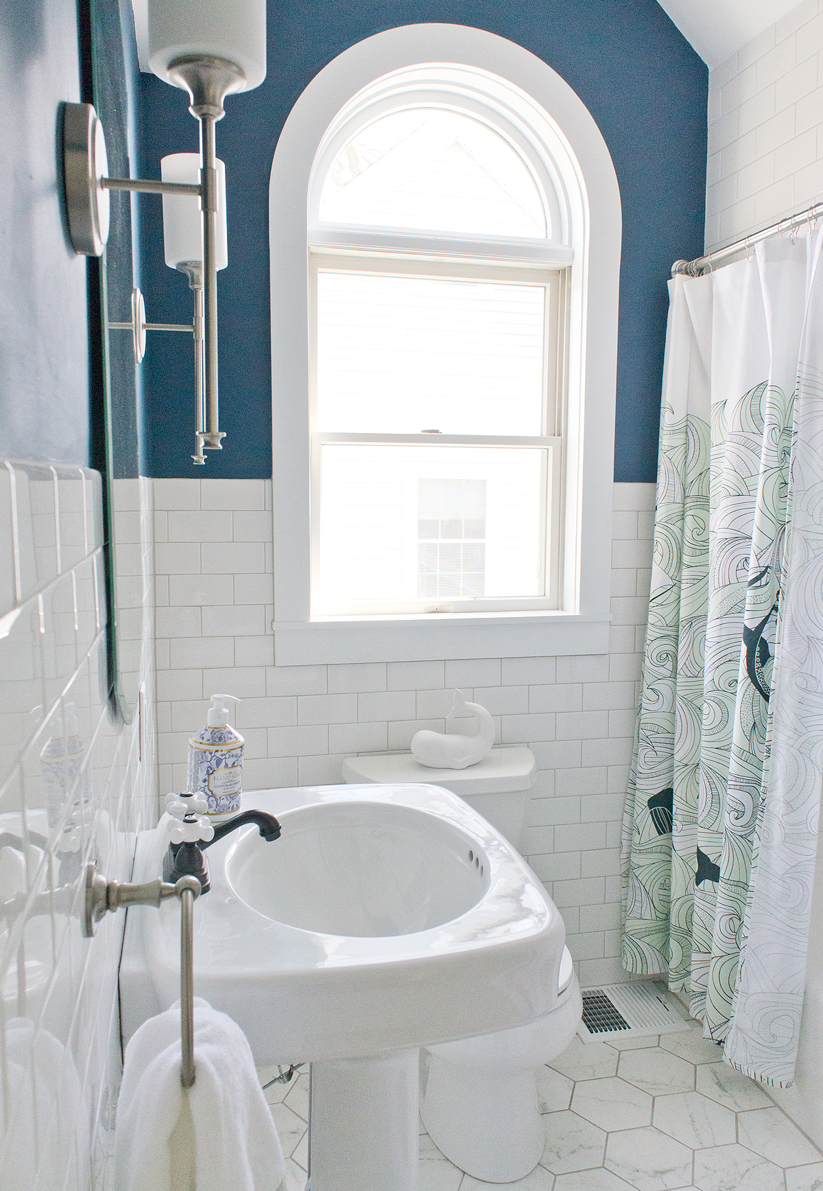
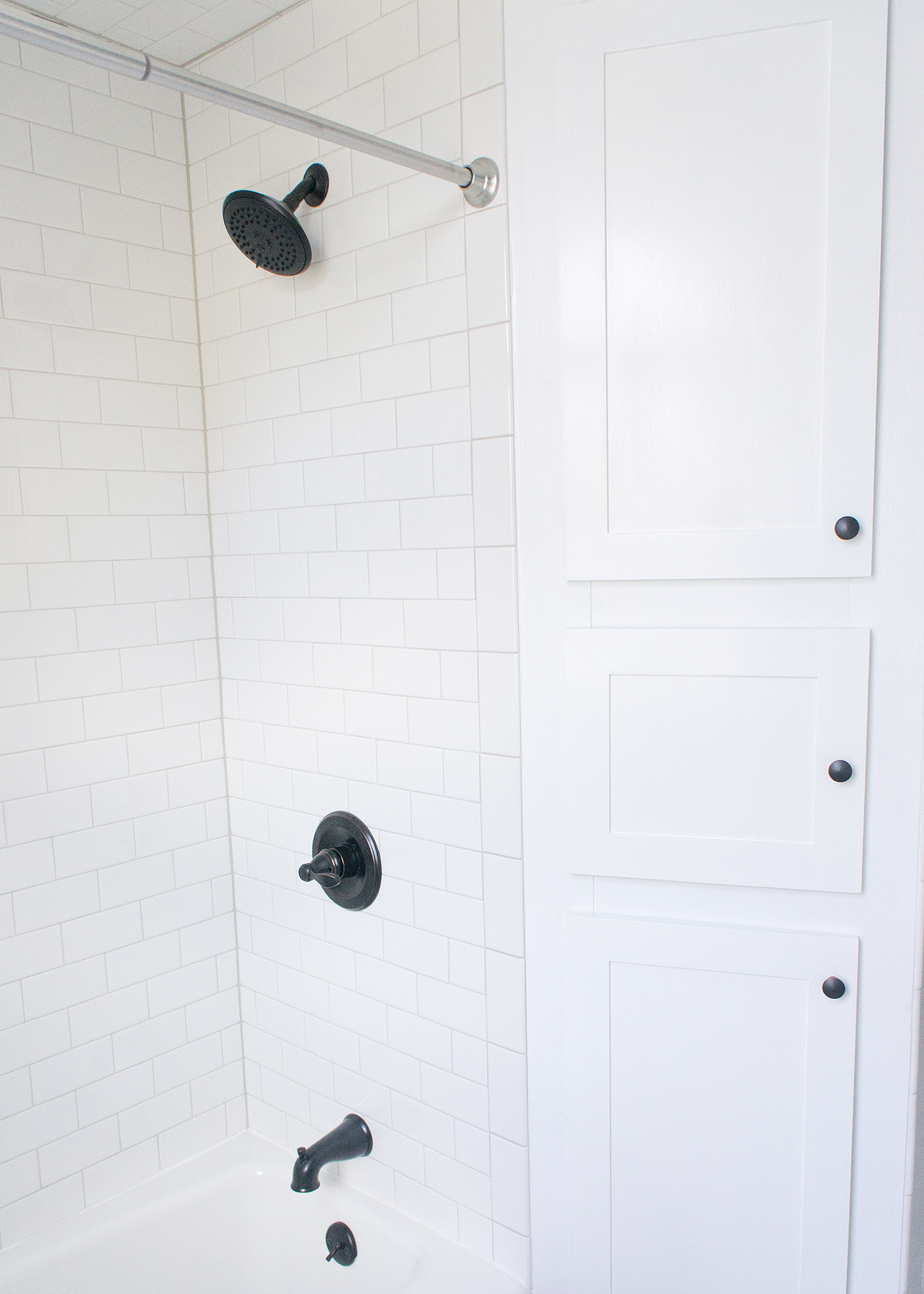
My favorite view of the room- tall mirror and sconces to emphasize the height, vintage style pedestal and tile wainscoting to nod to the history of the house, and a bold wall color to make a modern statement.
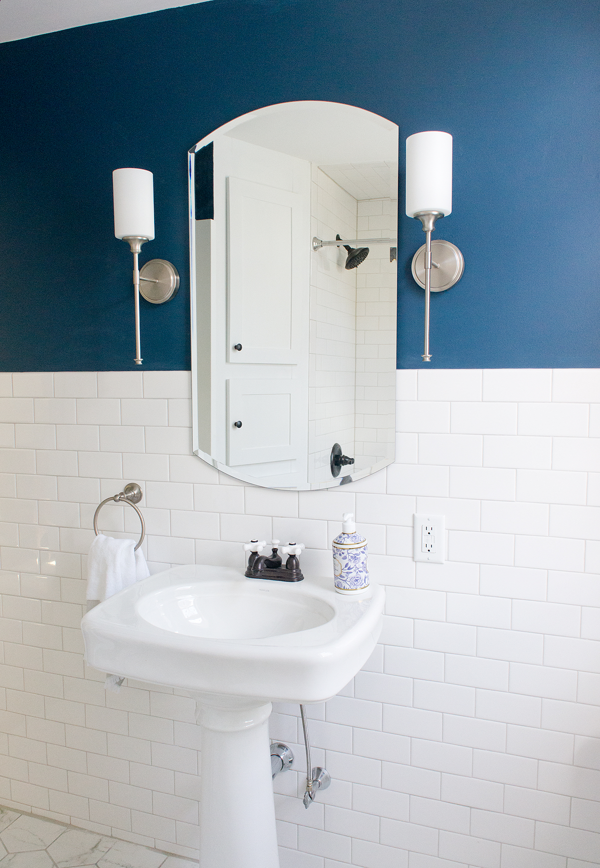
Quite a difference in these rooms, isn't there? Both rooms- but especially the upstairs bath- really put a smile on my face.
I hope I'm not torturing you too too much with the broken up reveals, but it helps to avoid a novel of a before and after post and I get to include more pictures- win-win for both of us I think. Check back tomorrow to see the how different the outside of the house looks (spoiler: very) and then my FAVORITE space on Friday... the kitchen!!!

