I'm so excited- as of about an hour ago, we have new cabinets!! They're still in boxes, though... in the dining room... and the kitchen... and one outside because the box couldn't fit through the door. BUT, this means that we're closer to having a new functioning (and oh so pretty) kitchen, so I'll take it! As I've been spinning my wheels (or so it feels) on this kitchen renovation, my parents have been busy checking items off of their own to do list. They've been in their new house for just shy of a year and have been working on putting their stamp on it. Normally my mom is the instigator of projects (since she's as addicted to reading design blogs as I am and we all know how dangerous that can be), but one project that they both were equally gung ho about doing was their fireplace hearth.
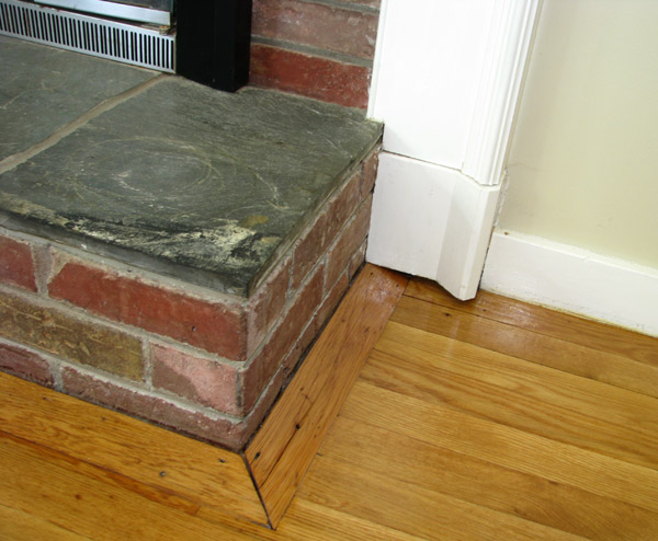
As you can see, the surround is beautiful, but was definitely an add on to the original fire place. The surround didn't even extend to the floor and was 'camouflaged' with ill-fitting trim. It was like sophisticated cottage meets hunting lodge, and not in any good opposites-attract kind of way.
And isn't that top stone just beautiful? That was Dad's favorite part. Of course, by "favorite" I mean he wanted to take a sledge hammer to it. Luckily, though, my parent's definitely had a vision of how to make the fire place look like one cohesive unit that had no more identity crisis.
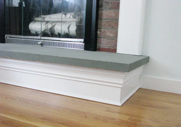
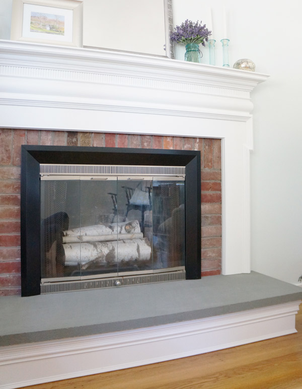
And Voila! Now they have a fireplace that looks original and cohesive. Quite the transformation!
Scroll back up and look at the befores. I dare you. You'll be amazed at the difference. Even having seen it in person, I had forgotten how weird it looked when it started. The finished result is pretty stellar in my opinion- it fits the room perfectly!
What do you think of my parents' fireplace transformation?


